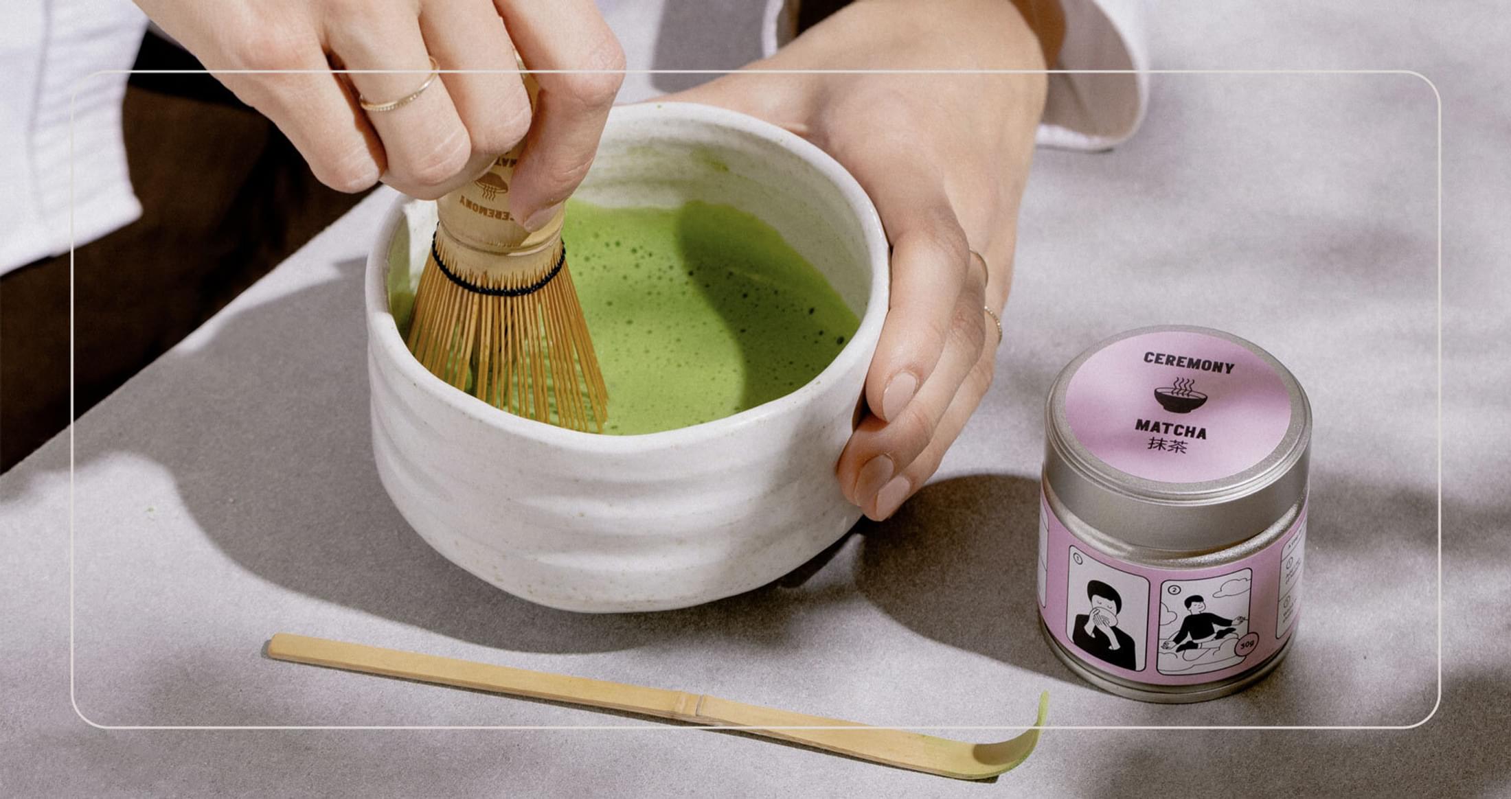
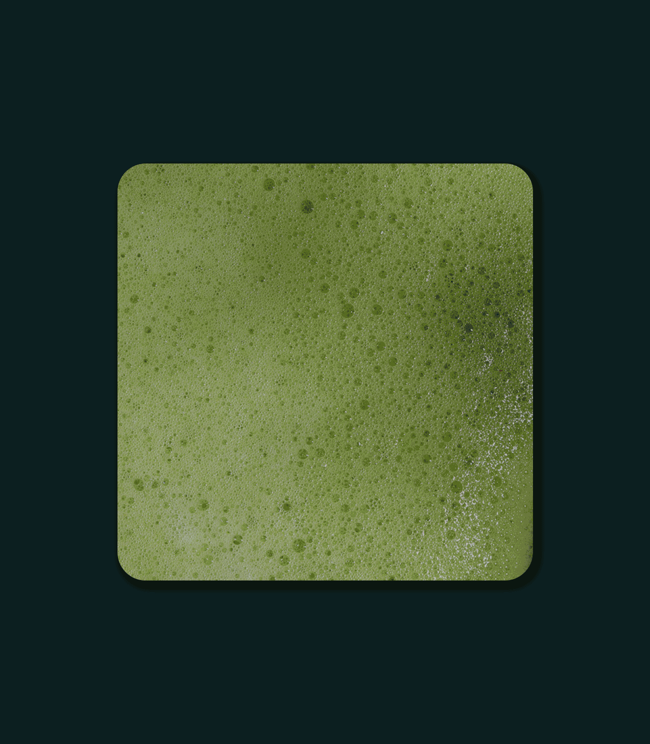
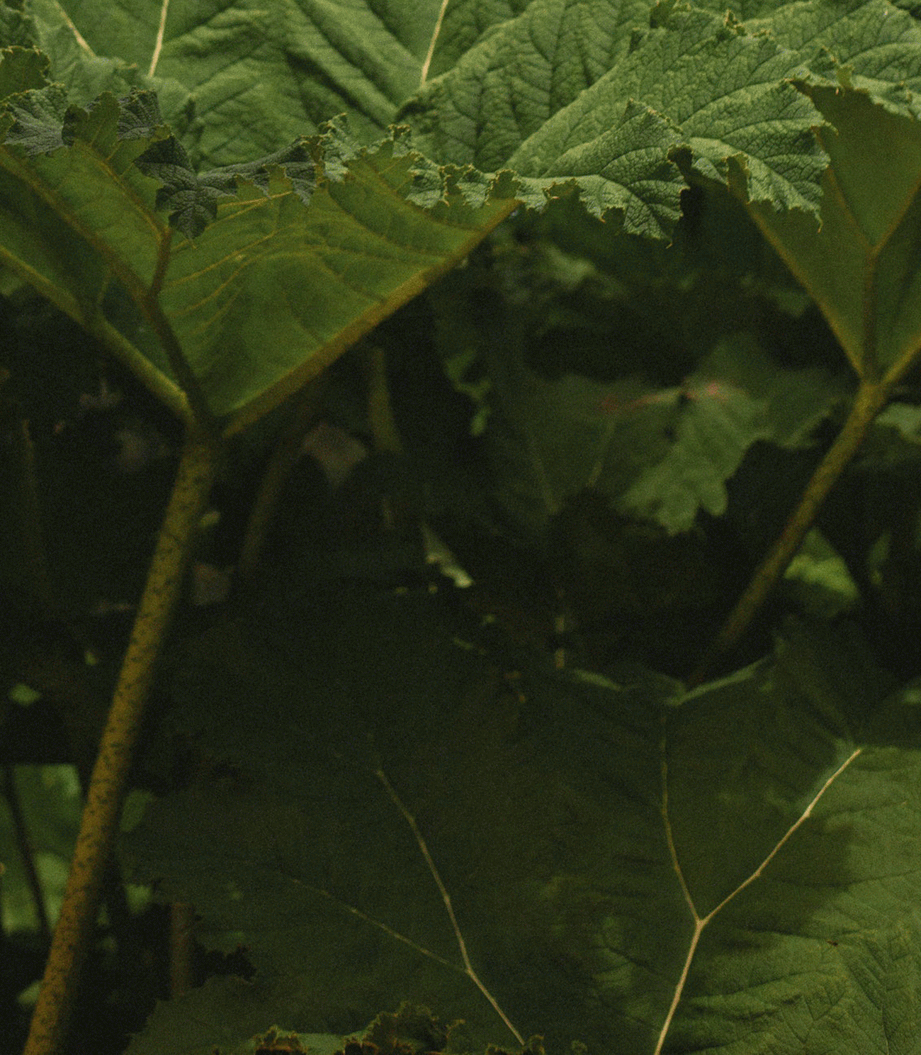
Ceremony Matcha offers organic, ceremonial, matcha imported directly from Uji, Japan. Their mission is to make the health benefits of matcha more accessible, and highlight matcha as a great option for a delicious daily pick-me-up to a global audience. We worked with Ceremony to develop their brand, packaging, print and digital applications.


Inspired by Japanese poster art, the logo combines bold Typography and simple Iconography to create a striking brand mark that captures the spirit of the brand. Placing the Japanese Translation next to the English ensures that the authenticity of the product is retained, whilst ensuring it works for a global audience.


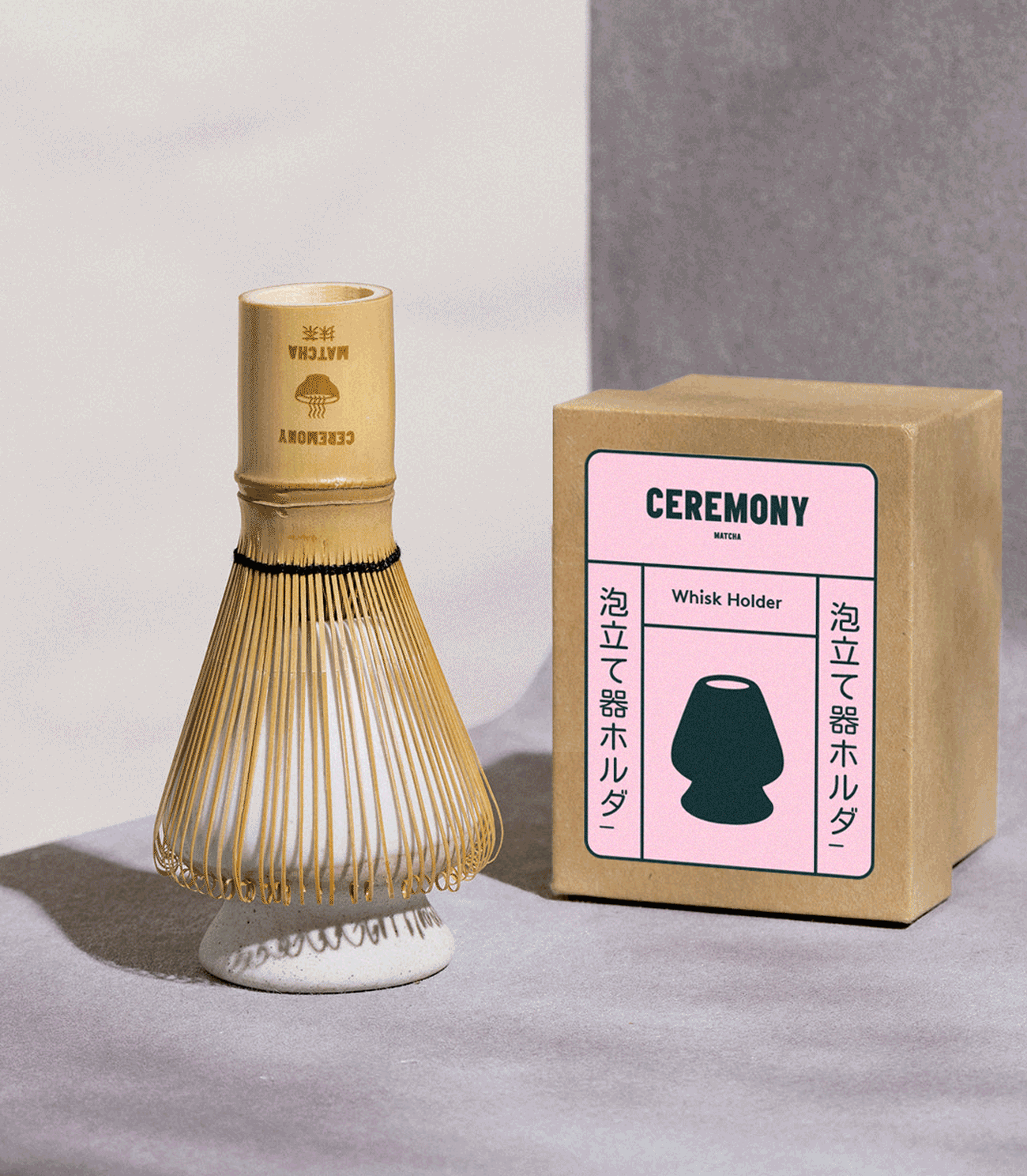
Combining the striking logo with the signature pink colour for the brand makes for a simple, yet bold application that works across the range of packaging.
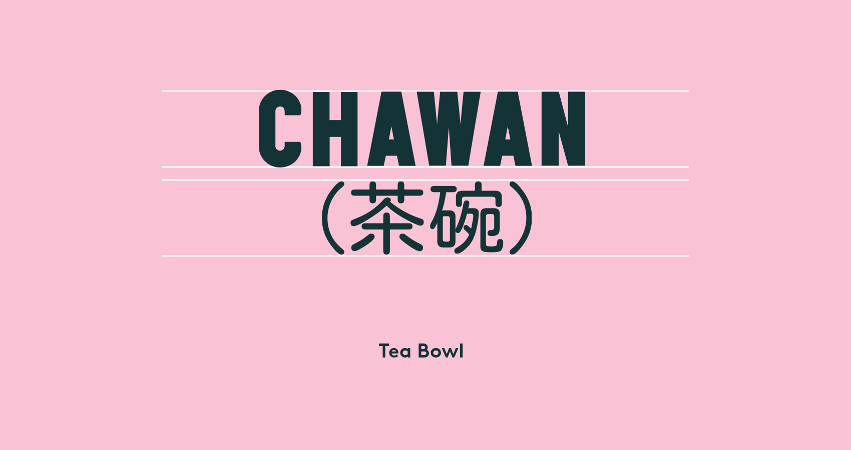
The brand utilises a heavy display font for key brand messaging, supported by the Japanese translation underneath. Using both languages across brand messaging ensures that the authenticity of the product is retained, whilst ensuring it works for a global audience.
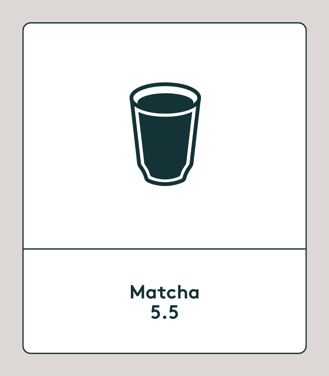
Inspired by the logo mark, we created a set of iconography to symbolise the different products that the brand has to offer, including a Matcha Whisk, Whisk Holder, Tea Bowl and Bamboo Spoon. Creating this unique iconography style allows us to create an easily digestible visual language for the products in order to simplify the concept and process.
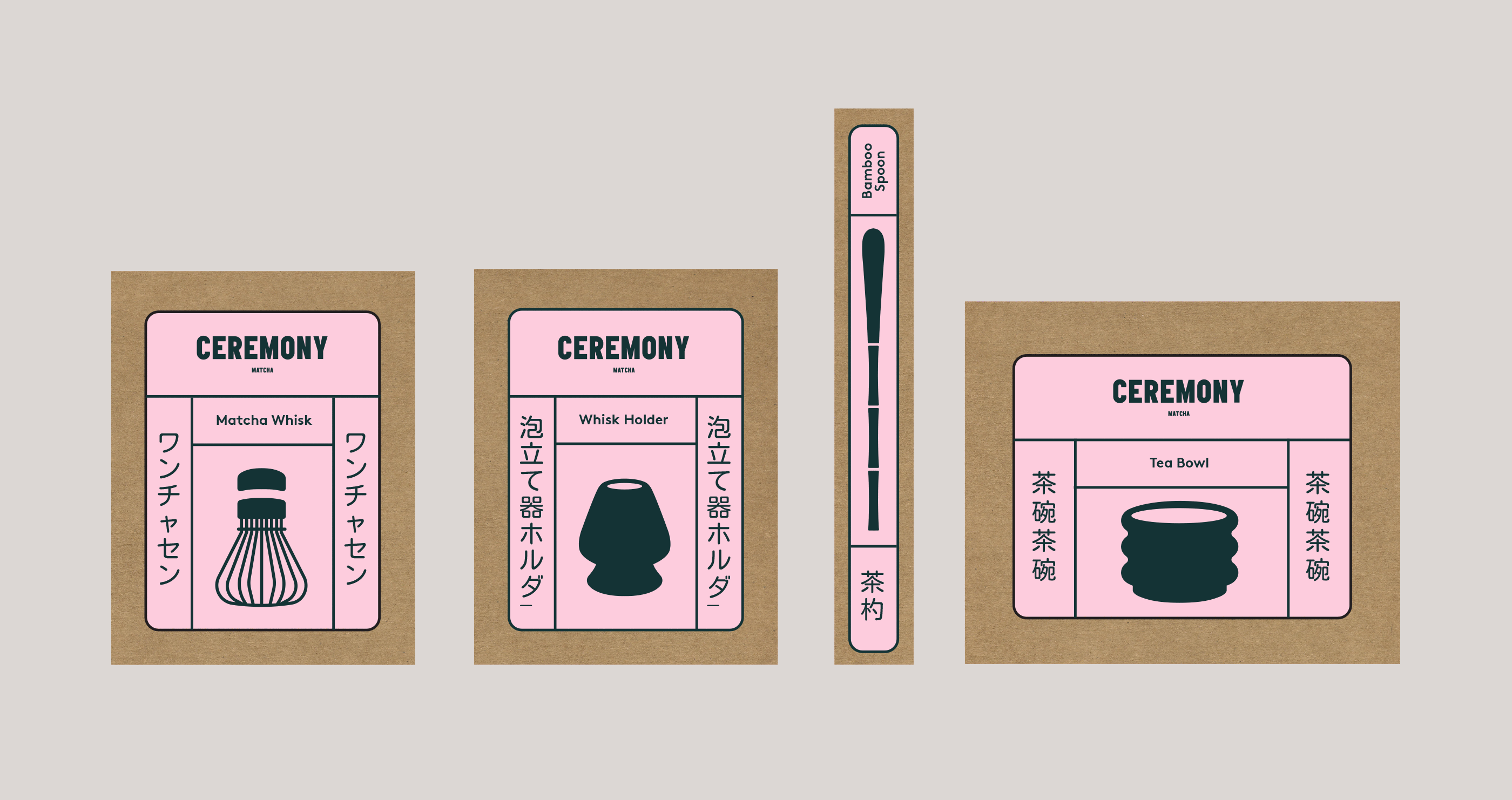
Inspired by Japanese tatami mats, we created a unique grid system for the packaging labels which includes the logo and supporting iconography along with unique vertical placement of the Japanese translations for the products. The bespoke grid layout emphasises the east meets west culture clash in a visually engaging way.

We ensured that the grid system was flexible, working across different product sizes and formats effectively, from a wide Tea Bowl down to a thin Bamboo Spoon.

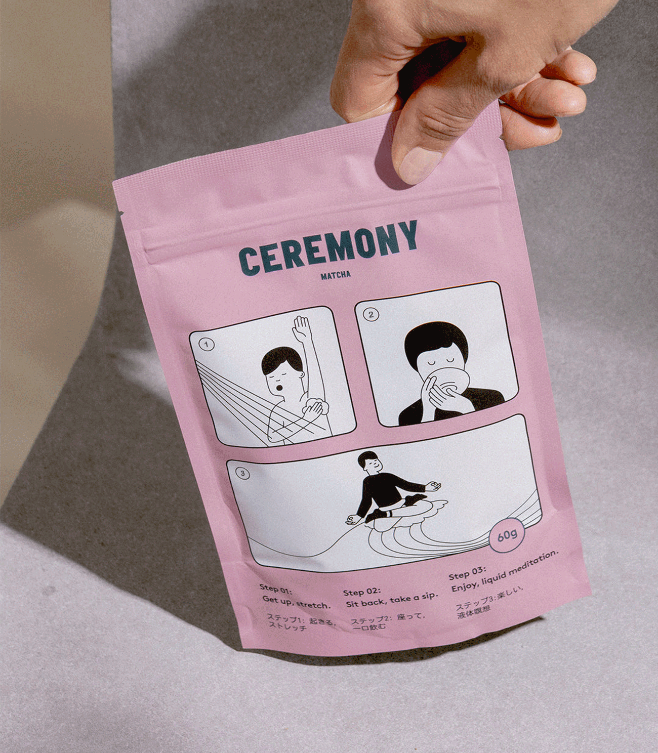
For the packaging of the matcha itself, we introduced an illustration style with a heavy Japanese influence. The concept was to create a story through the illustrations, in a manga style, showing the daily routine, from waking up and showering to drinking matcha and experiencing 'liquid meditation'.
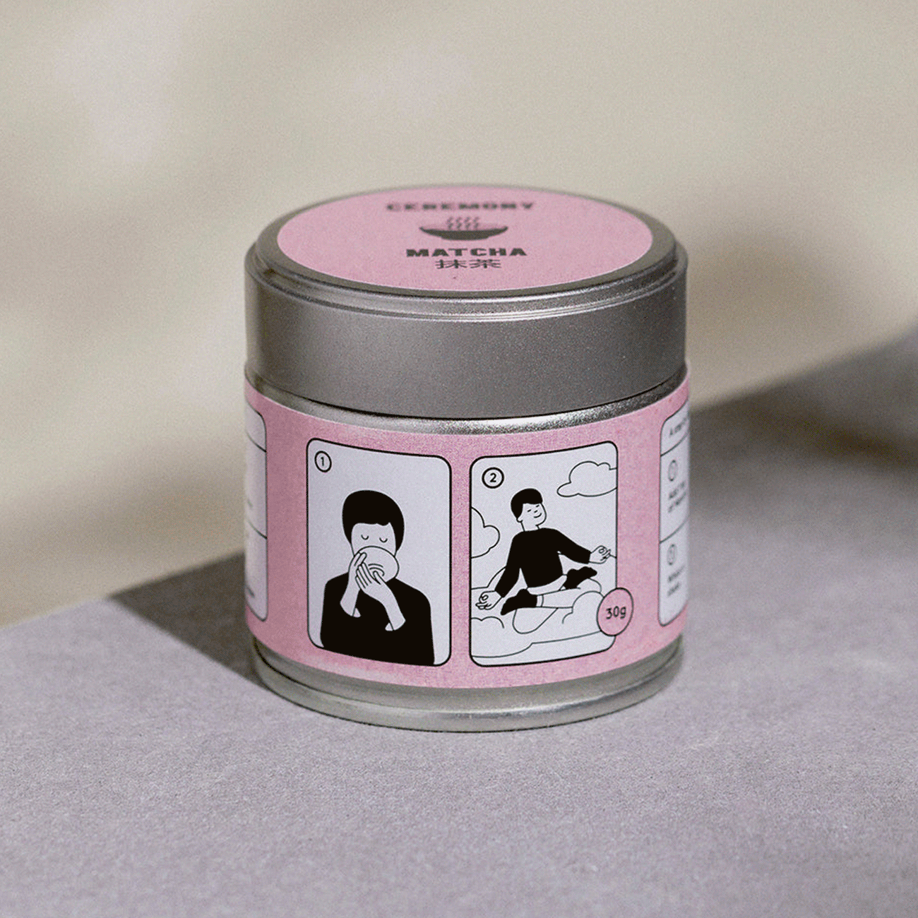

The illustration style was carried through into the matcha tin packaging, utilising the same concept, but making it work across a much smaller format.

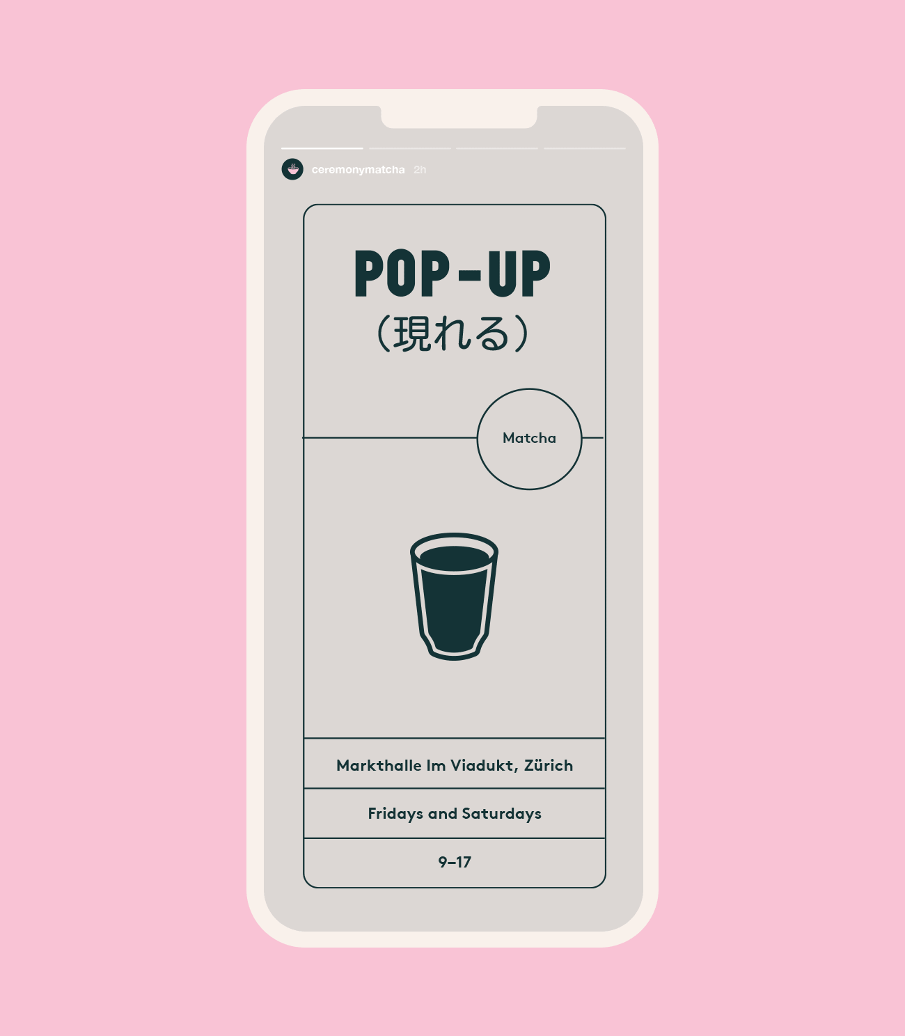
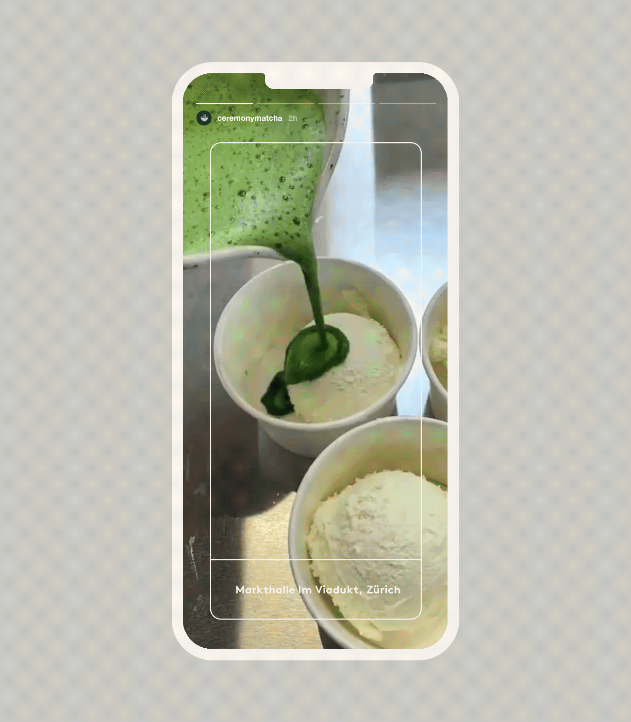
The iconography is key to the bold visual style of the brand. For pop-ups and events, we created a unique icon set to represent all of the different matcha drink options on offer, from Matcha Lattes and Tonics down to Floats and Affogato.
The grid system used across the packaging was also translated over into digital design, separating information and creating a unique look and feel across the website and social media.


Creating lots of bold, visual brand assets was key for the brand to ensure that the fun personality comes through at all times. The illustrations were used as key visuals for brand pieces such as stickers, tote bags and signage.

The grid system extends to the website, creating a unique look and feel to the user journey across e-commerce, whilst ensuring that it's clean, simple and functional.

We ensured that the brand can extend effortlessly across social media, creating template styles for different styles of posts from Infographics, to features, to product launches and beyond.


The grid system extends to the website, creating a unique look and feel to the user journey across e-commerce, whilst ensuring that it's clean, simple and functional.

The brand extends beyond the core product range and into merchandise, utilising the bold iconography and unique typographic executions of the slogan 'liquid meditation' across ranges for t-shirts, sweatshirts, caps and tote bags.


Slow down. Take a sip. Enjoy liquid meditation. Ceremonial grade quality matcha, grown in Uji, Japan, and ground to order in small batches. Thanks for reading.