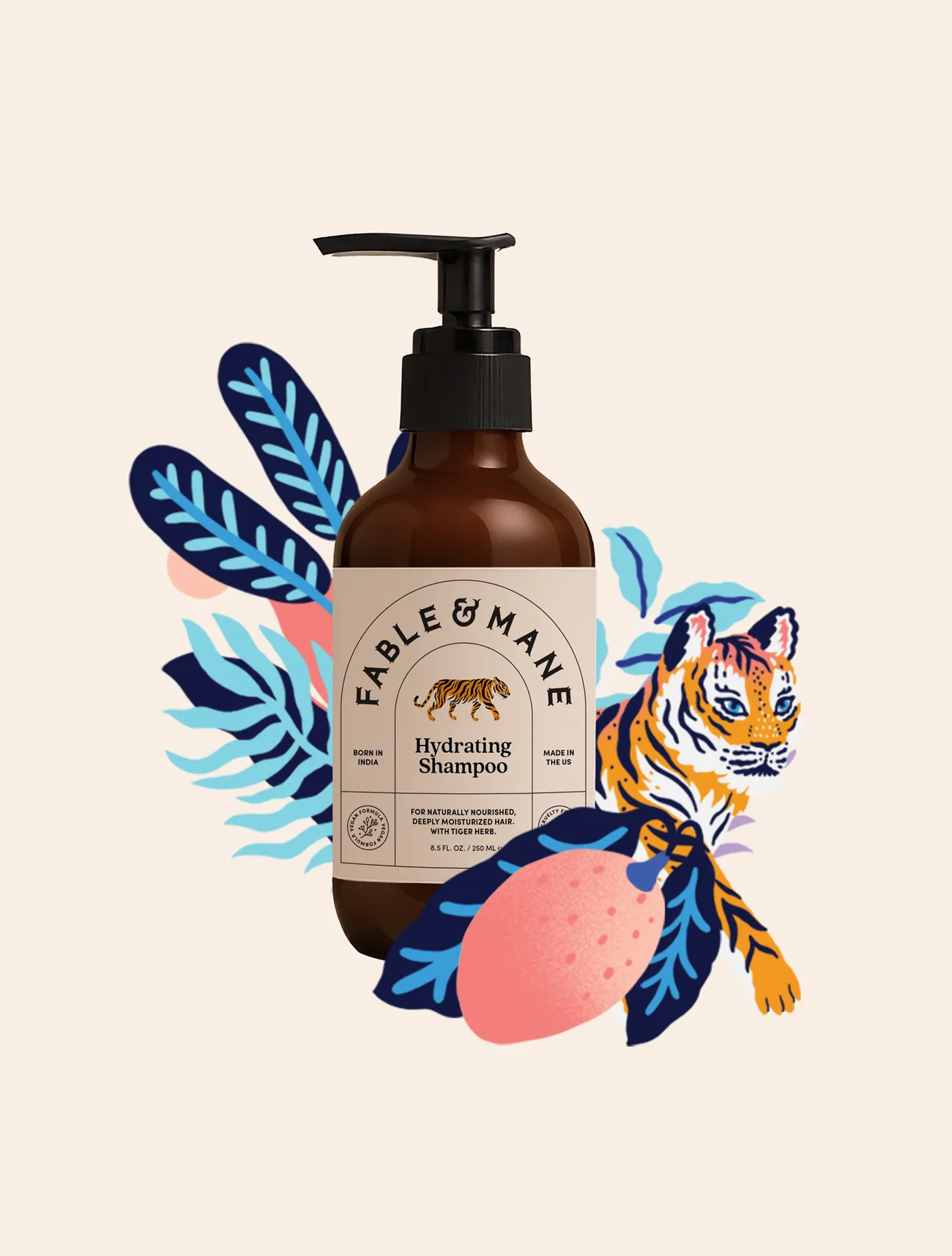
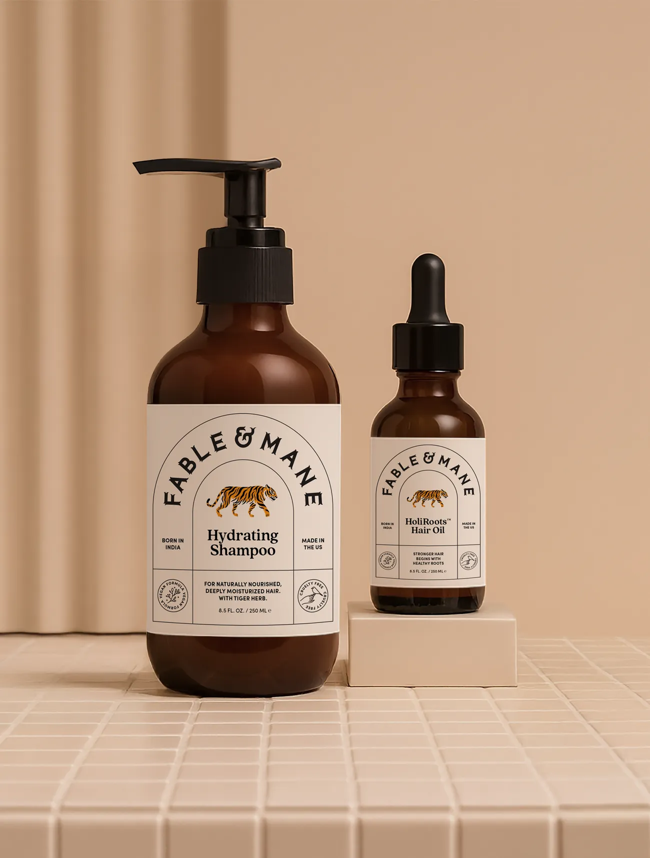
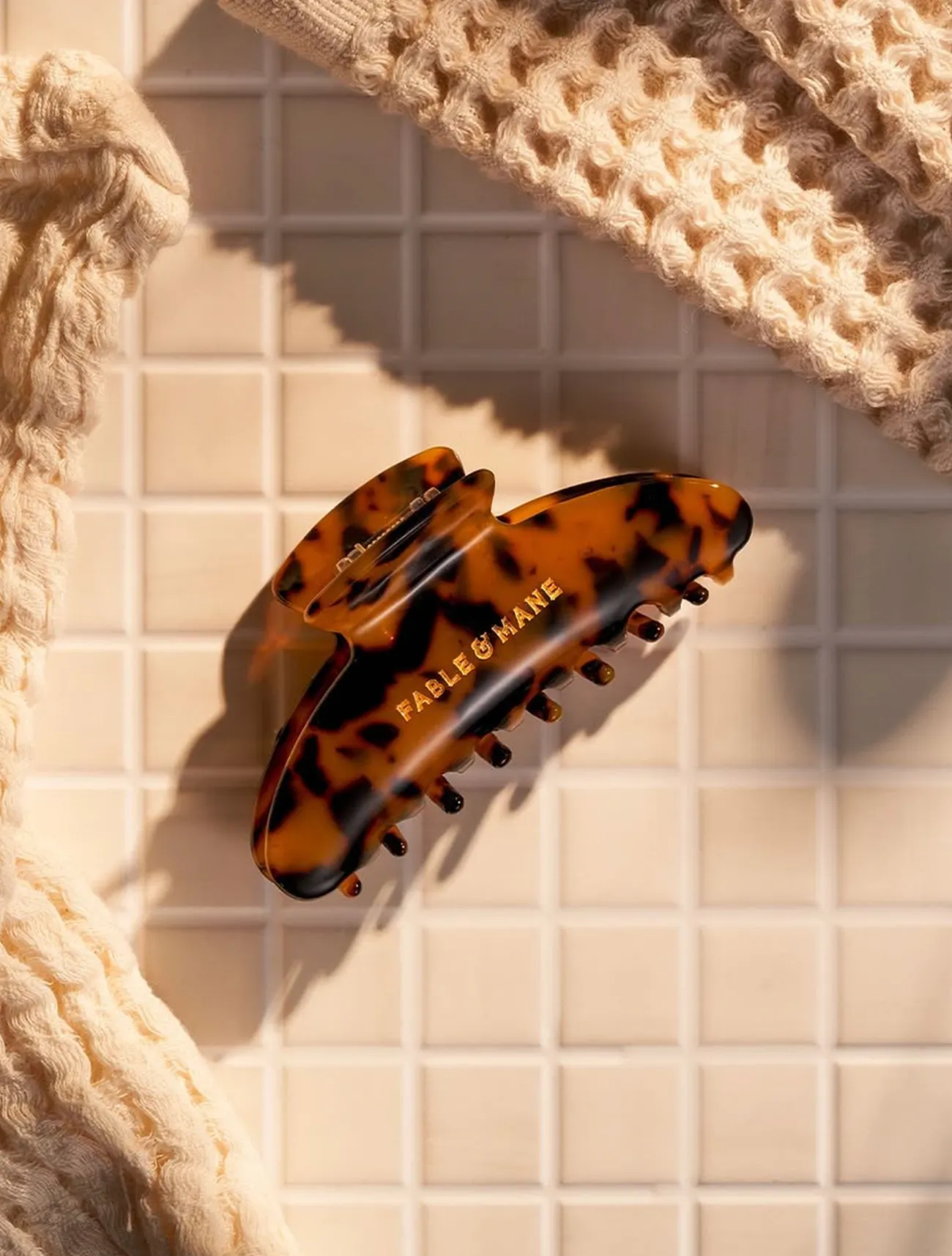
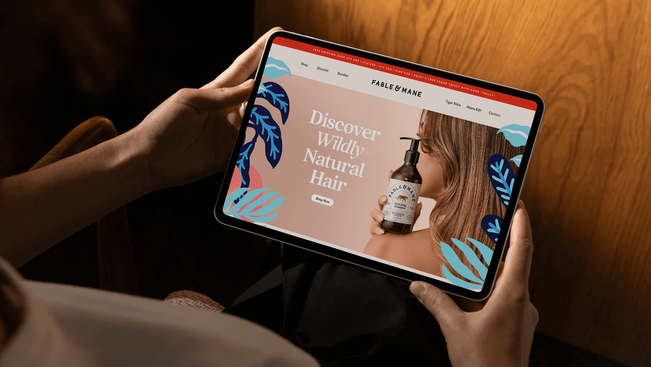
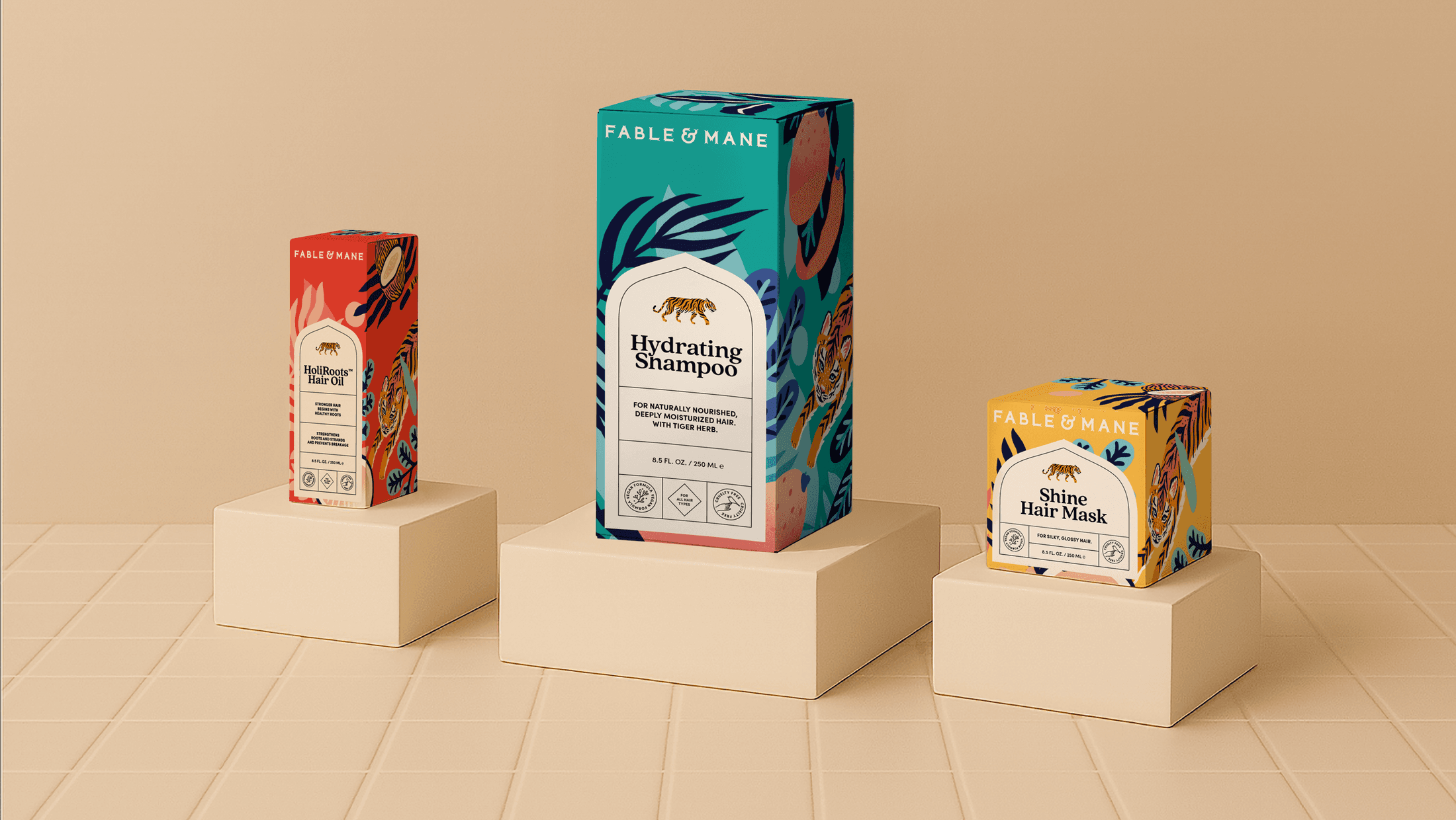
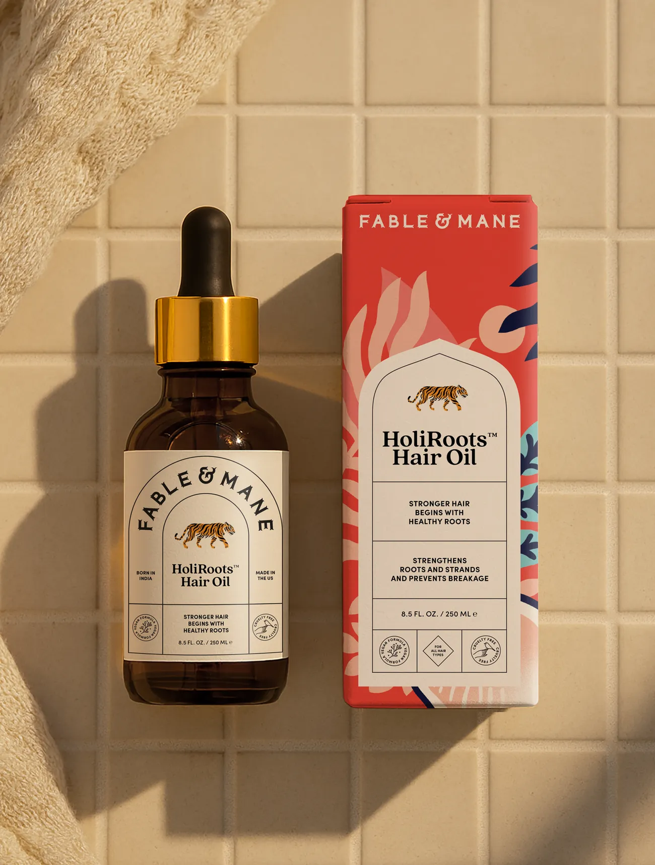
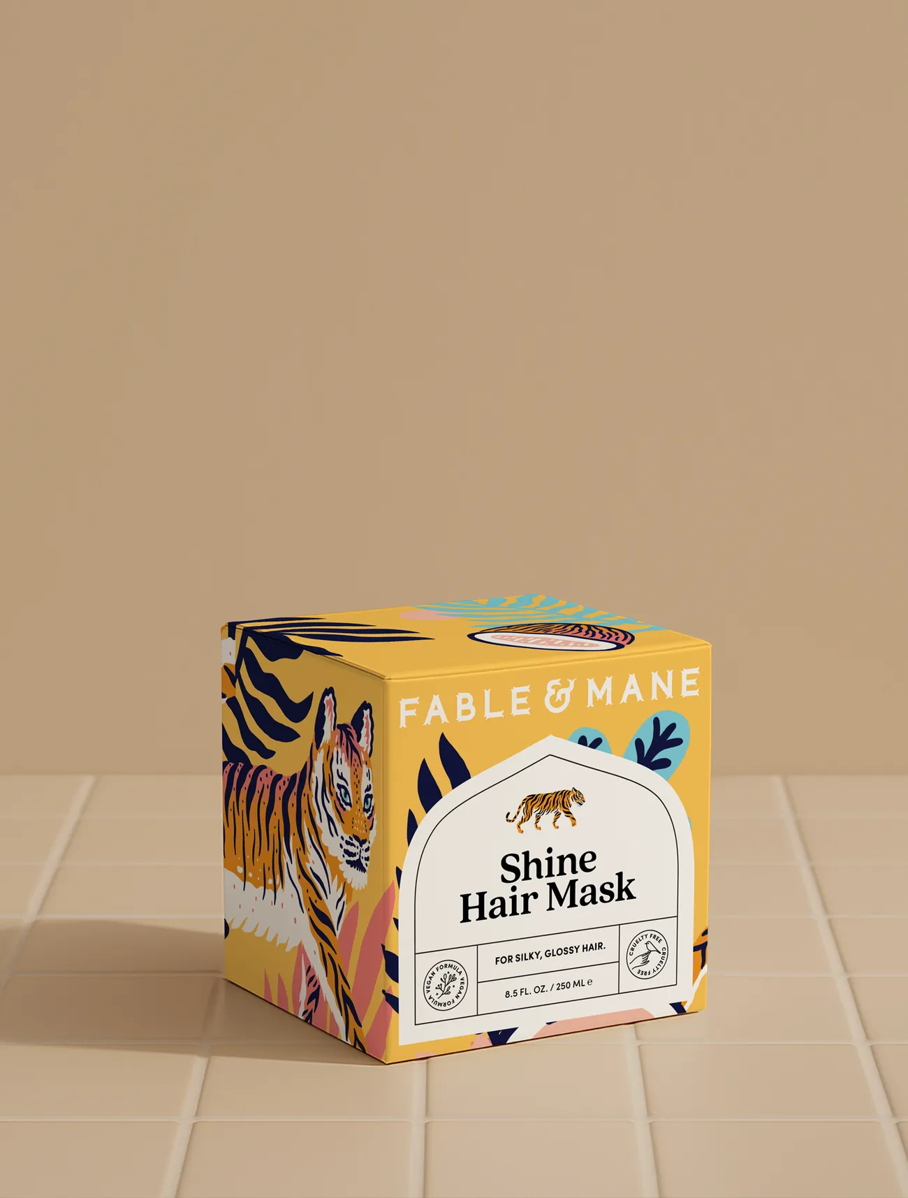
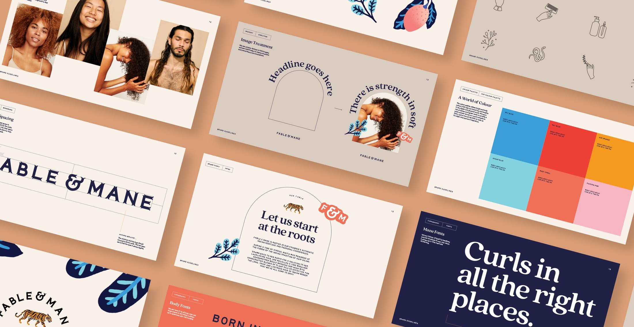
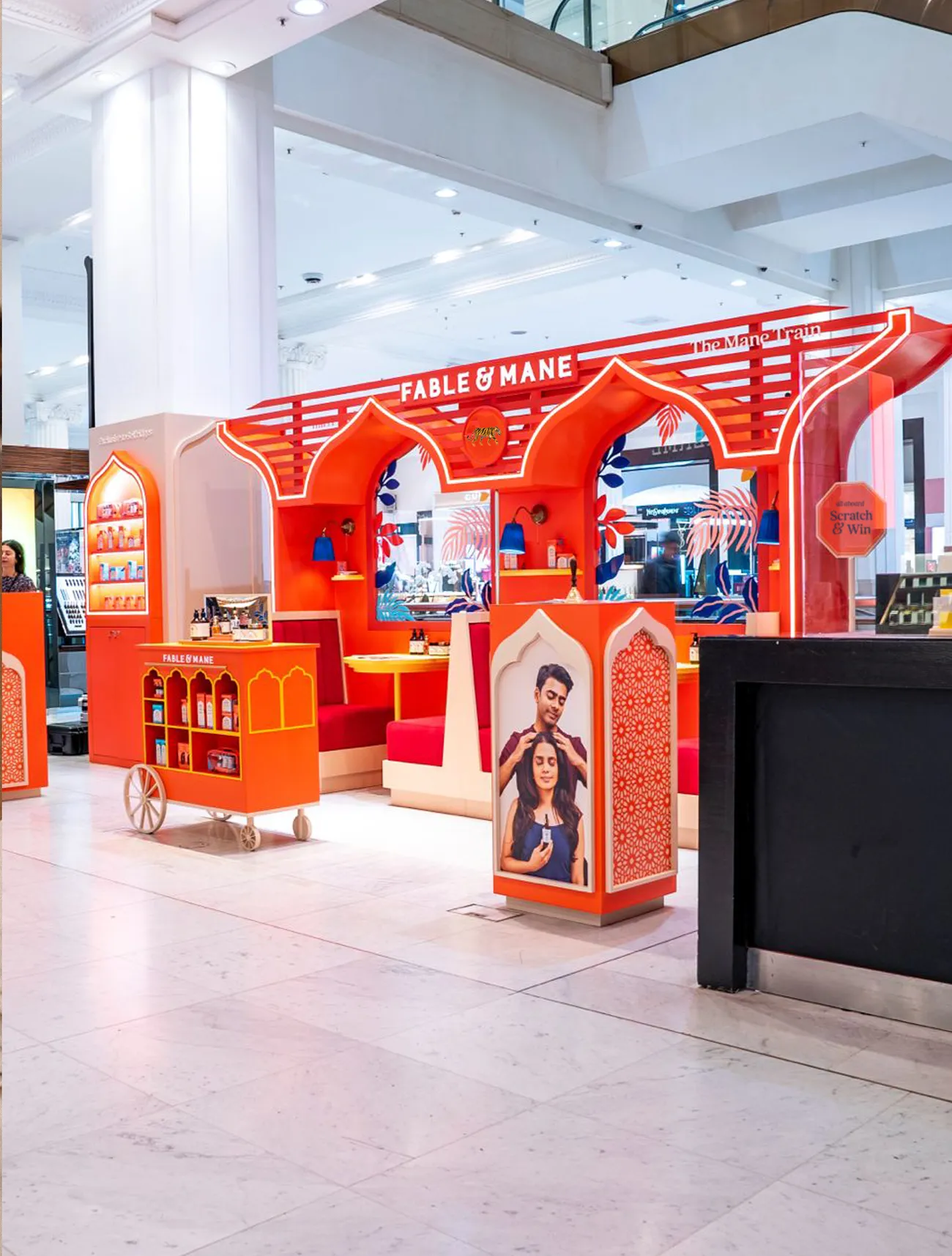
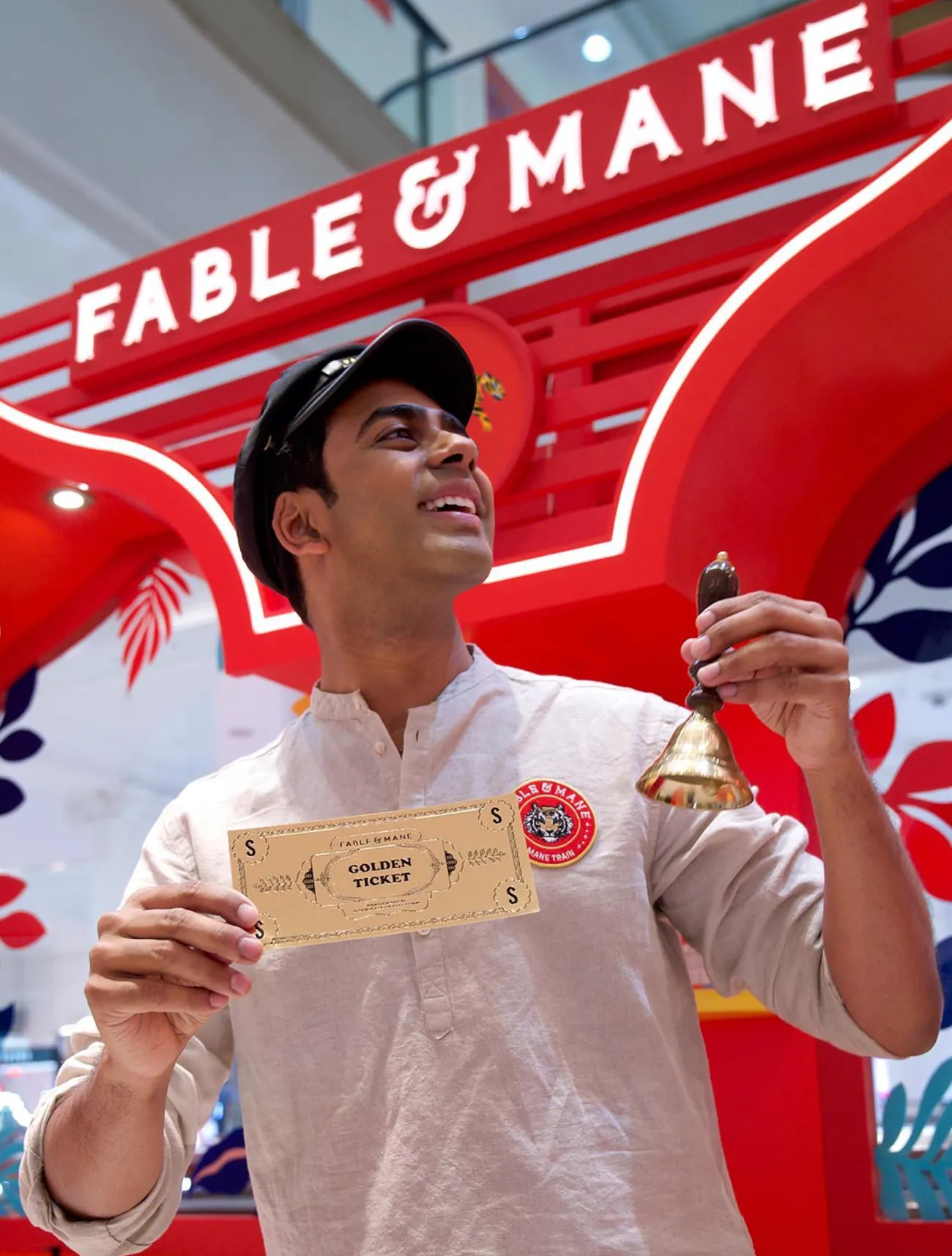
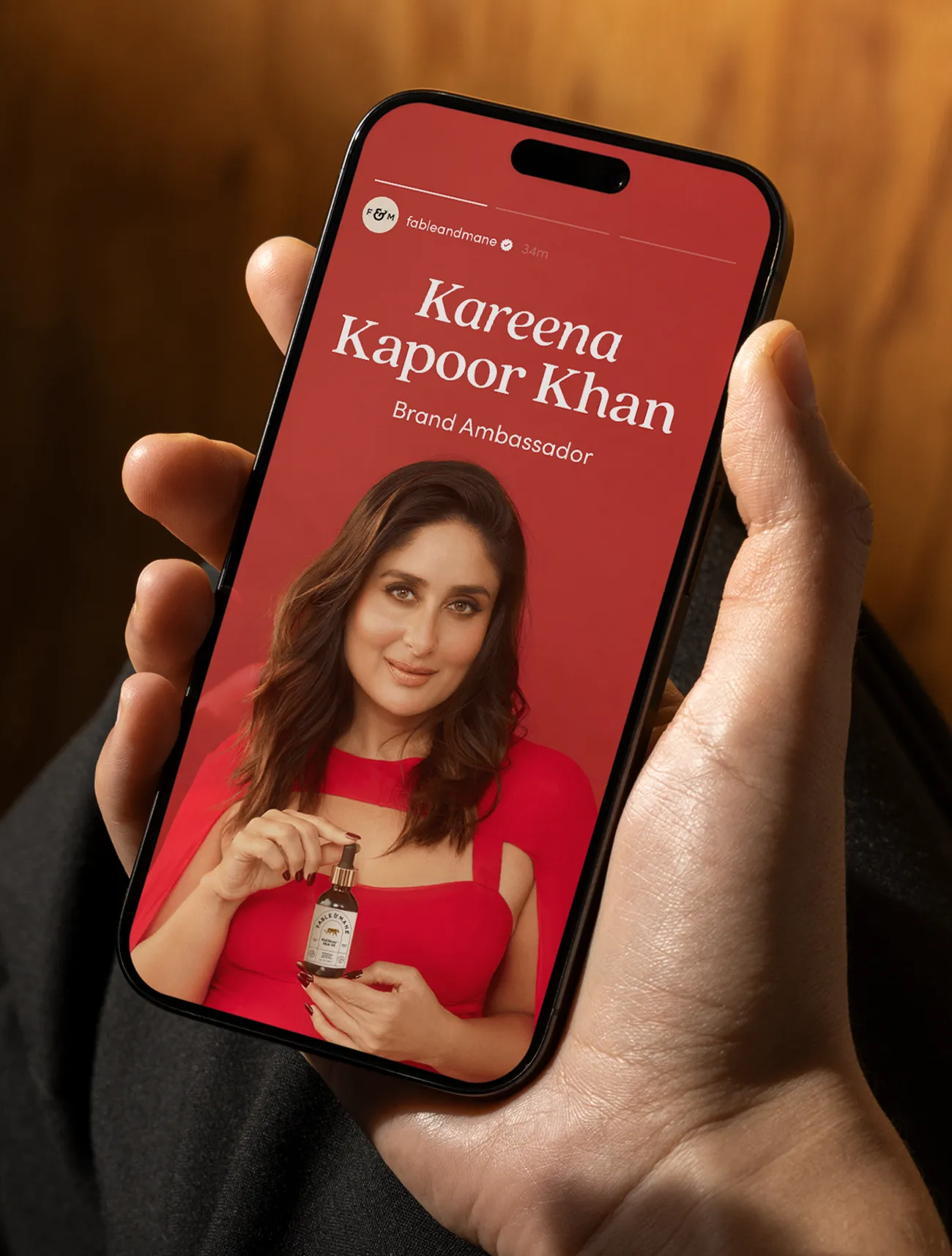
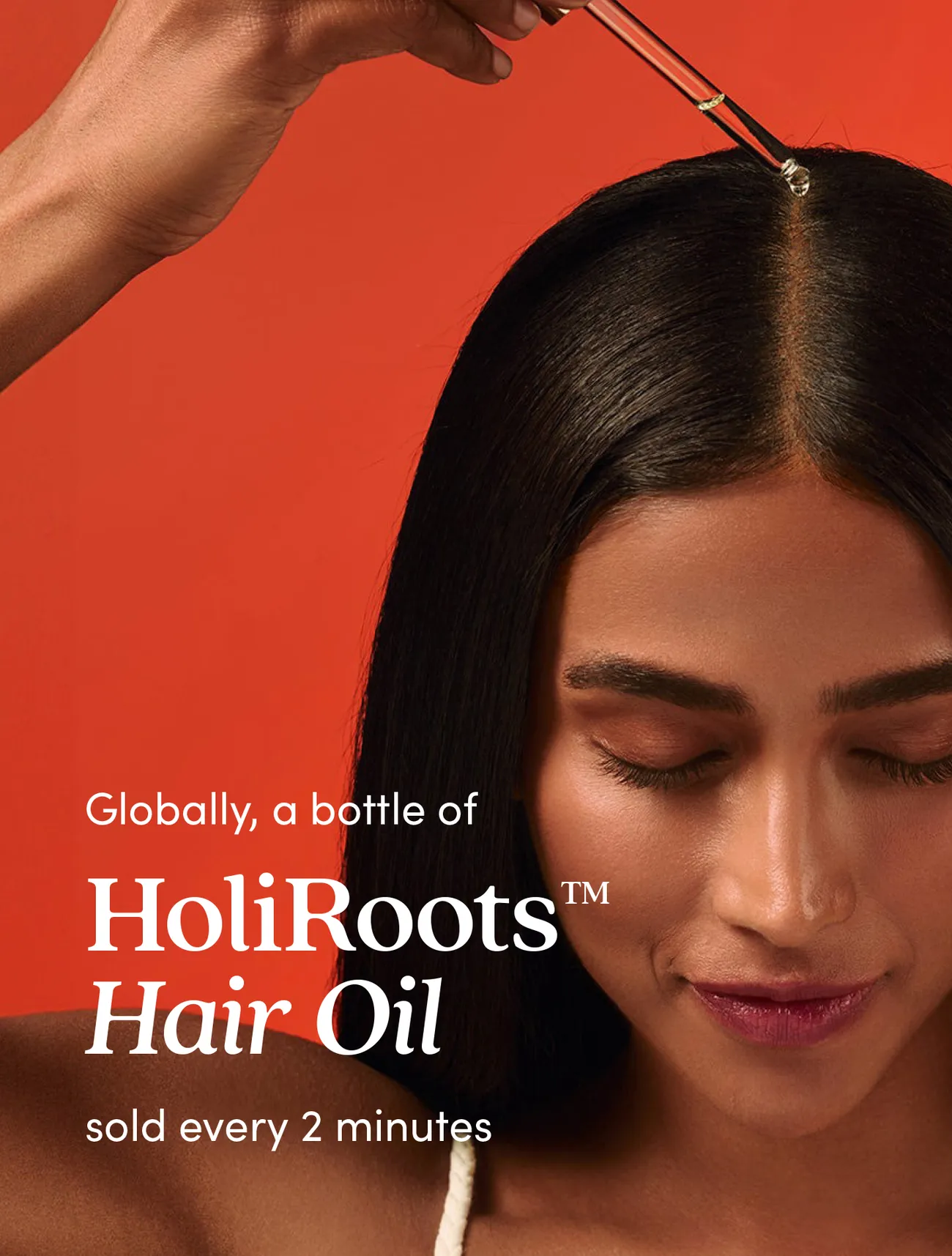
Fable & Mane is a modern hair wellness brand inspired by ancient Indian rituals. We developed it from the ground up—shaping research, strategy, naming, and messaging through to brand identity, packaging, and rollout across digital and print.
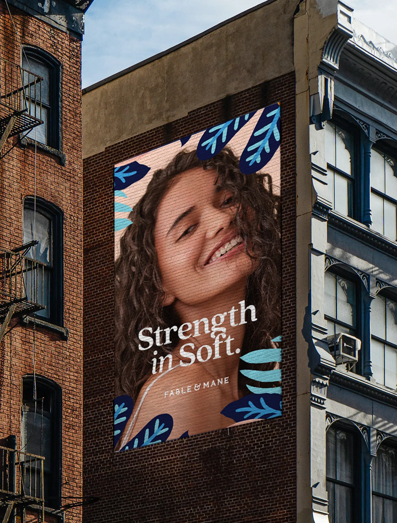
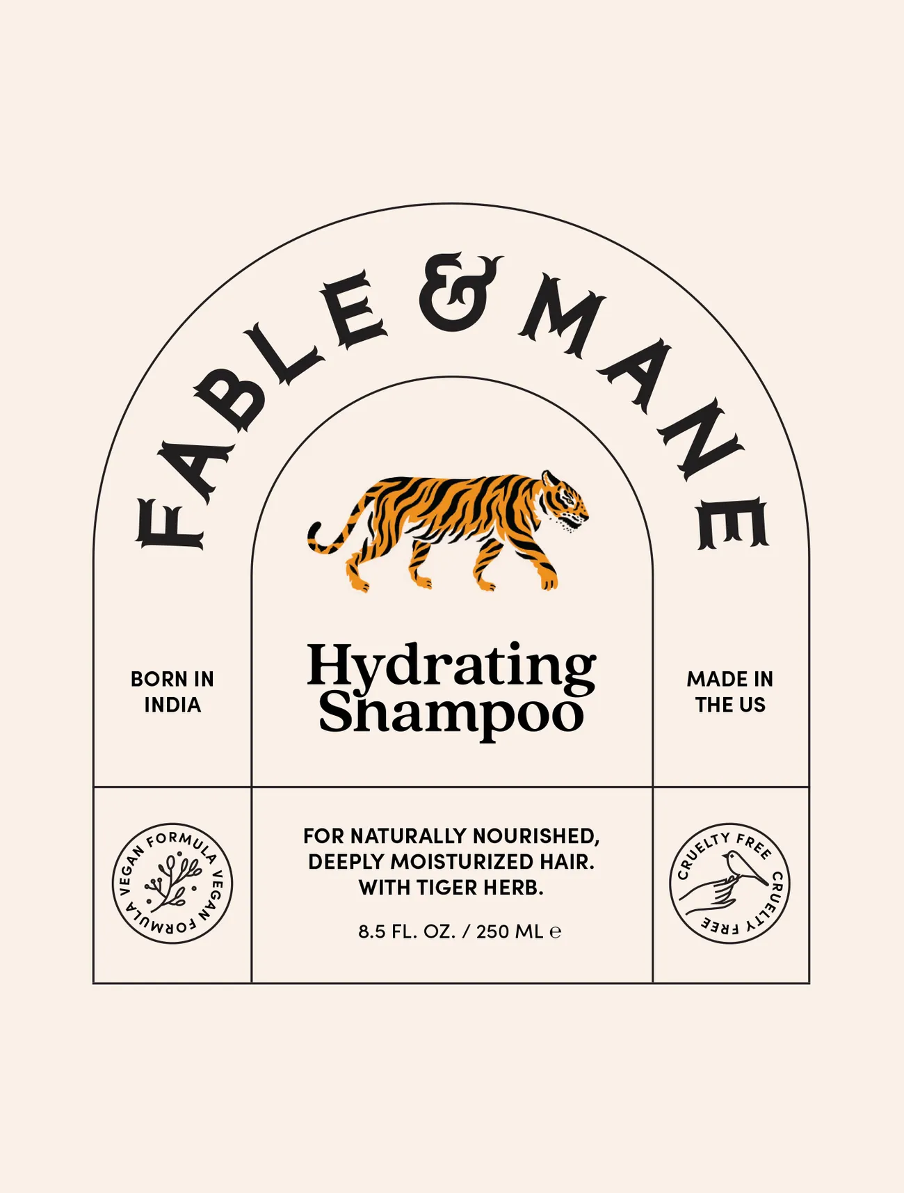
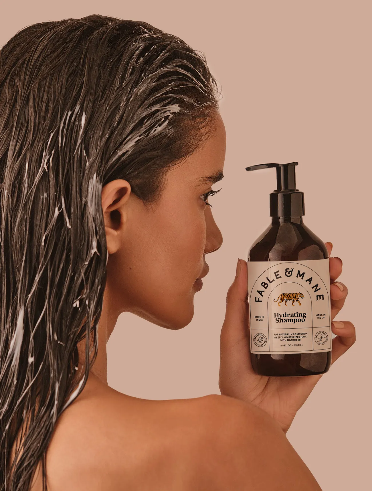
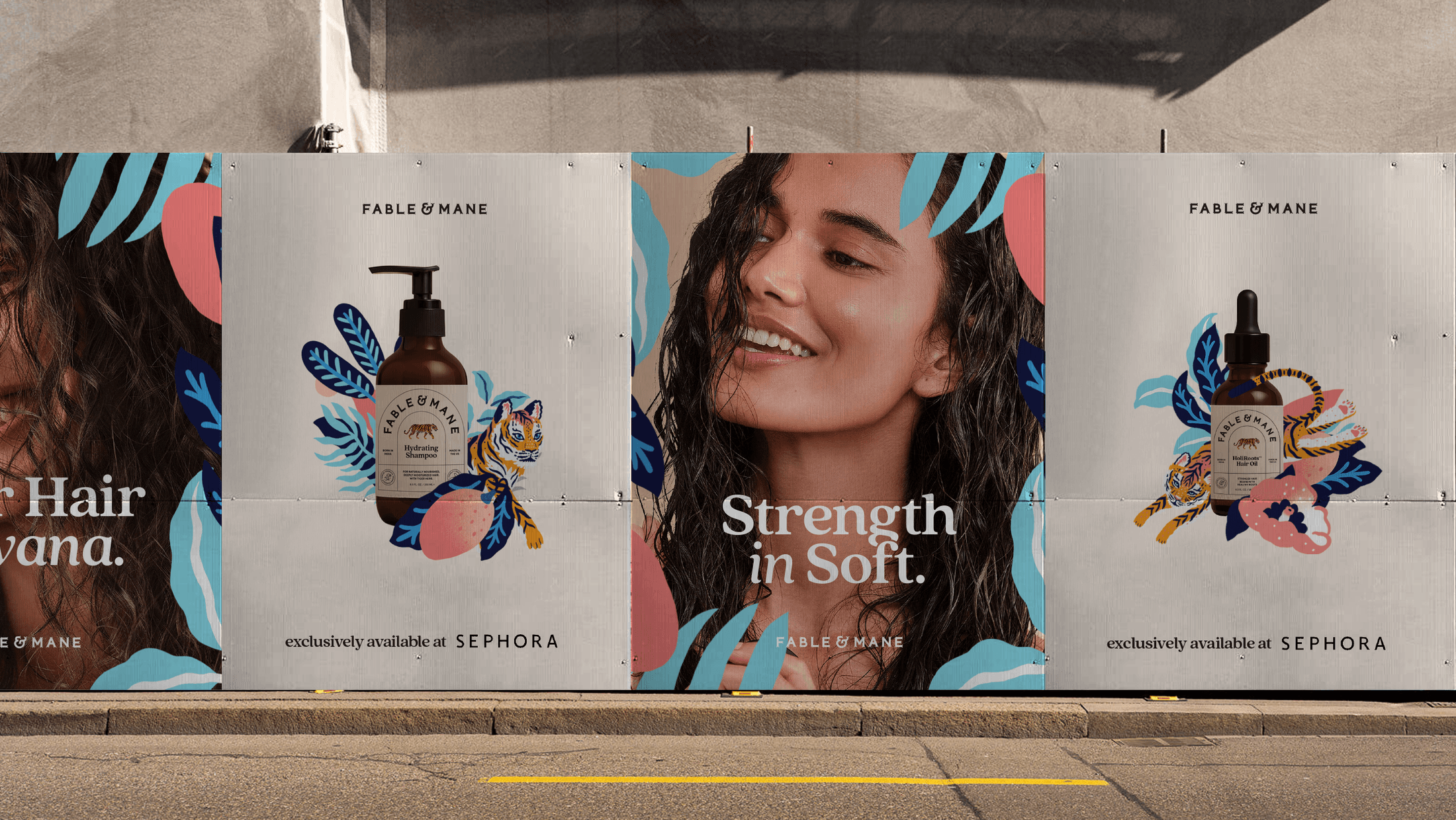
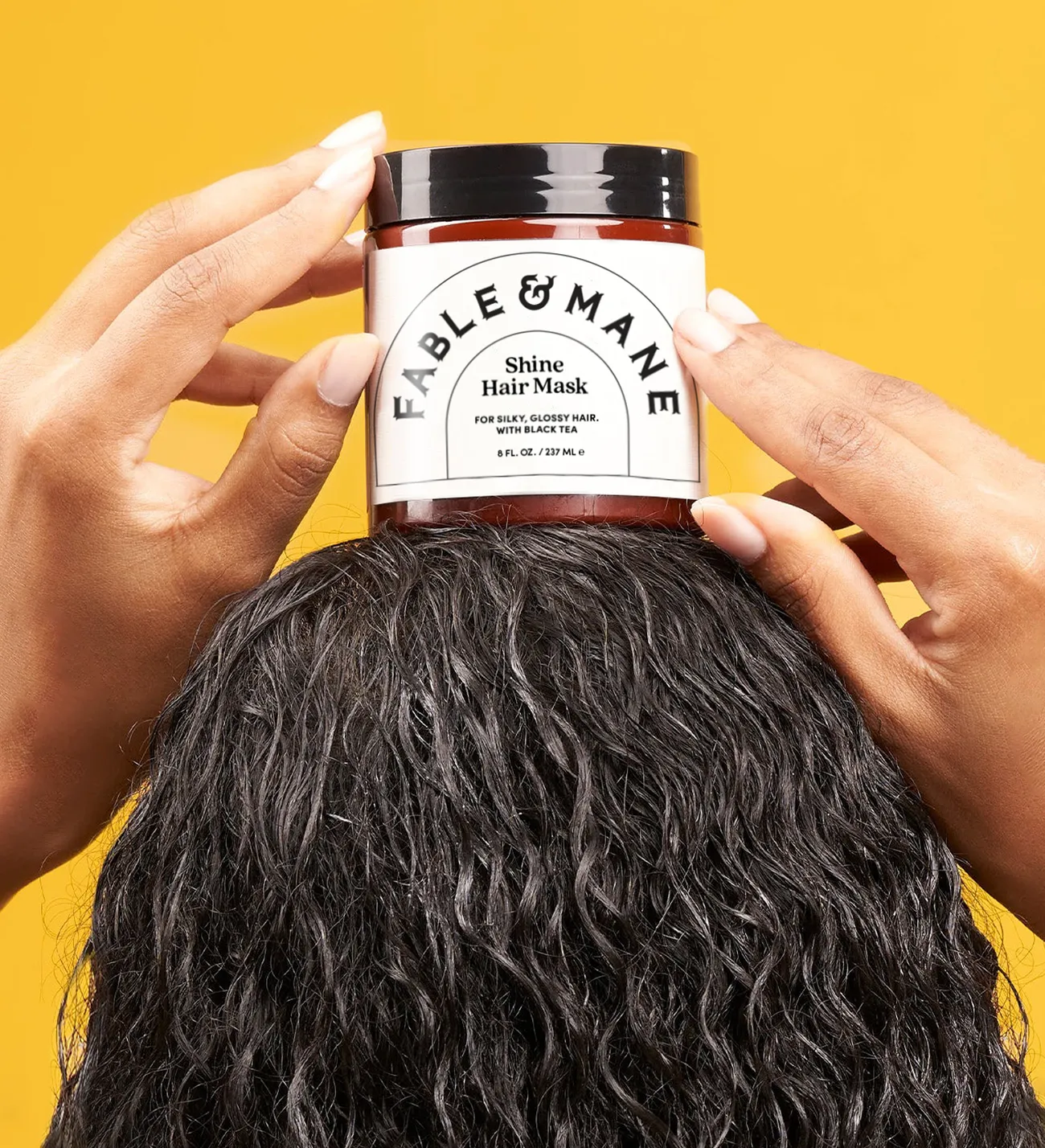
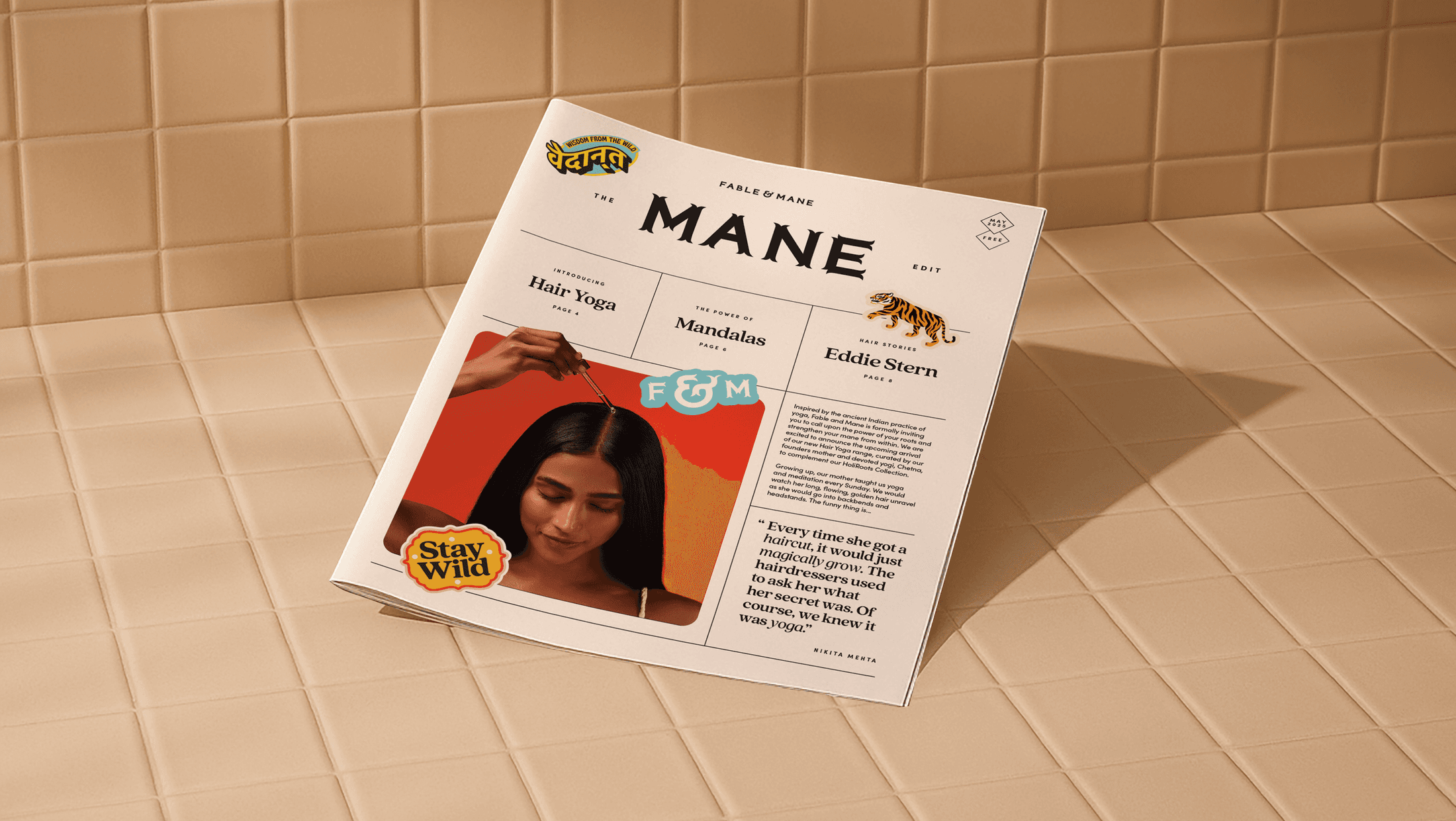
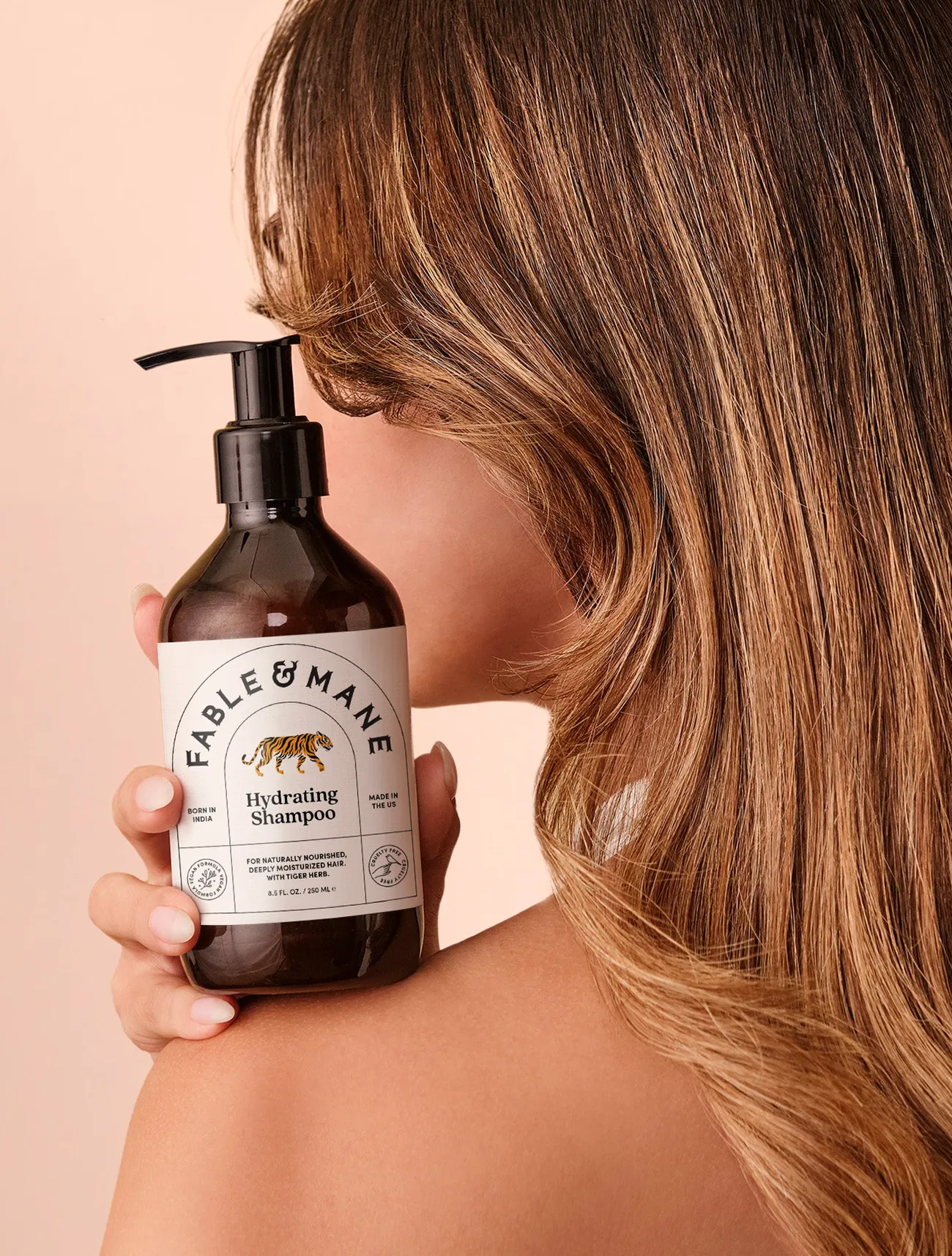
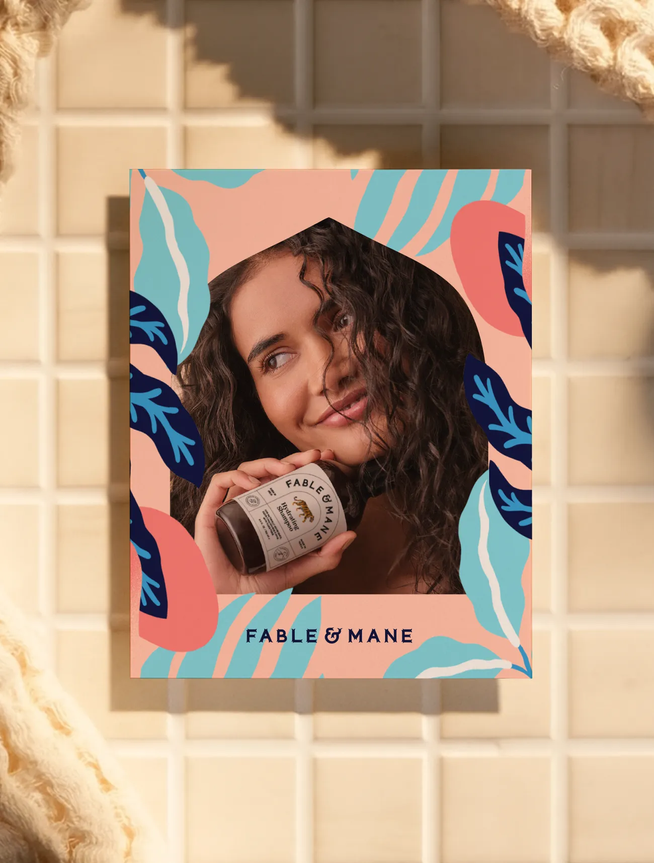
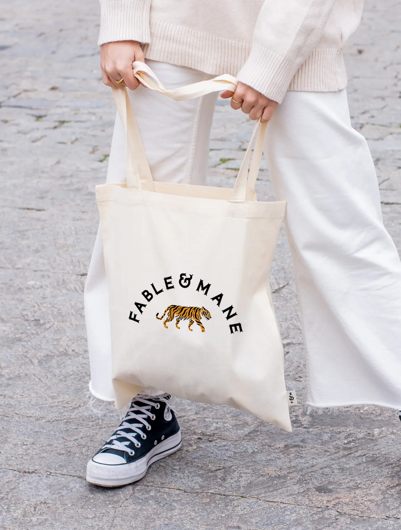
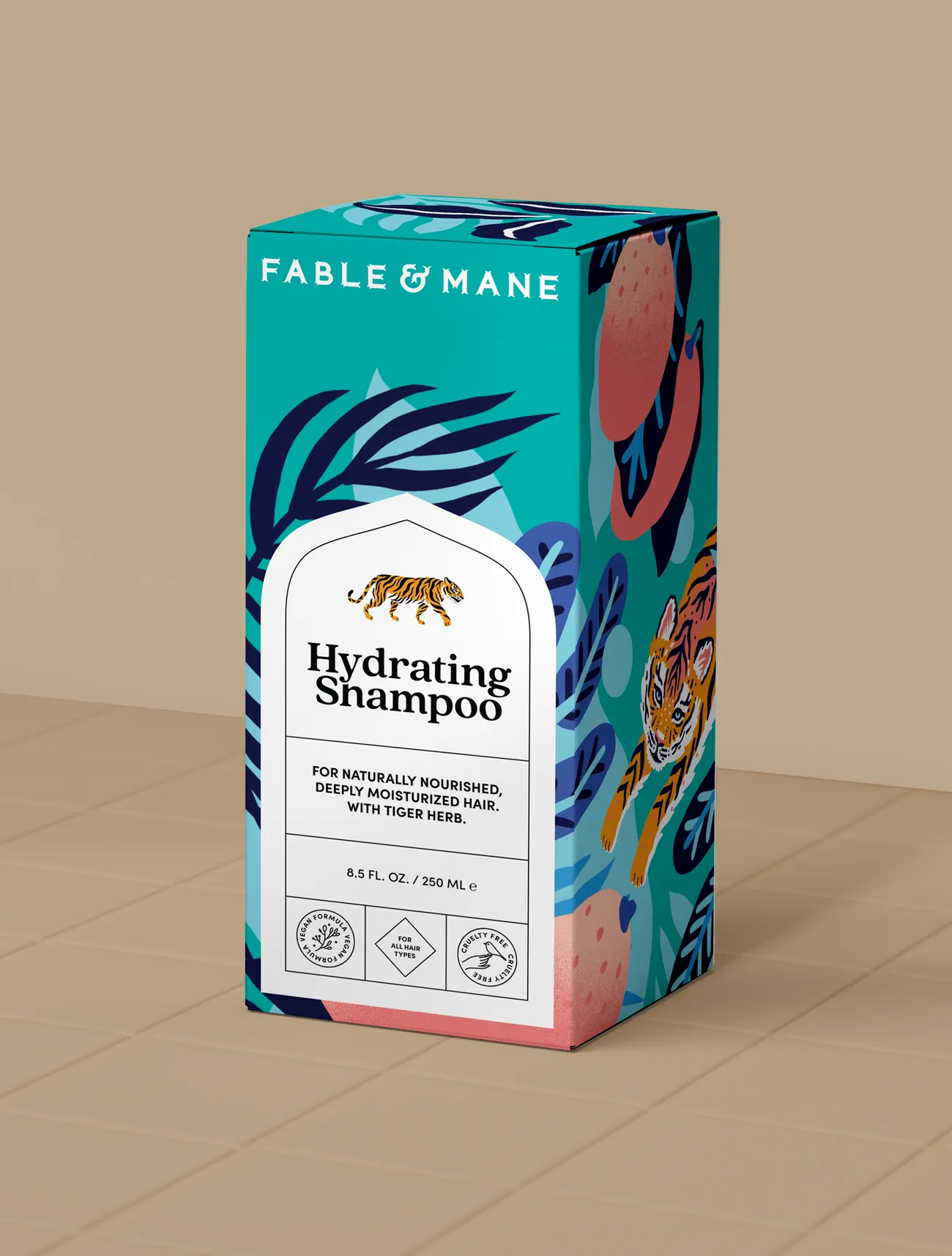
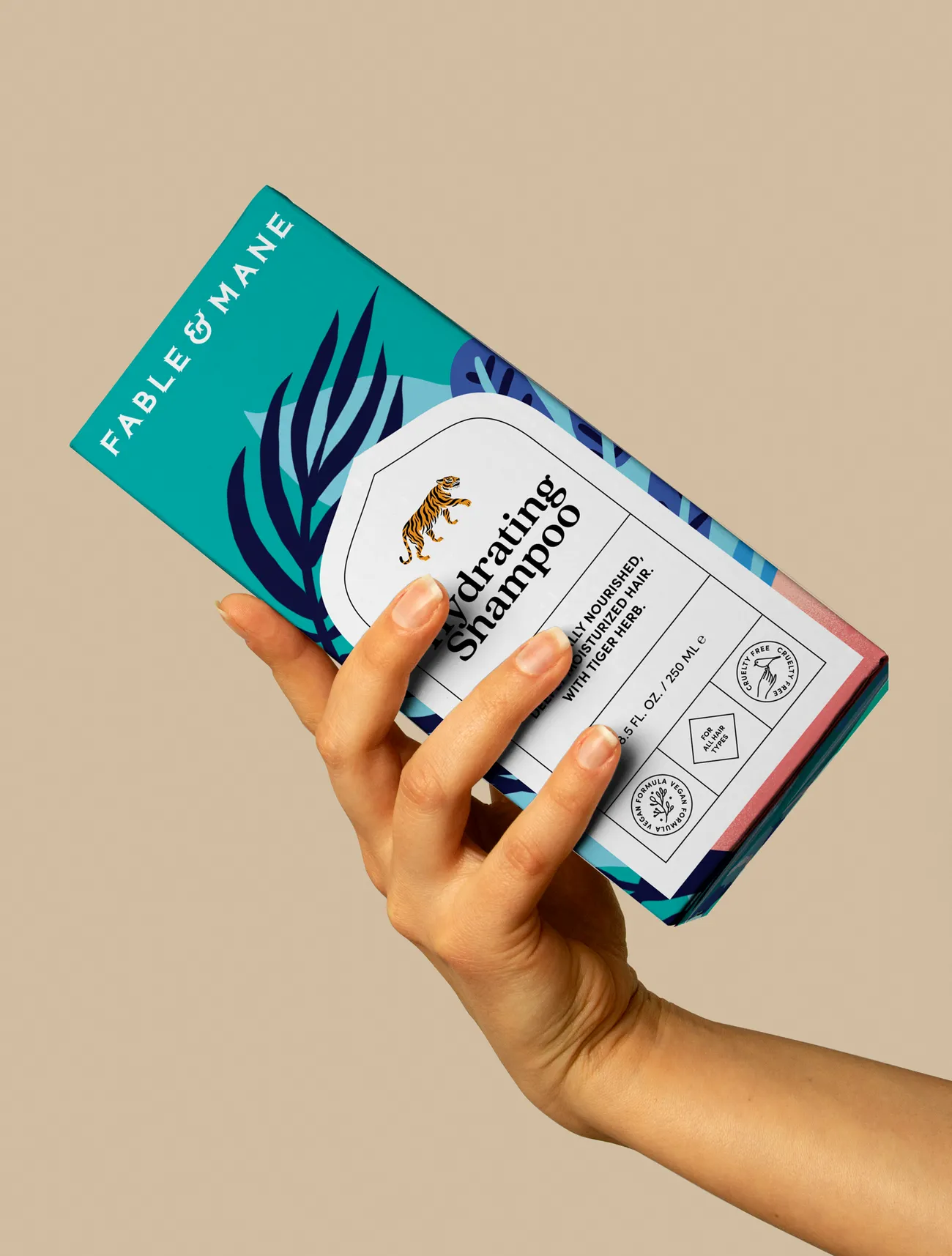
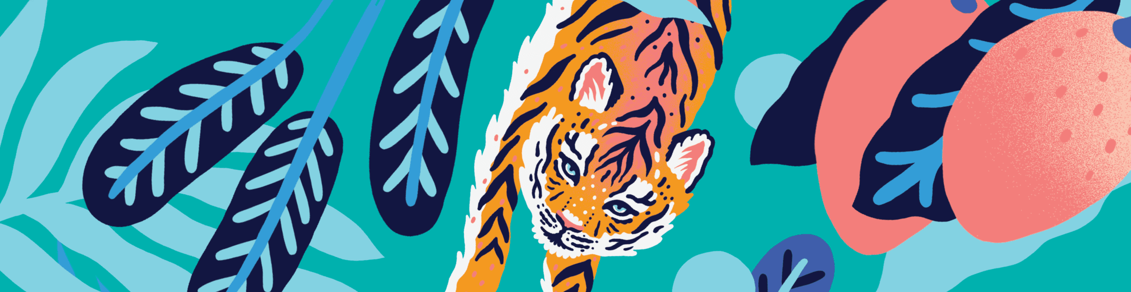
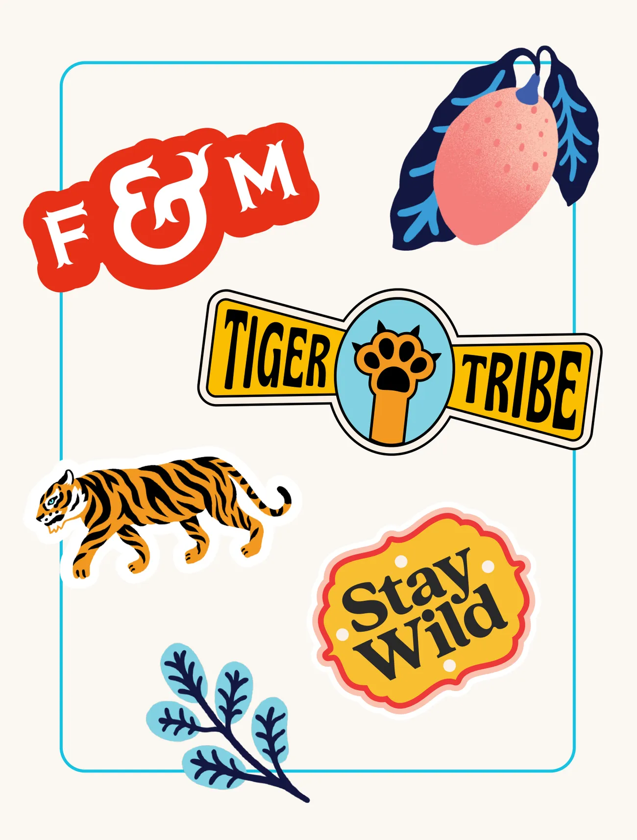
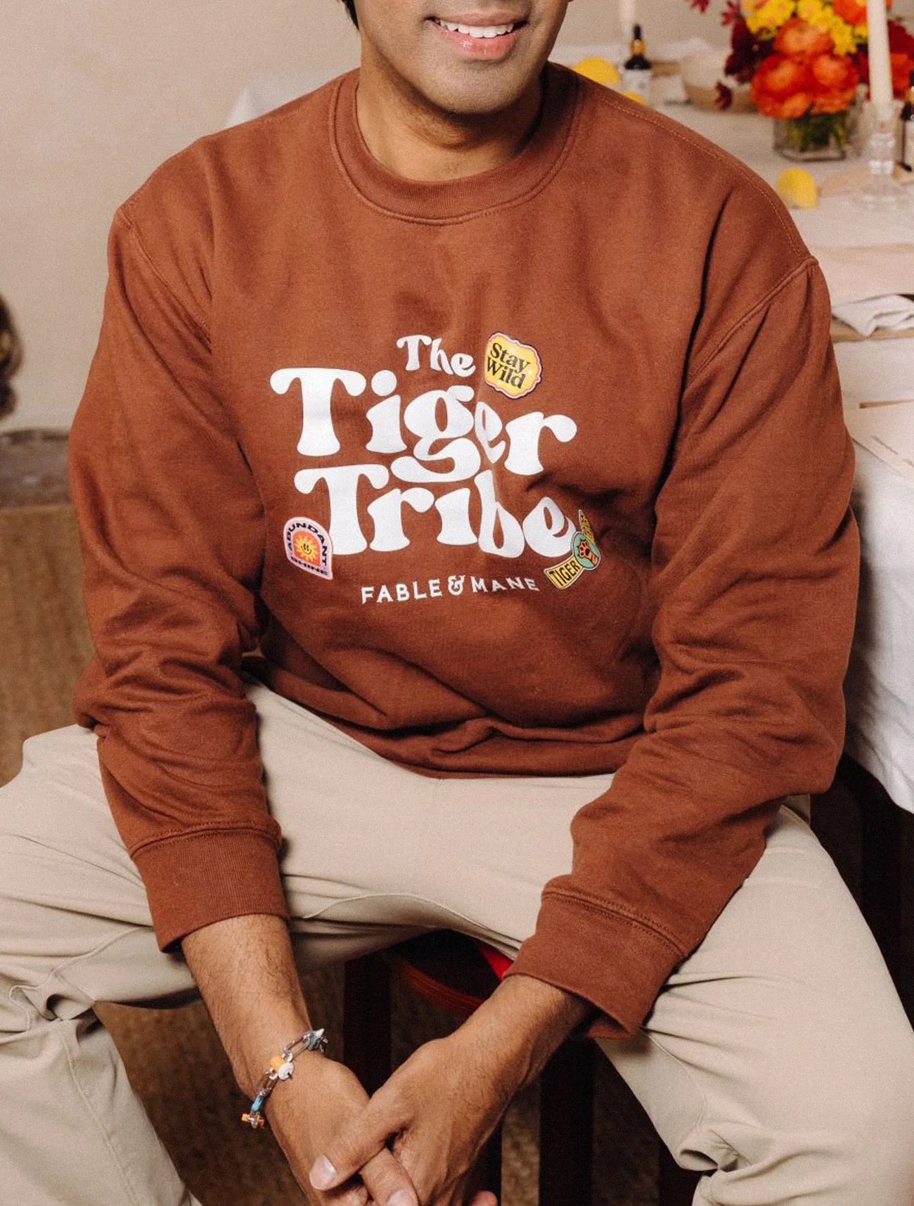
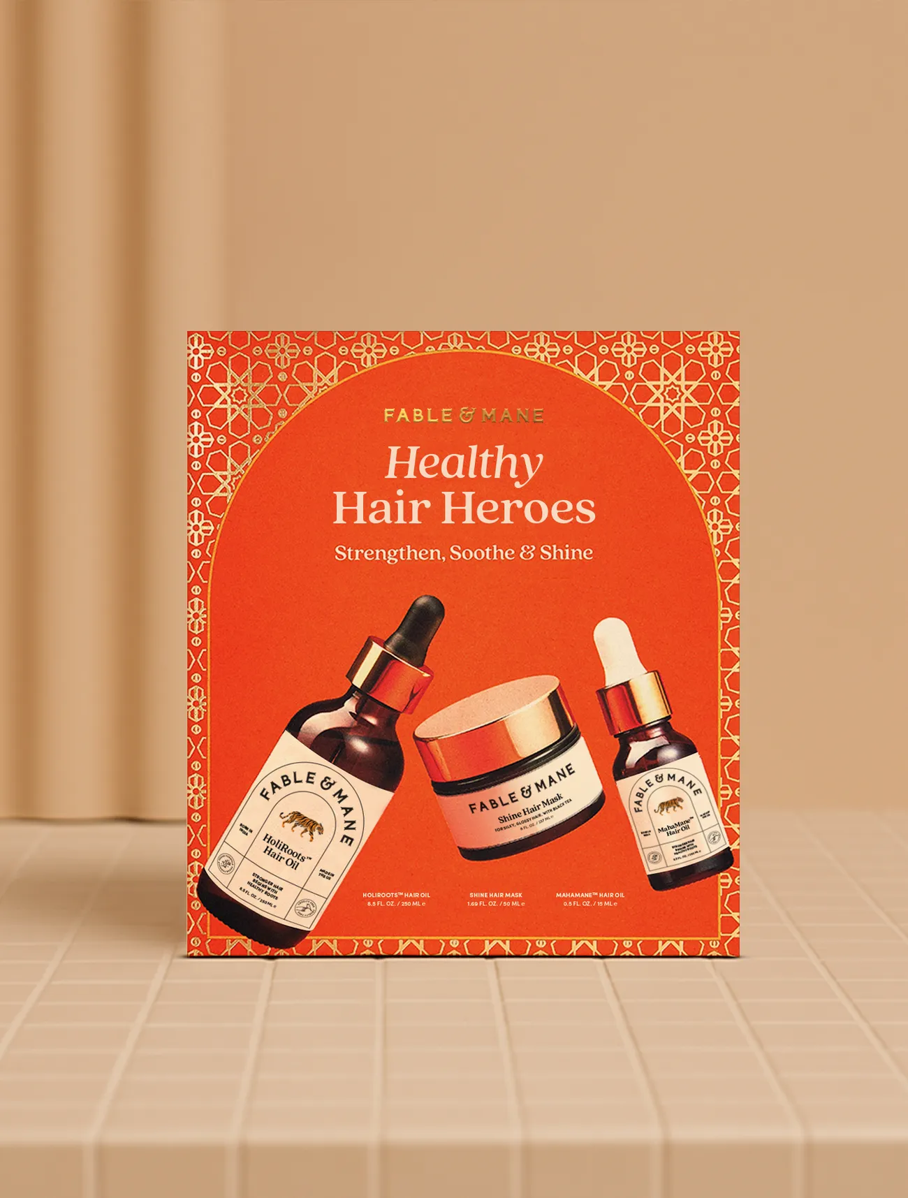
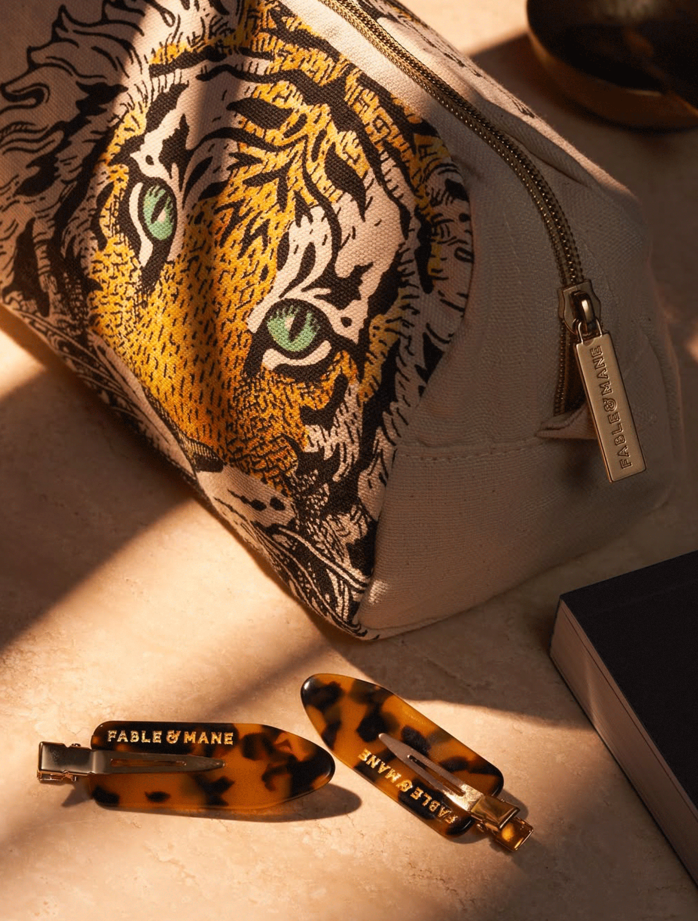
Rooted in the founder’s Indian heritage and hair-oiling tradition, F&M transforms cultural wisdom into a forward-thinking, generational brand. The tiger—a symbol of power, beauty, and bravery in Indian culture and Hindu mythology—anchors the brand’s imagery and logo. The label combines modern design with traditional Indian influences, featuring a rounded window inspired by historic architecture. Bright, story-led illustrations unify the brand across packaging, while fresh, modern photography—balanced with playful pops of colour—creates the perfect ‘east meets west’ blend for a unique and timeless identity.