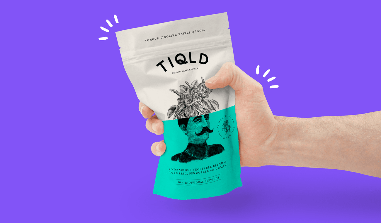
Born from a love of home cooking and bold flavours, Tiqld is a unique range of Indian Spice Blends that take you on a culinary adventure of nature's wonderfully delightful flavours, sharing the culture, tastes, and stories they discovered along the way. Our task was to bring these flavours and experiences to life through quirky branding, playful packaging and witty bold marketing.
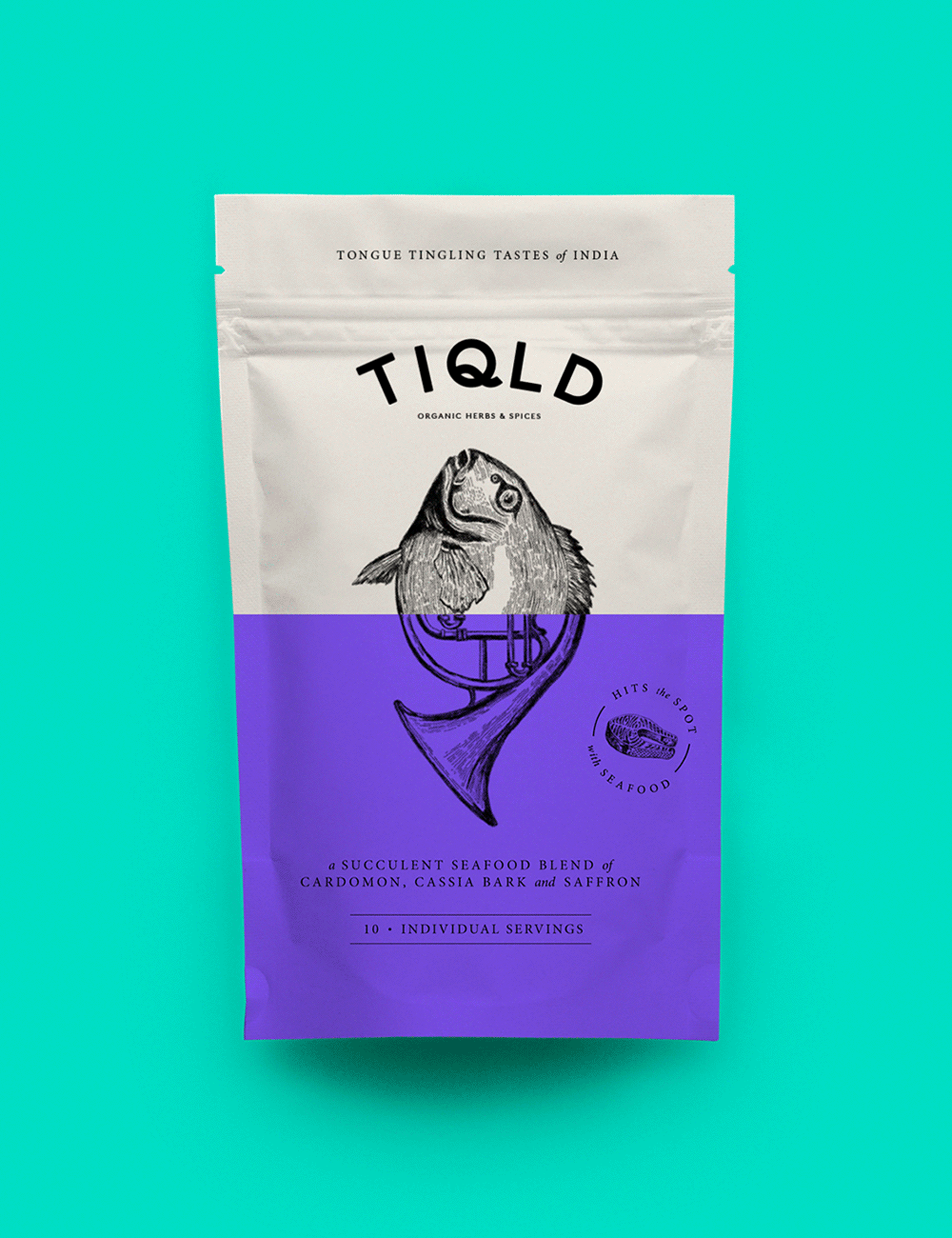
The main focal point of the packaging is the illustration split, which is focused around 'unexpected combinations'. We brought the idea of making meals more bold and adventurous into the brand imagery with illustrations that combine the base ingredient that the spice works with (either meat, fish or veggies) and juxtaposes this with an unexpected abstract element that visualises the story that accompanies the spice blend.


The playful nature of the brand is communicated through the art direction of the product photography. We displayed the bold flavours and personality through the use of colour and hand expressions. These varied hand expressions represent the different personalities in the kitchen.


We art directed the photography for the Recipe Tips as well as the products. For this, we focused on the end result and shot a variety of meals from directly overhead to reference a personal point of view. The split is used through photography which not only references the packaging but also aims to show the versatility of the product and the wonderful meals it can create.


A brand as loud as this one needed a voice that could be heard. We created a custom display typeface that is big and bold, just like the spice blends themselves. The condensed typeface was created by hand with brush strokes as a subtle nod to traditional Indian sign painting.
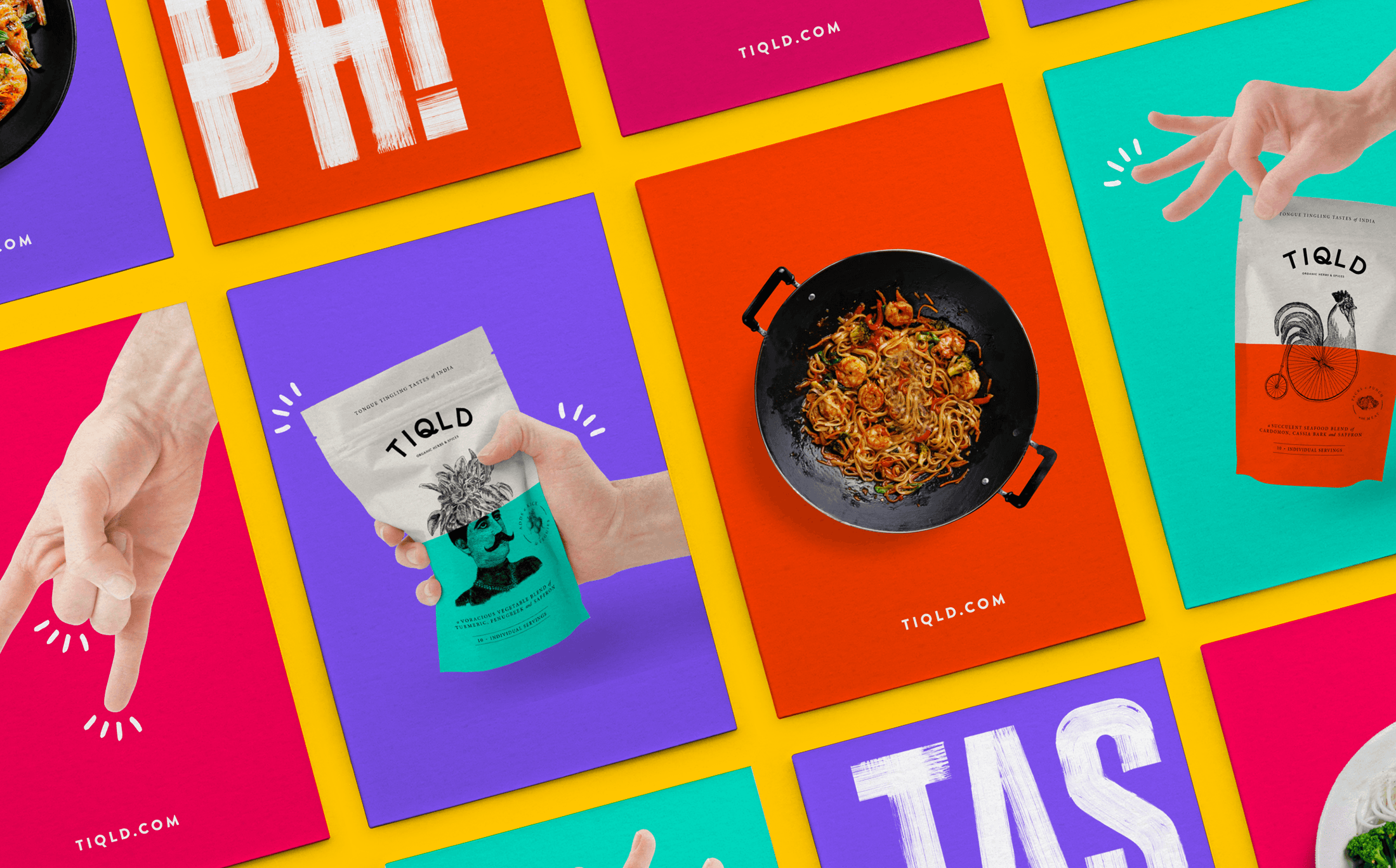
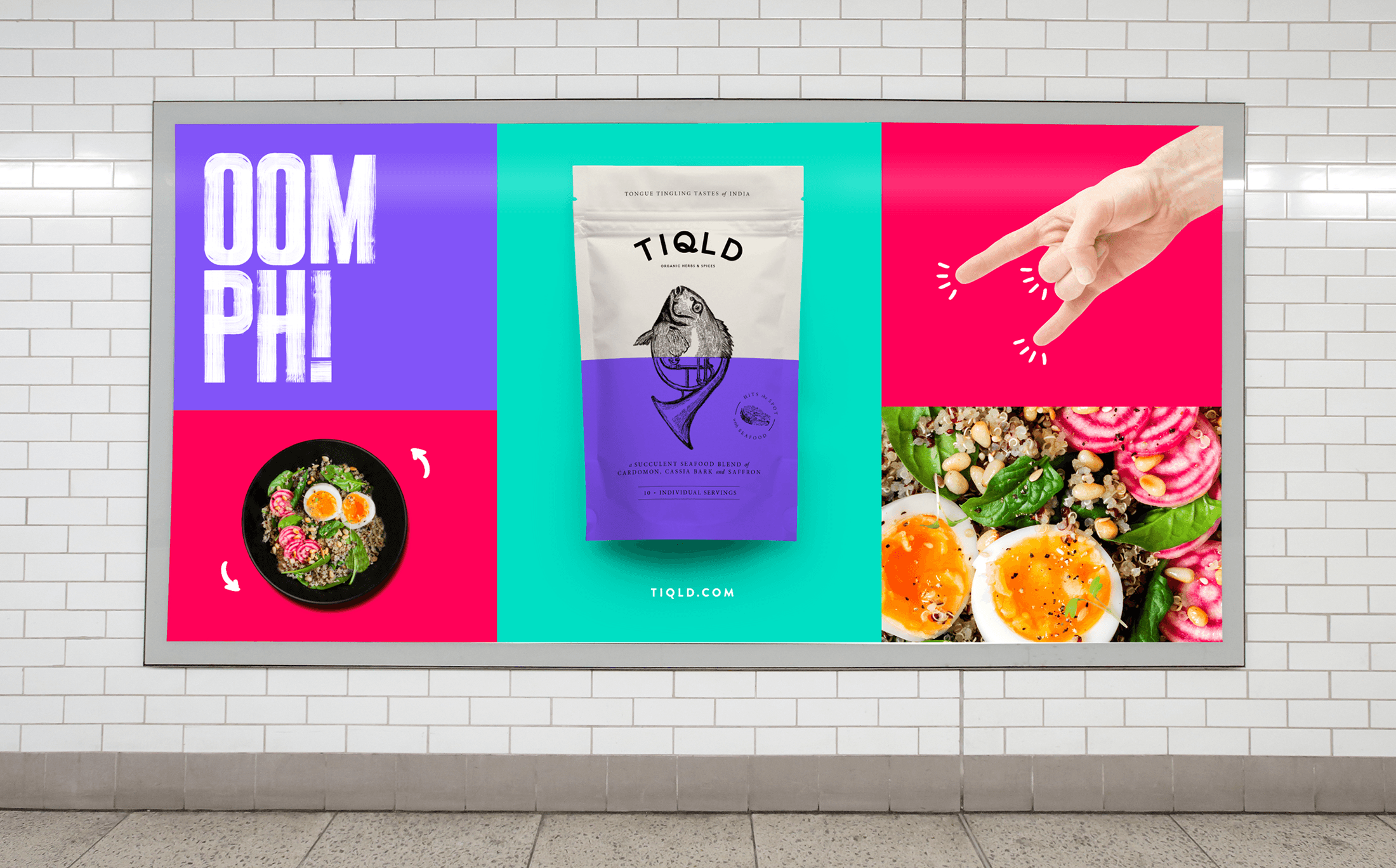
We created a modular grid system which brings all the brand assets together in a straight-to-the-point way. This was used primarily across print material for the product launch. The main objective of this material was to be bold, attention grabbing and most of all recognisable to the brand itself.


We art-directed the photography for the Recipe Tips as well as the products. For this, we focused on the end result and shot a variety of meals from directly overhead to reference a personal point of view. The split is used through photography which not only references the packaging but also aims to show the versatility of the product and the wonderful meals it can create.
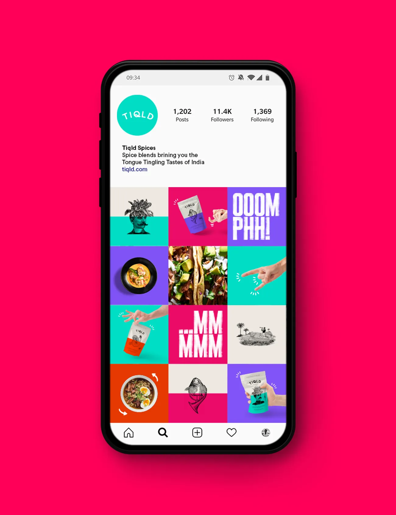
Creating a clear and striking set of individual brand assets made it easy to apply and maintain the brand across the website and social media in a bold and engaging way. The bright colour is used frequently as a highly recognisable feature of the brand ensuring that it stands out on your screen as well as on the supermarket shelves.