OnePlus is a multi-national technology company, experiencing rapid growth and a client whom we are proud to call a long-standing partner of Alphabet. We were approached to revitalise and reinvent the packaging design system to create a vision for the future of all OnePlus products, from Smartphones to Accessories.
A Necessity for Consistency
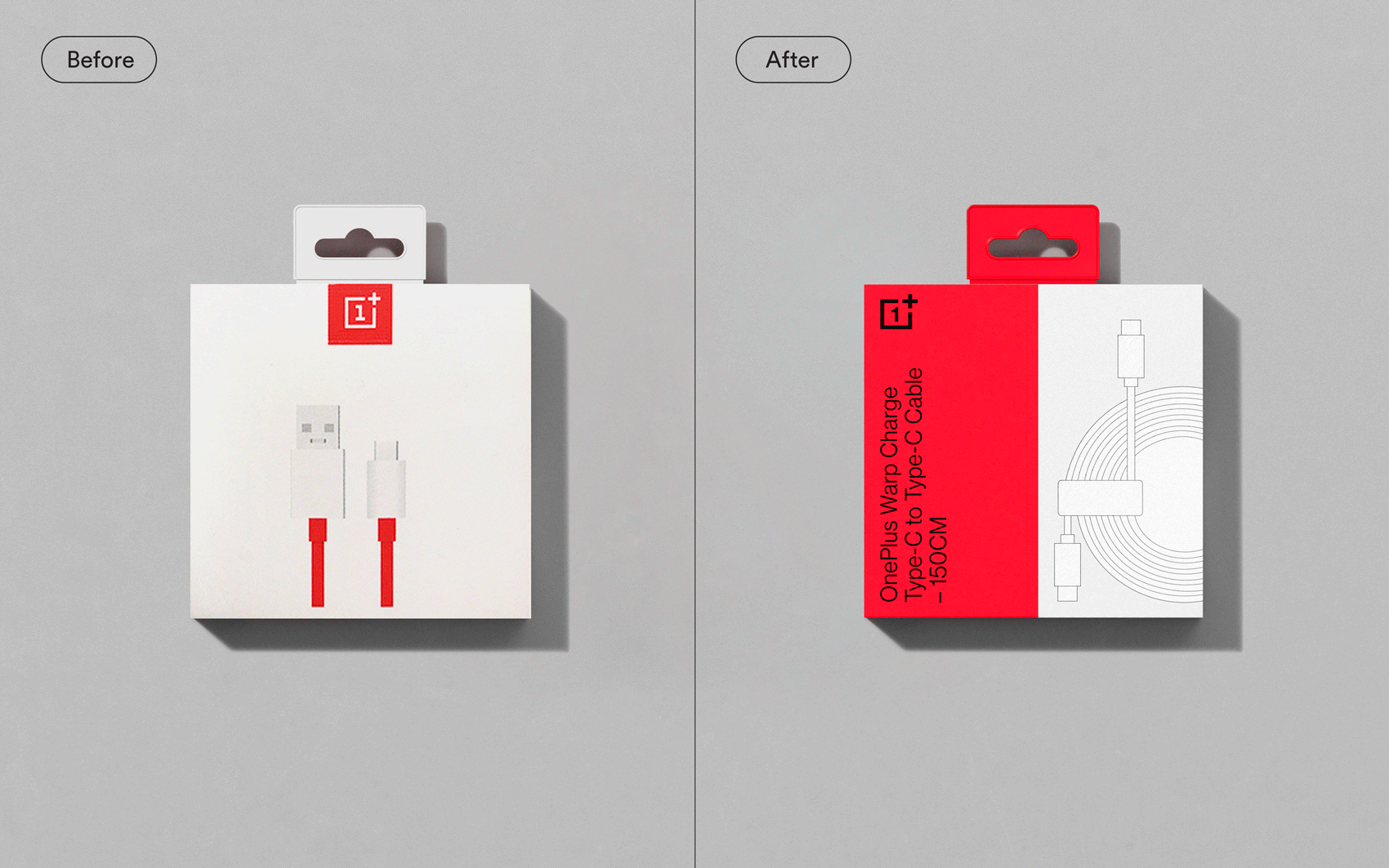
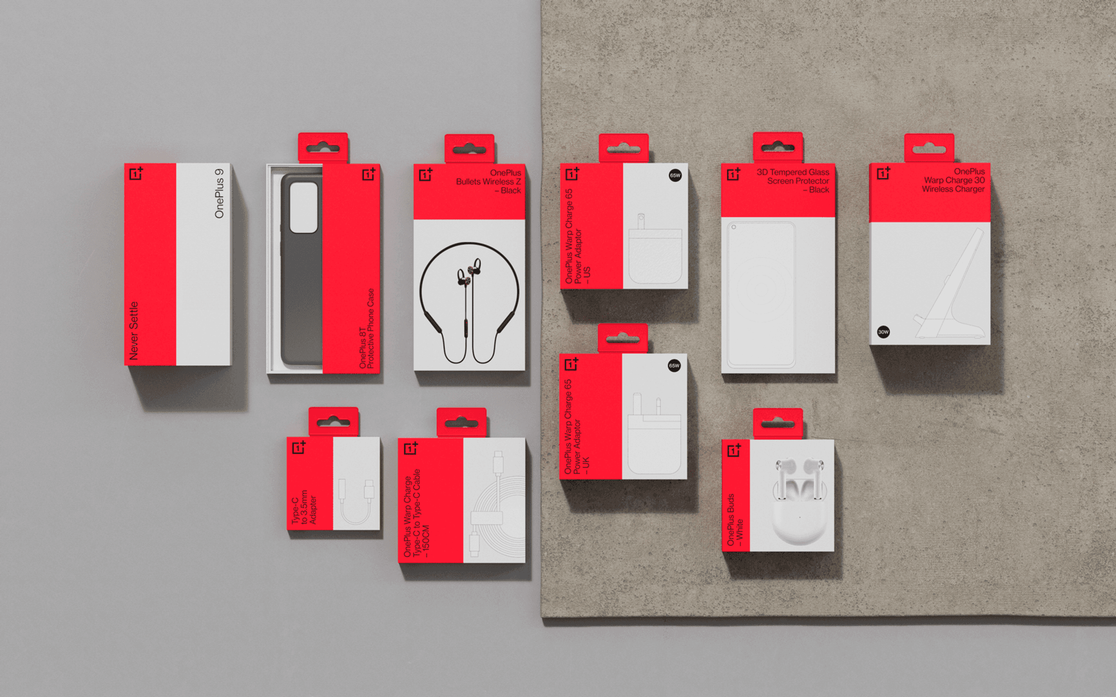
The current packaging had a key problem across all SKUs. There was no consistency in terms of design and messaging. Meaning for the consumer, the information was confusing and there was a lack of connection across all products. The lack of a unified design system made it difficult for in-house teams to work on packaging new releases. Our goal was to create a unique and highly sustainable packaging design system that works across all touchpoints.

A Modular Grid System
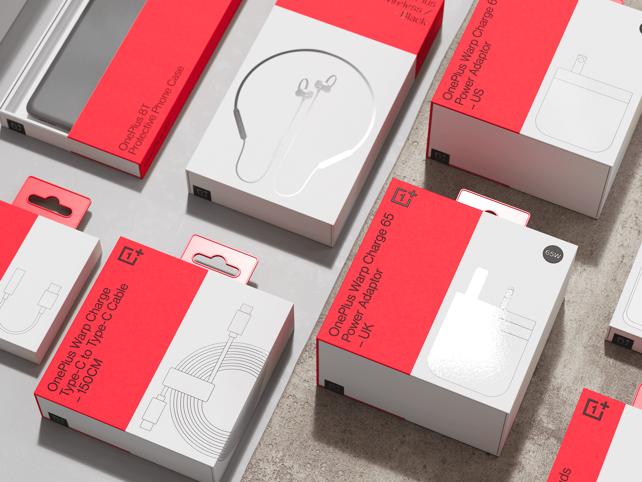
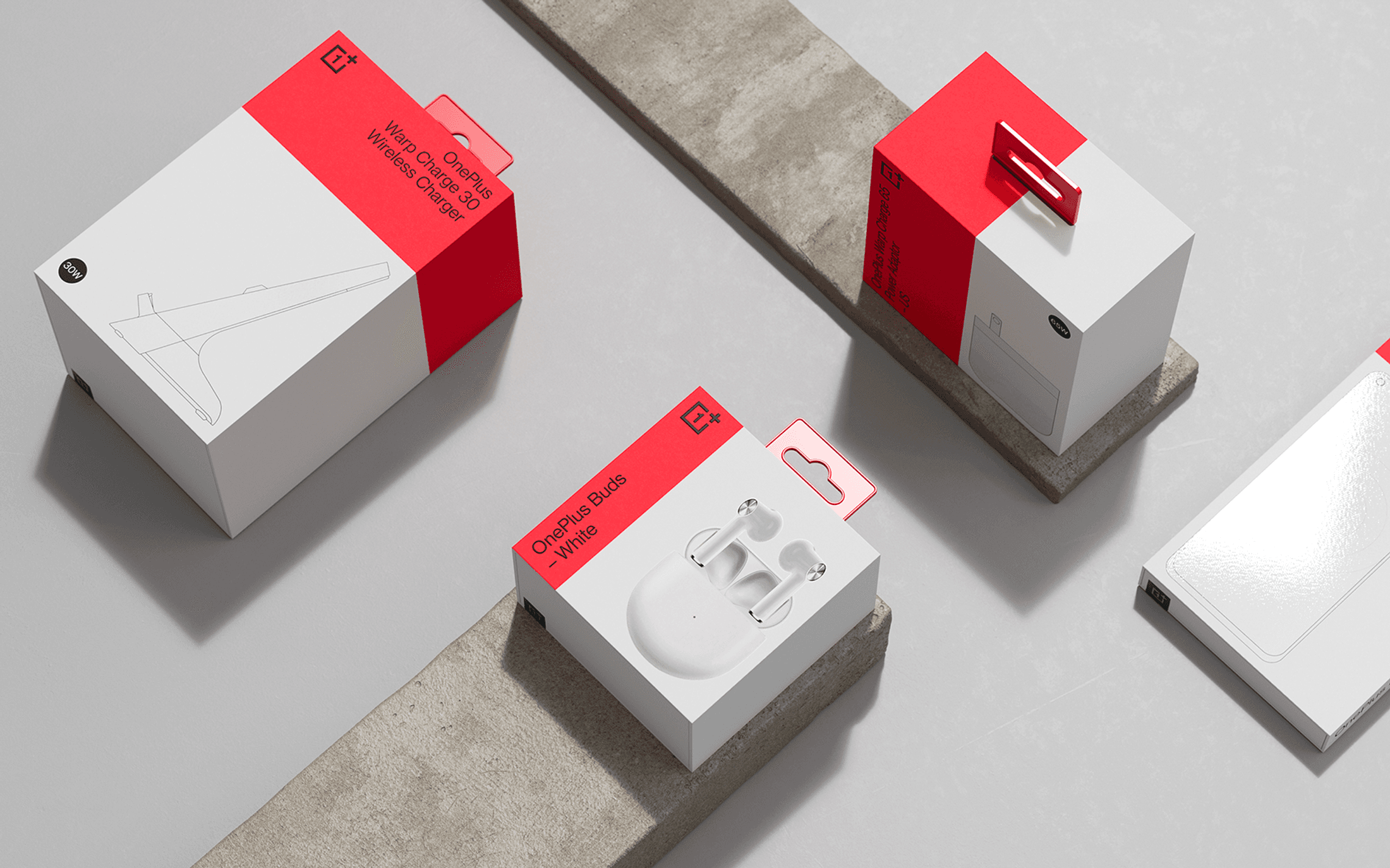
The goal was simplicity, for the in-house team, and for the consumer to understand. So our solution is simple. The grid system is highly flexible and scales across any size and format to create a home for imagery and key messaging such as Brand Logo and SKU Name to live. Creating a simple solution to a complex problem allows the consumer to focus on what matters - the product inside.
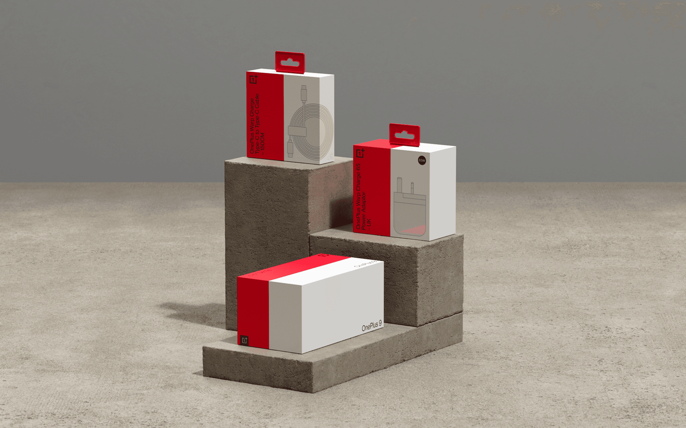
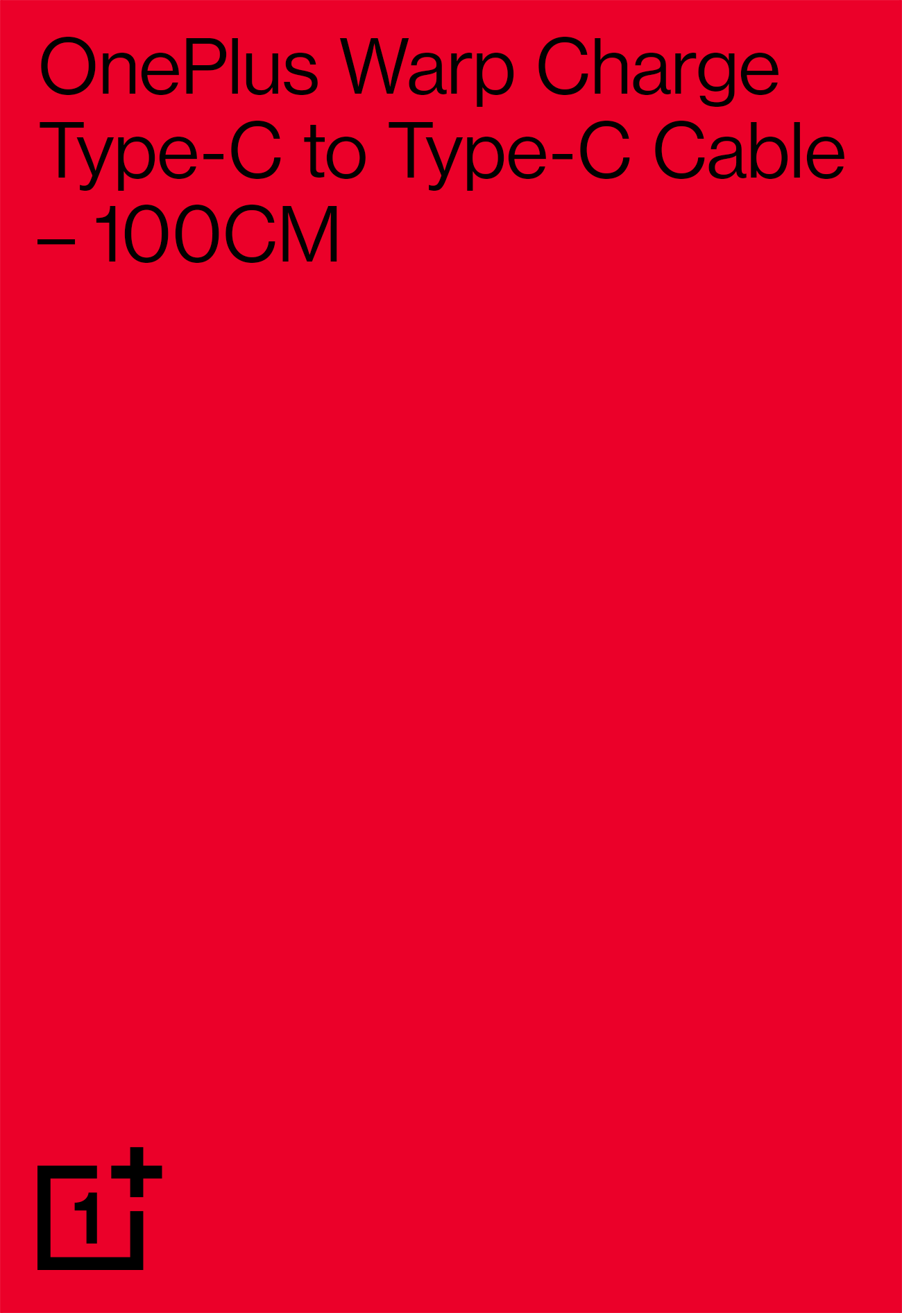

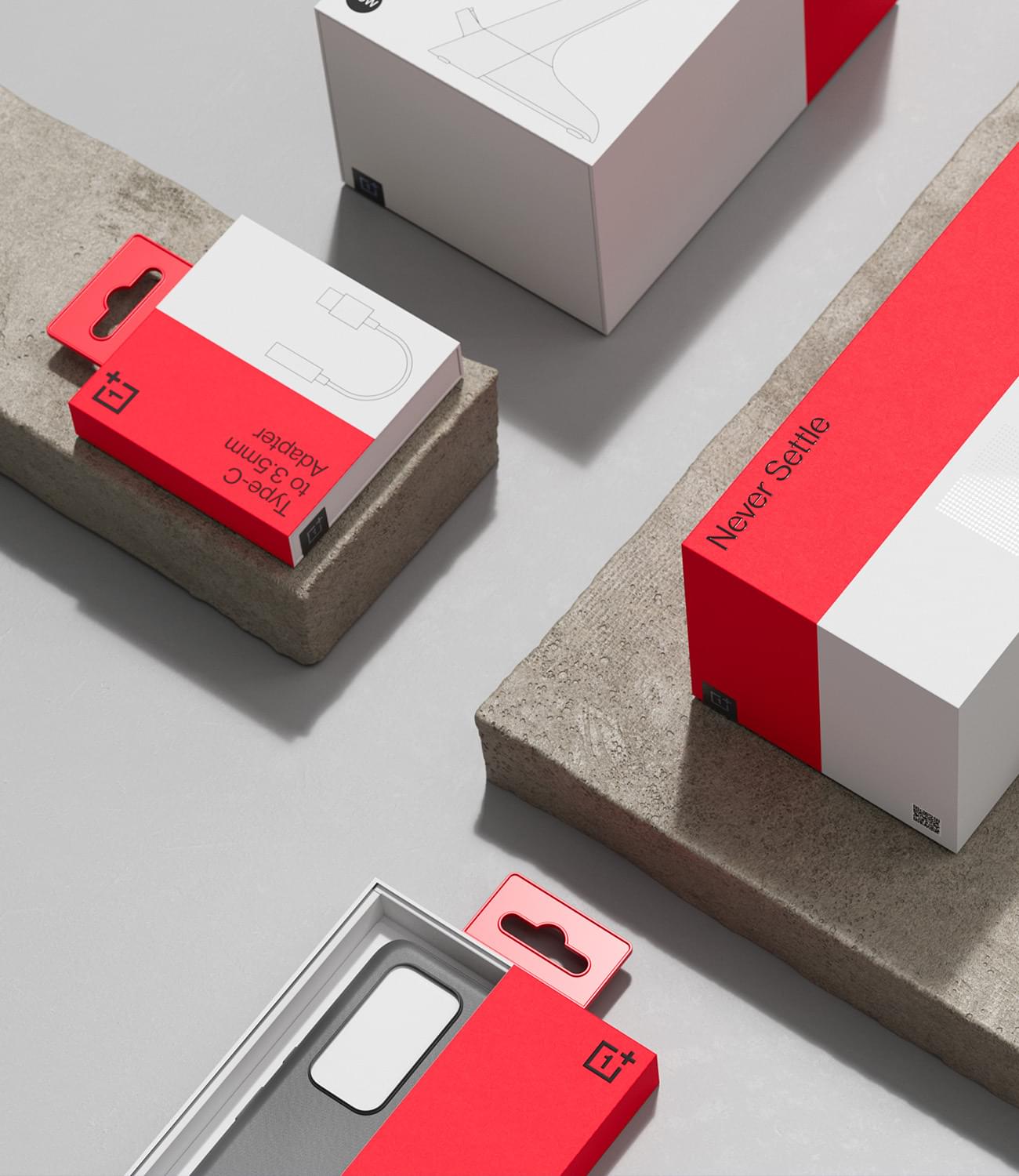
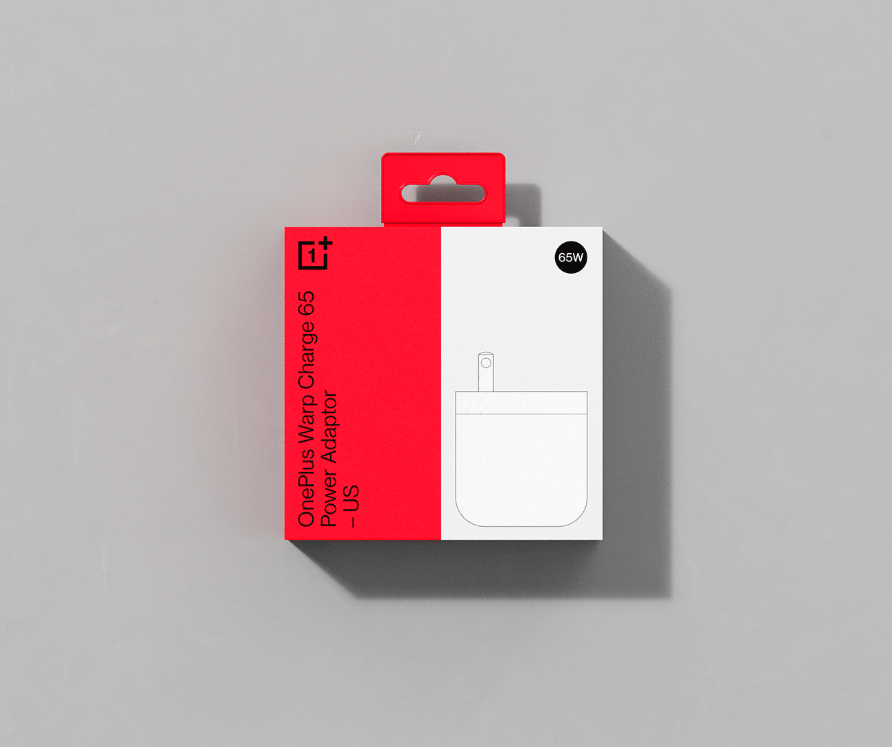
A primary goal was to establish a clear hierarchy, and allow the eye to focus on what’s important – the product. We created a simple typographic system which outlines the OnePlus Brand Name, Product Name and relevant Regions. This is paired with simple, front-on photography for High-End products and highly functional keyline illustrations for the Essentials range, where the finish and the colour of the product are less important to see.
Functional iconography
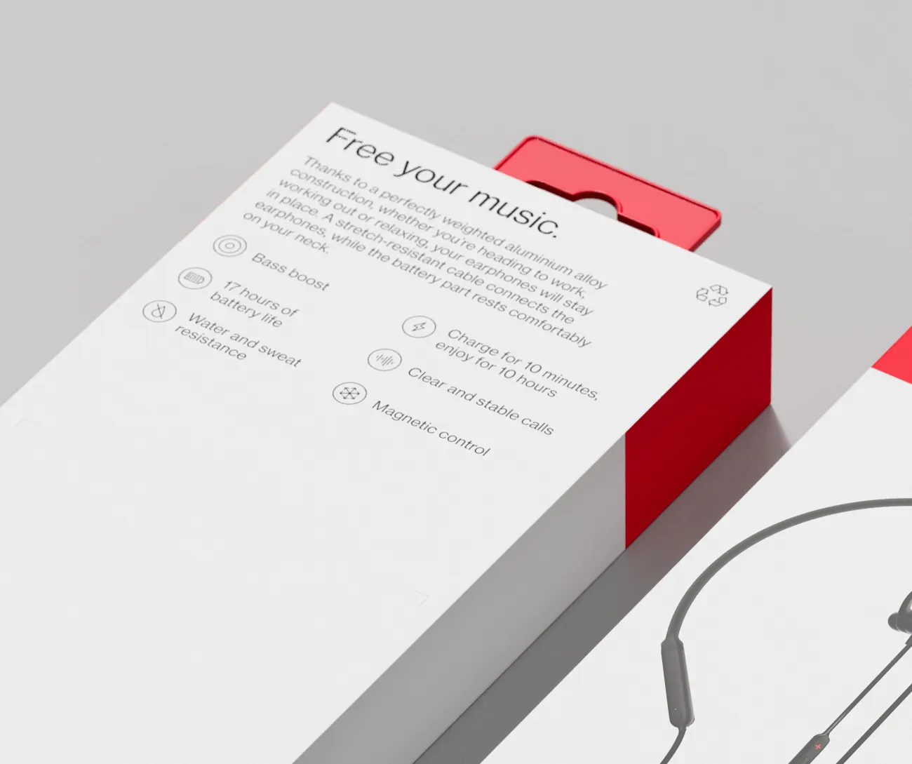
An area which was severely lacking, or inconsistent on previous packaging was a clear home for functional icons and product USPs to live. We created a library of icons which are understood quickly in any language, and across any region for a truly global product.


Every detail is the most important
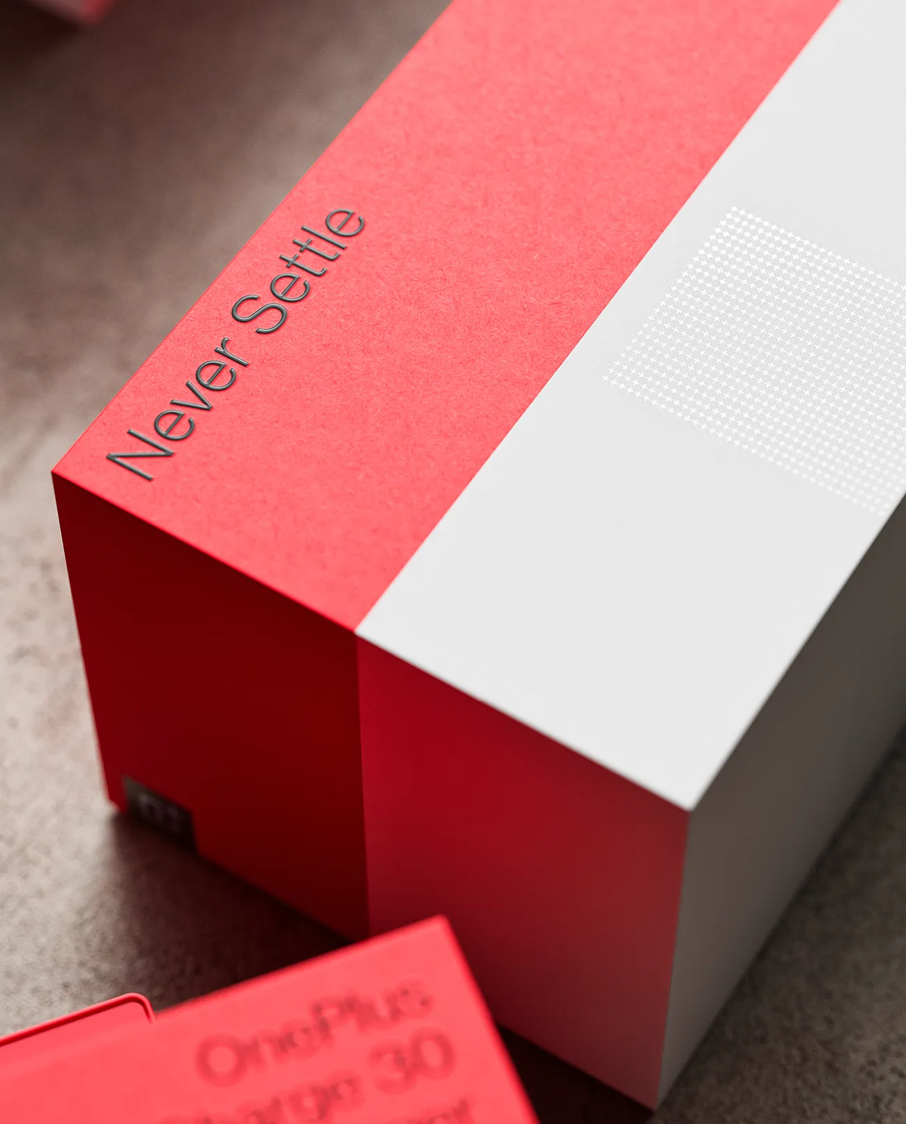
As well as design, our goal was to create a consistent unboxing experience across all packaging, in terms of touch, feel and production quality. We wanted the packaging for a basic USB-C charger to feel beautiful, and memorable in the same way a high-end packaging piece is.
All OnePlus packaging from a simple protective phone case to high-end Enco earphones utilises a spot varnish, and a combination of textured and untextured paper stock to feel tactile, considered and inviting to the touch.
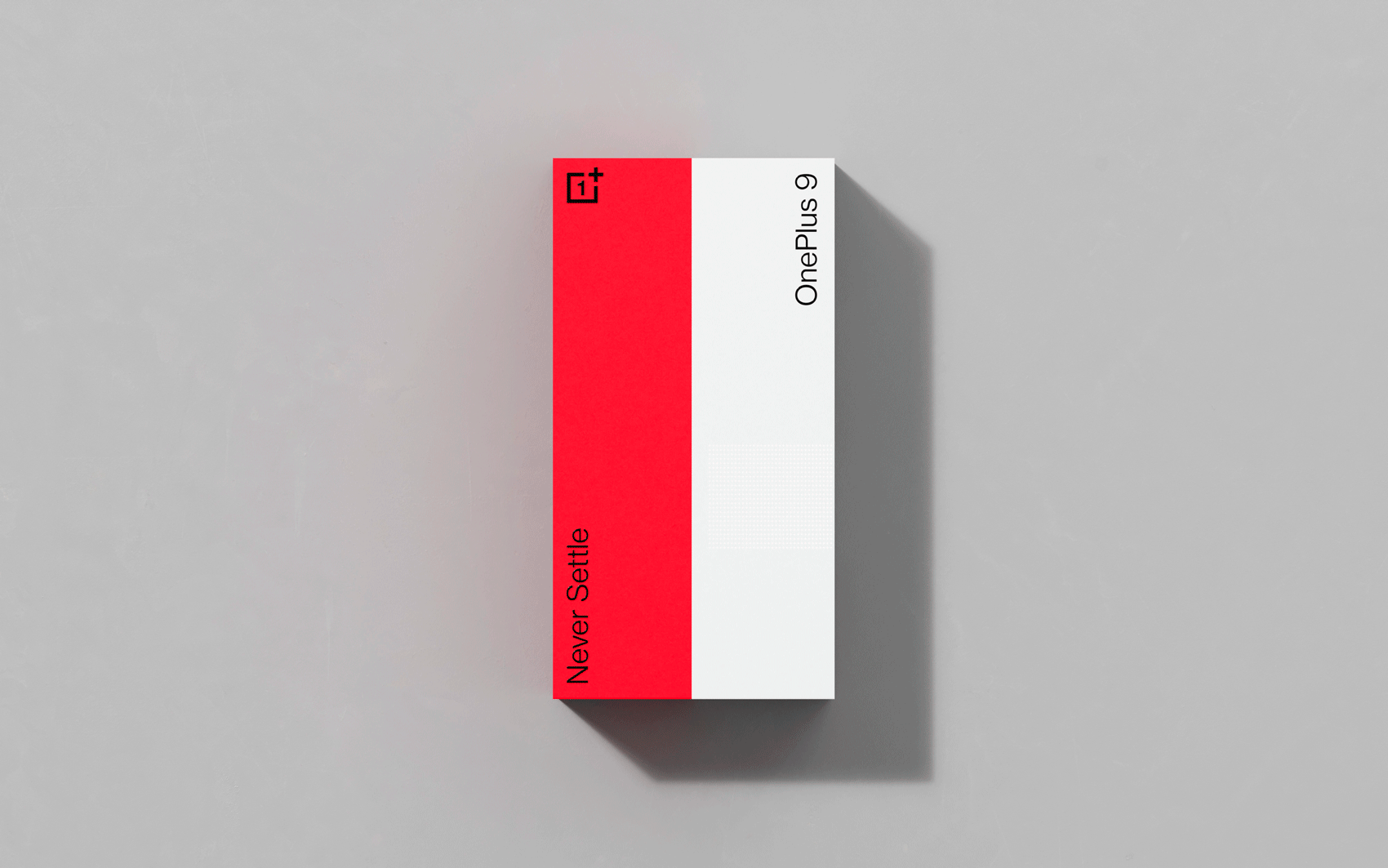
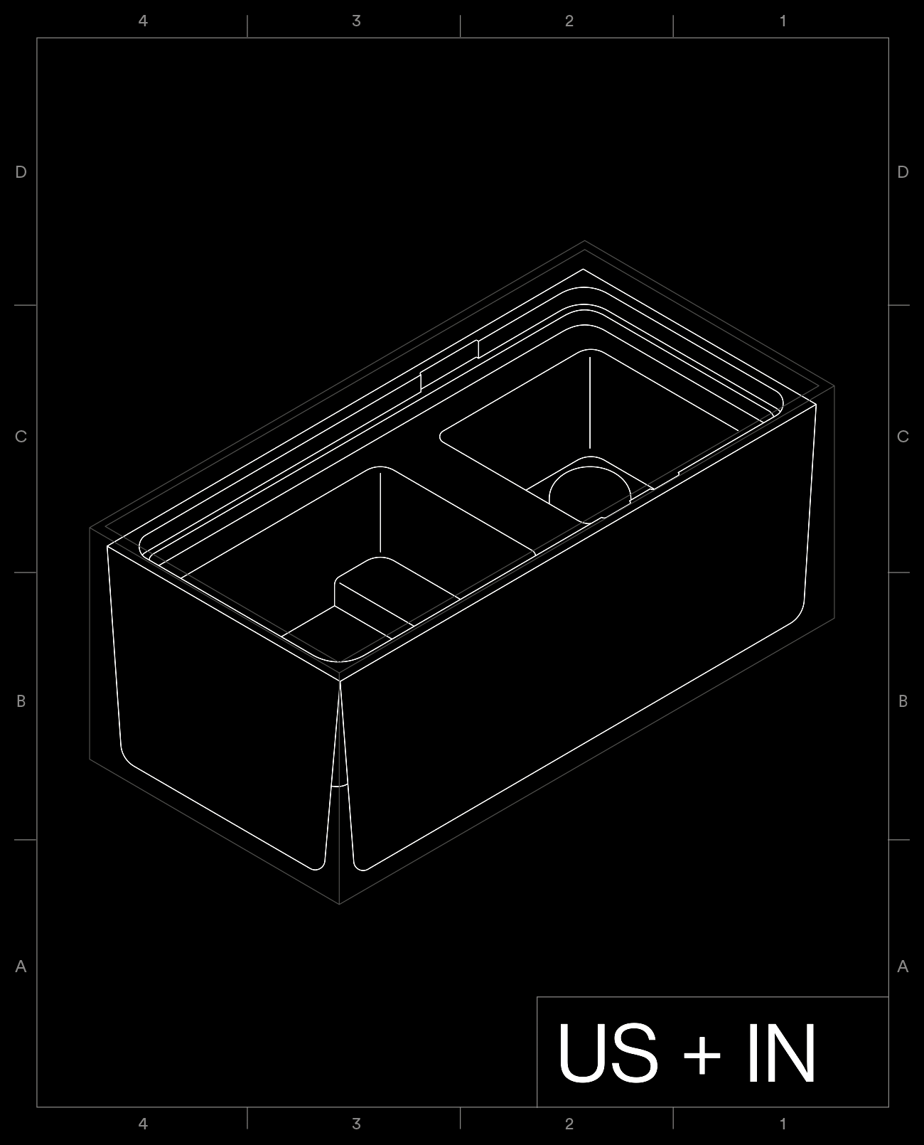
An Iconic and Sustainable Smartphone Box
OnePlus originally had four different internal moulds for different regions across the world, and three different box sizes for the same release to accommodate these moulds.
We worked with the team at Instrmnt to engineer one unified box size, regardless of region, in which just two internal moulds slot inside (US + CN + IN and UK + EU). This creates a much more sustainable, cost-effective and unified solution across all markets.


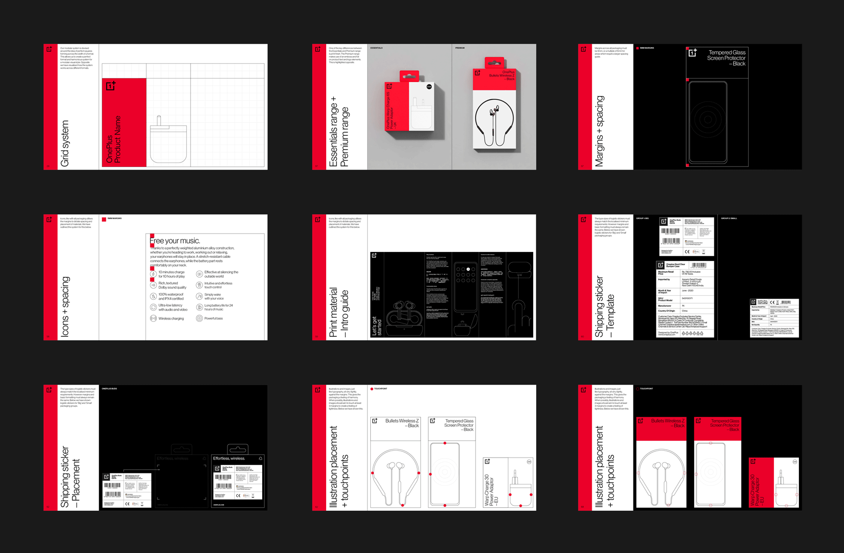
Packaging Guidelines
We created a packaging guidelines document as an important resource for the OnePlus team to effectively implement the design system for future releases to come.


The Unboxing Experience
We didn’t just focus on unifying the external design of the packaging, but the internal design too. We created a library of consistent templates for user guides, membership cards and warranties within the packaging components.
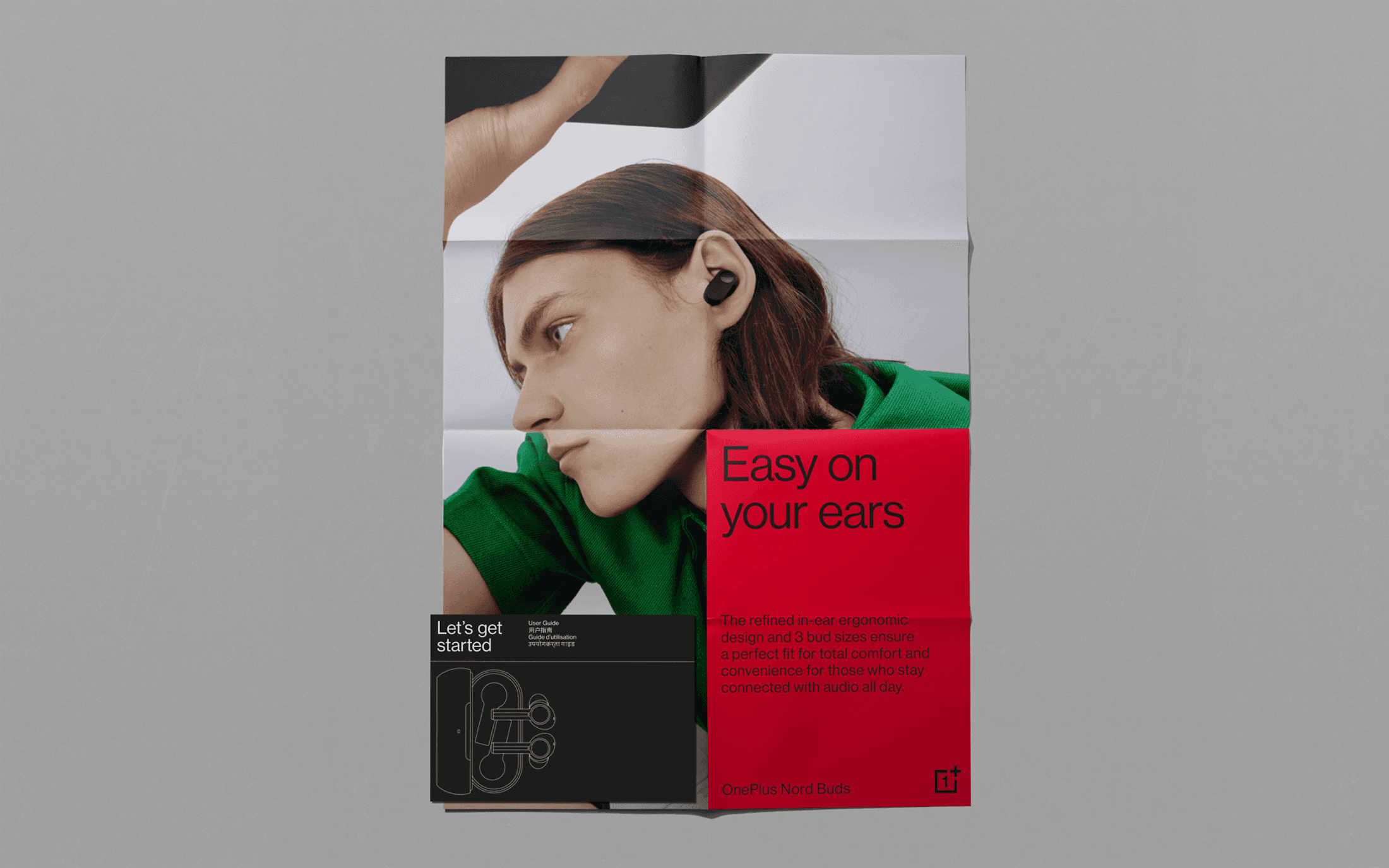
Extending the System Beyond Print
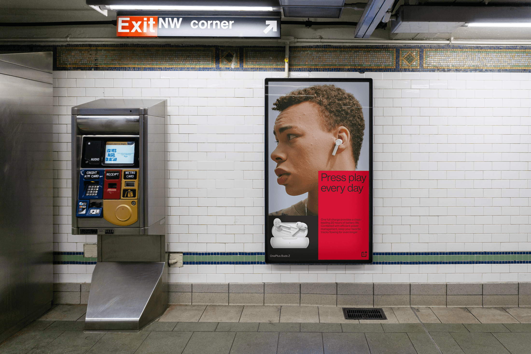
The modular design system was designed with the idea of expanding beyond just the packaging. There is great potential for the system to work for campaigns and specific product releases. This allows the marketing for individual products to feel closely connected to the product packaging in your hands.
Before and After
Below you can see the before and after comparison of the packaging overhaul. As you can see, the previous packaging had problems across all SKUs. There was no consistency in terms of design and messaging. Our goal was to create a unique and highly sustainable packaging design system that works across all touchpoints.