We had the pleasure of developing the Branding and Spatial design for Cha.ology; A unique Japanese teahouse that has recently opened its doors in the heart of Manchester city centre. The teahouse aims to capture the tradition and heritage of Japan in a clean, sophisticated and contemporary way that works for the westernised market. We worked alongside Hong Kong born founder of Cha.ology, Mei Lee on creating a contemporary brand that is firmly rooted in Japanese heritage.
The Tatami System
It was important that the overall identity for Cha.ology was heavily influenced by the traditional tea-drinking culture of Japan. We found our inspiration in the Tatami flooring system. The tatami is a type of mat used as a flooring material in traditional Japanese-style rooms. They are made from a series of blocks that stack and slot together in a grid-like formation. We used this grid as a base for our Brandmark. The Words Cha.ology were split and placed inside different shaped Tatami blocks which then created a dynamic, interchangeable brandmark that references the environment and interior of the Teahouse.

Precision Meets Playfulness
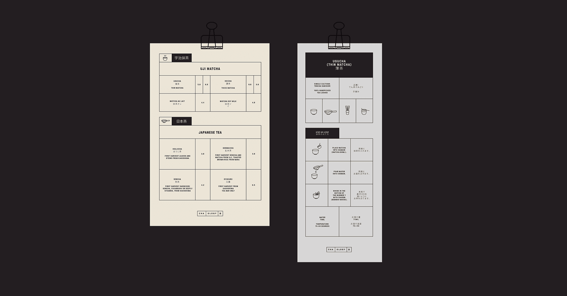
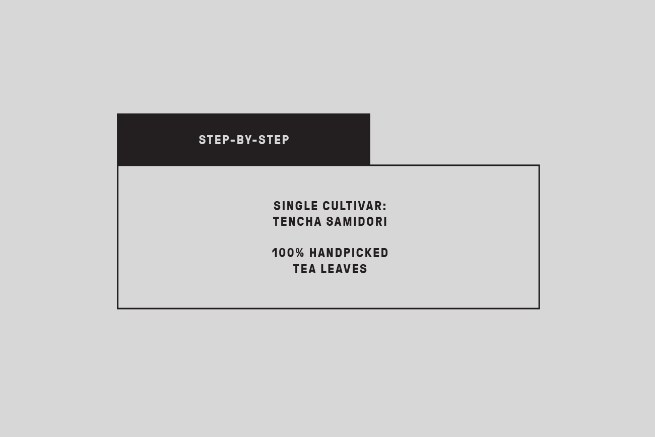
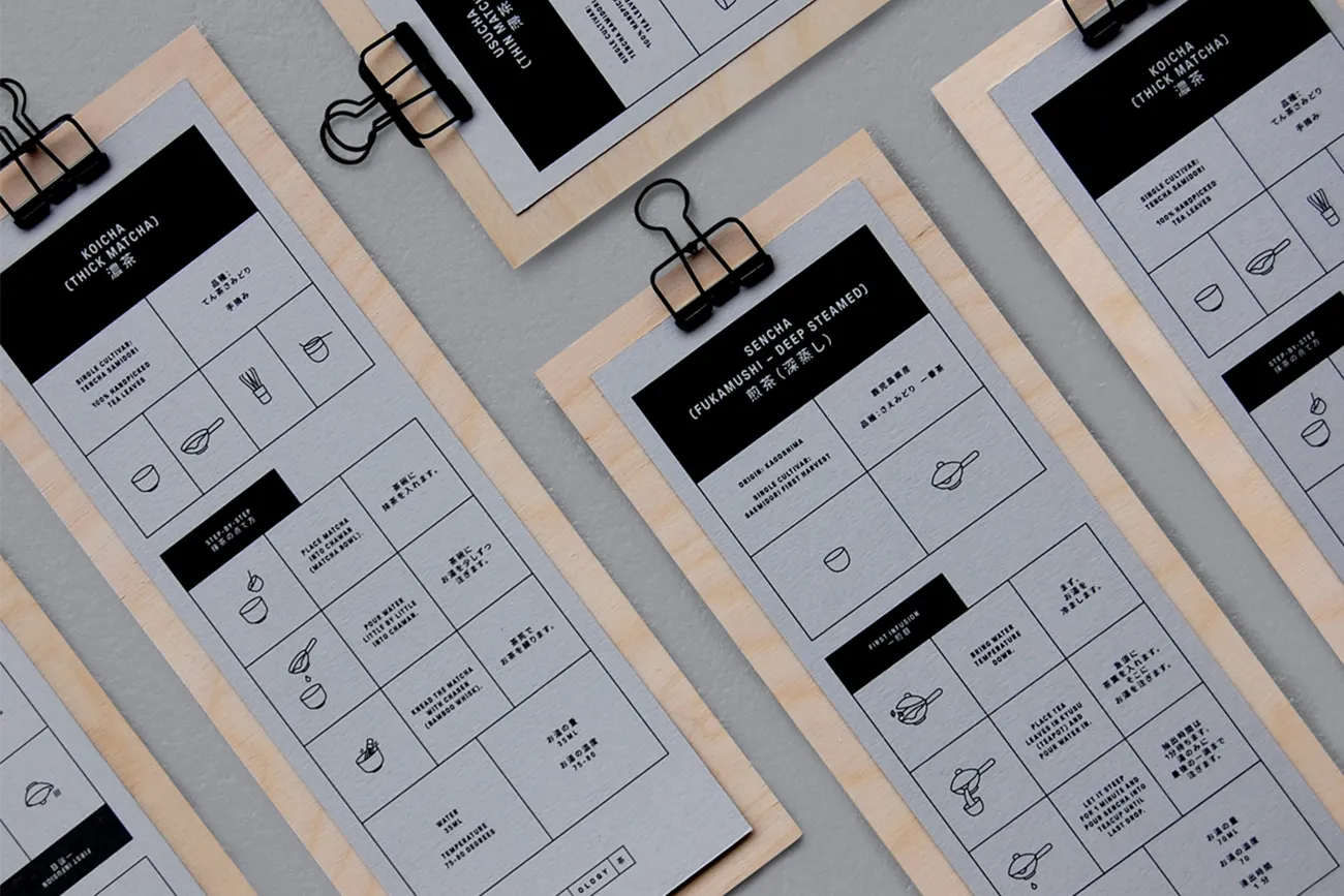
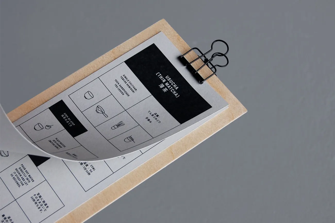
We carried on the Tatami concept through into the grid systems that are used throughout the brand. The menus for example are made entirely of different sized blocks that stack and slot together to create a modern interpretation of the traditional Japanese culture. The menus needed to contain two columns which housed both English and Japanese translations and the grids helped us keep structure and a form to this process. We also created iconography that had a similar minimalist approach as the key-line grids. The icons are used to help describe the complicated process of Japanese Tea Brewing to the customers who are less familiar with the experience.


Capturing the Product
We shot the Products how they are traditionally served, on a wooden board. We shot everything from an overhead angle as we wanted to recreate what you would see as the Tea is served in front of you. The overhead shots also allowed us to create consistency across how the products are displayed whilst also showing the variety of the tea leaves and teaware.


An Authentic Drinking Experience
We wanted the tea-drinking experience to be authentic and unique from the minute you walked into the teahouse. We created two types of menu that the customers would interact with. The first menu used to choose the product and the second menu used to take the customer through a step-by-step process of brewing and drinking the tea in the correct way. The menus were printed on a muted, neutral stock and clipped to thin pieces of birch plywood which referenced and mirrored the minimalist interior of the teahouse.


A Tranquil Environment
It was important to capture the tranquil environment of a traditional Japanese teahouse in the middle of one of the UK’s biggest and busiest cities. This was achieved through the use of neutral colours and raw materials combined with plenty open space and large floor-to-ceiling windows across the front of the store to let in the natural light.


Strictly No Shoes Allowed
We captured the environment of the space using an illustration style that was a modern take on a traditional Japanese style. One side of the space features a raised wooden seating area, with low tables and cushions on the floor for seats with a strict no-shoe policy. We created signage and wayfinding that directed the customers visually, through illustration, which is a universal language. This allowed us to communicate the same message to both English and Japanese natives without using written translations.