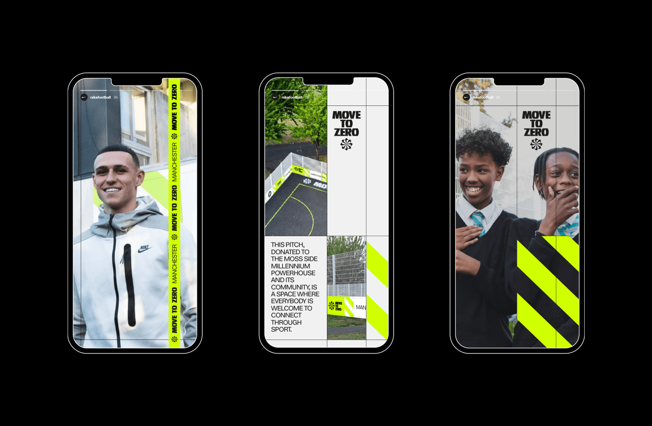
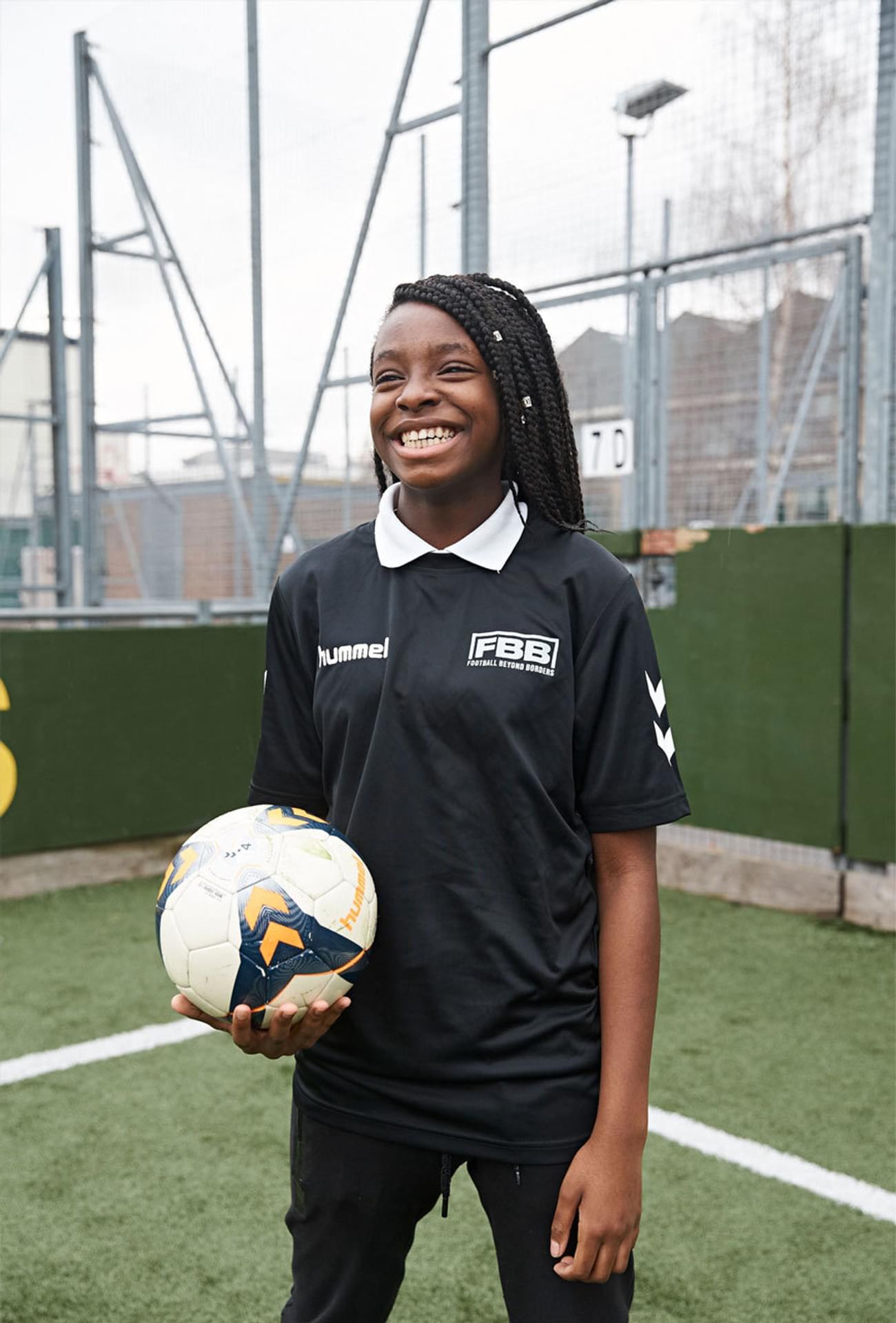
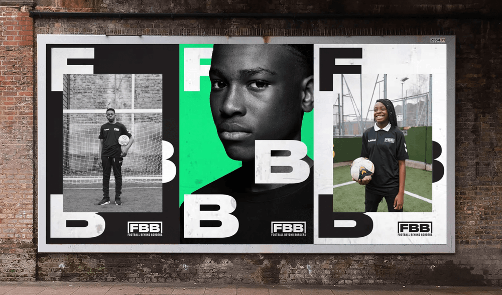
We collaborated with Nike, alongside our long-standing clients Football Beyond Borders and JD, to deliver the branding for the Move To Zero Manchester event at the Moss Side Millennium Powerhouse.


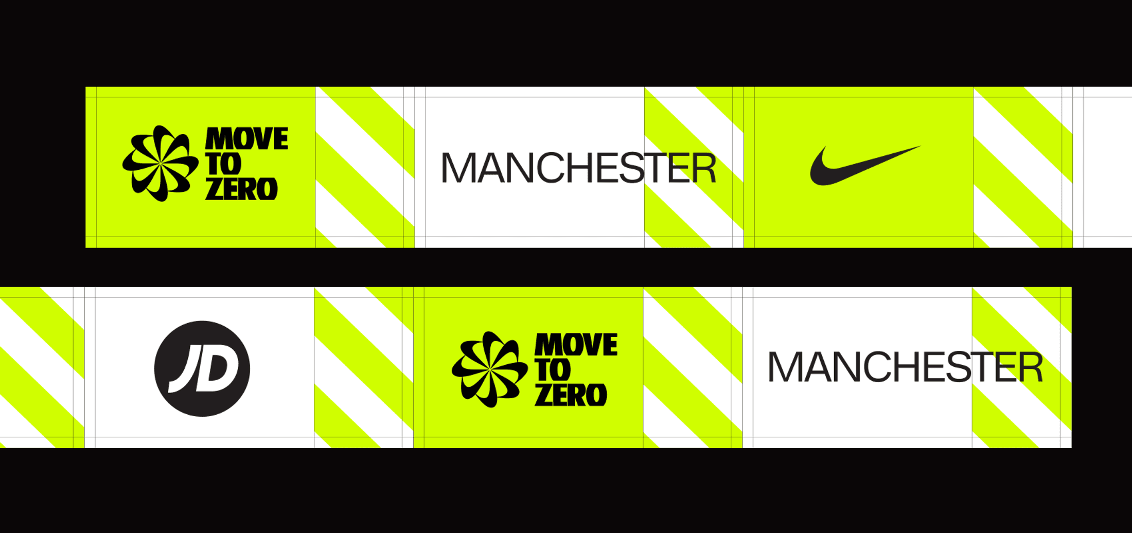
The identity for the event was inspired directly by the core Nike MTZ branding, and the challenge was to make sure that all three collaborative brands (Nike, JD and Football Beyond Borders) were represented clearly and in equal measure, without diluting the overall visual impact.
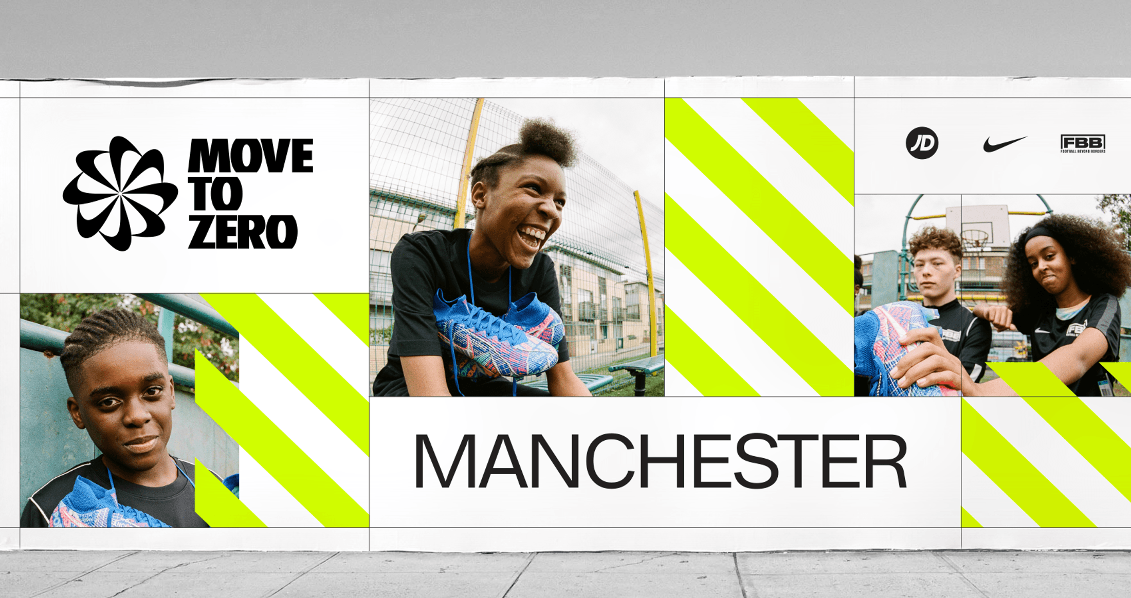
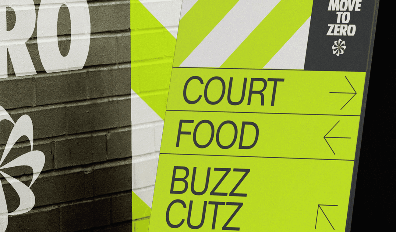
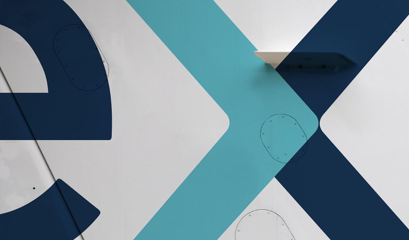
The strict colour palette of Yellow, Black and White referenced the iconic Worker Bee symbol of Manchester and the chevron pattern was reminiscent of the industrial history of the City as well as more modern music-related interpretations of that, referencing the iconic Factory Records and The Haçienda.

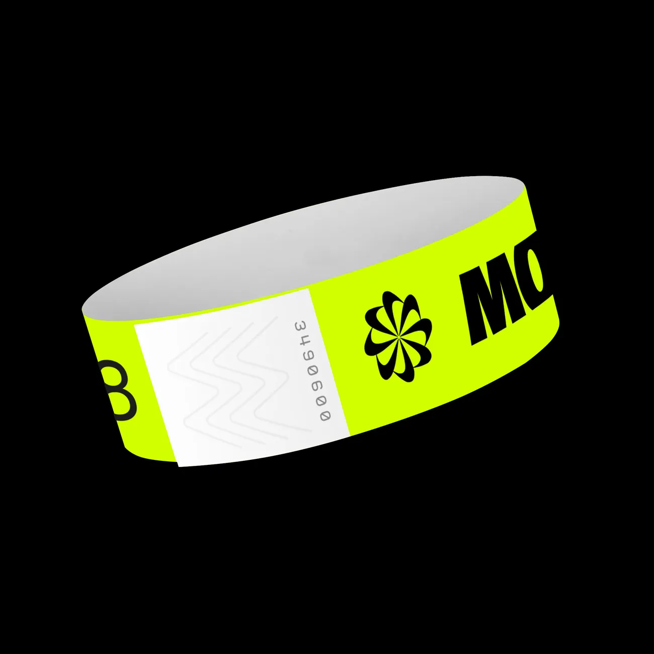
The ticker tape style of the design lent itself well to various print materials across the event, most notably the paper wristbands, making sure the identity was clear throughout every touchpoint.


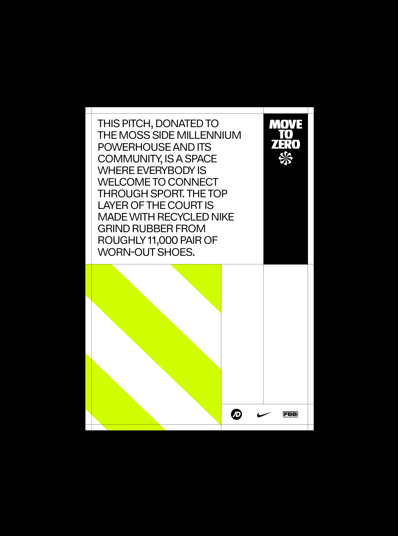
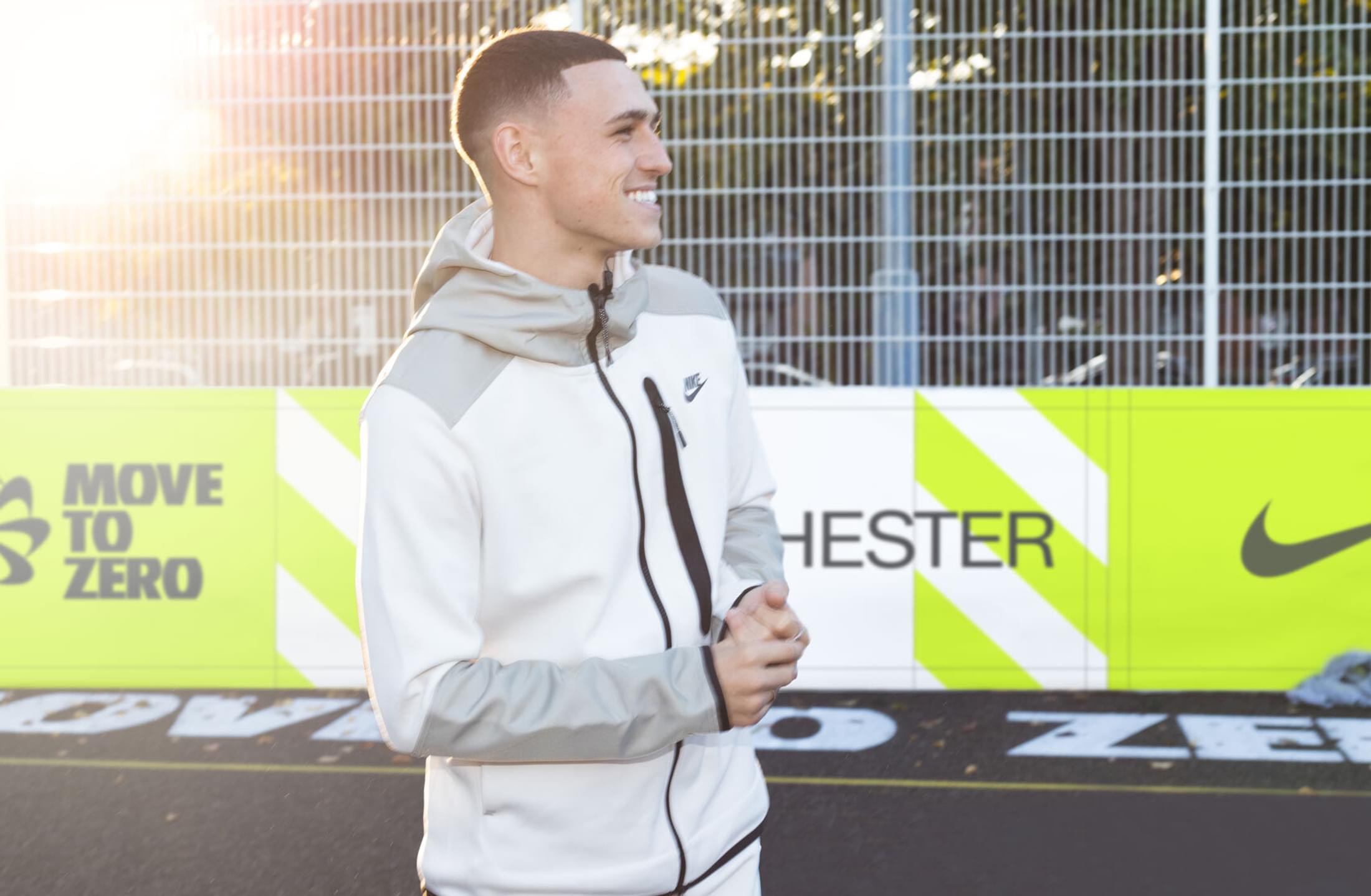
The official opening of the Community Football Pitch was attended by 300 young people and unveiled by Nike Athletes, Phil Foden (Manchester City) and Ella Toone (Manchester United). The pitch itself consists of a top layer made with 11,000 worn football boots.
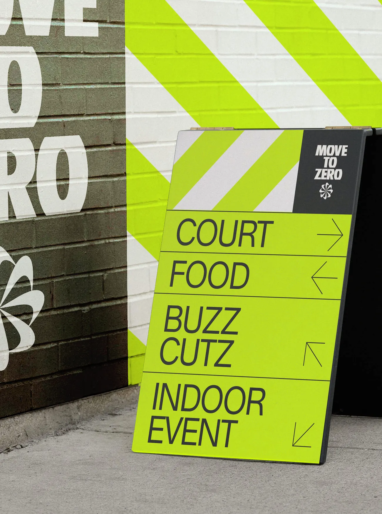
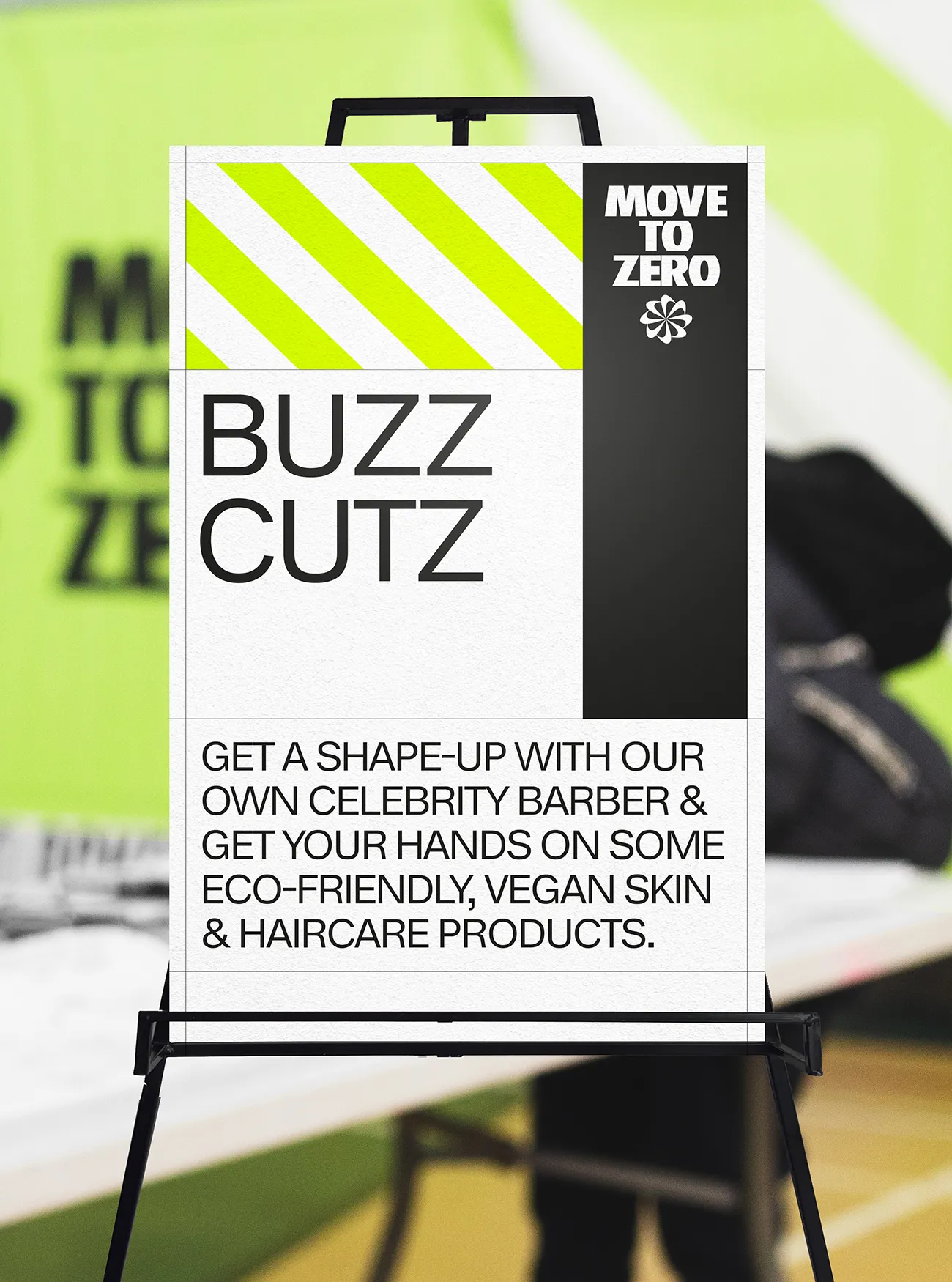
We used a bespoke grid system across all parts of the event branding which spanned across more standardised layouts for Print and Digital material as well as temporary signage and permanent hand-painted murals across the Millennium Powerhouse location.
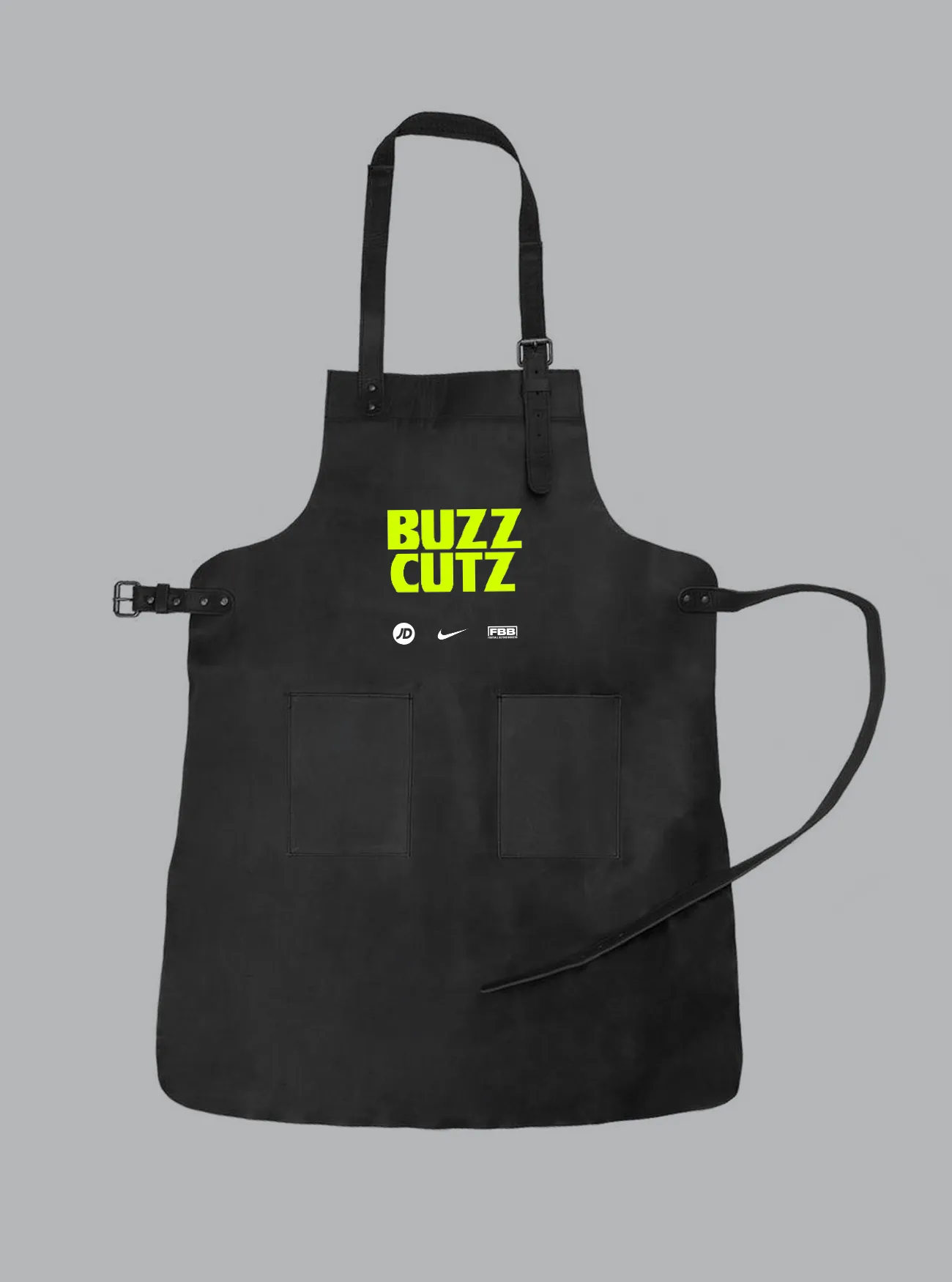
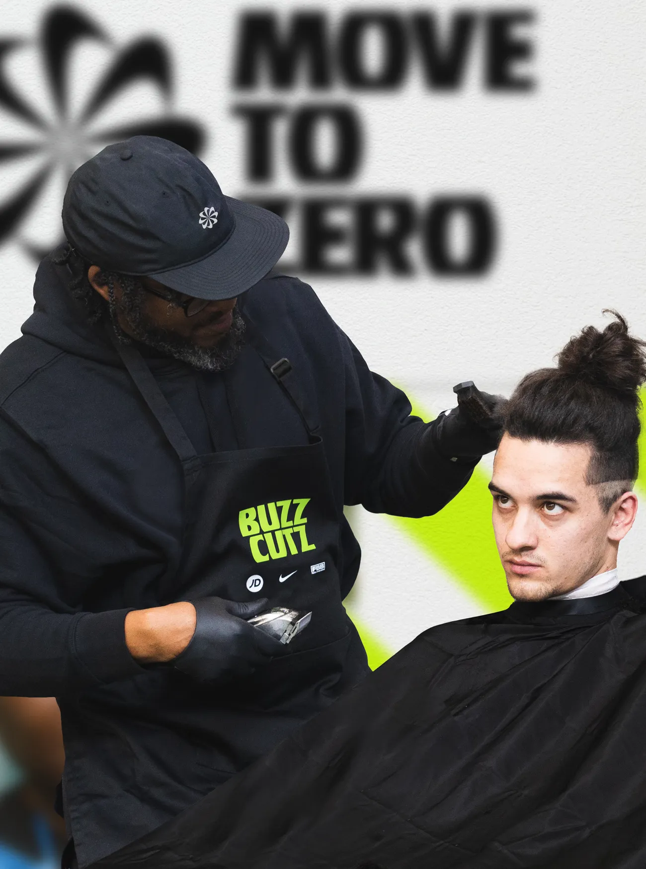
We created 'sub-brands' across the event for various activities. Buzz Cutz was one of the stand-out activities with the double entendre of the name representing the Manchester Worker Bee as well as the hairstyle.


Permanent hand-painted murals in the MTZ Brand colours and patterns were painted over the Millennium Powerhouse Sports Centre to bring a vibrant look and feel to the space that will be used as an important hub for the surrounding community for years to come.
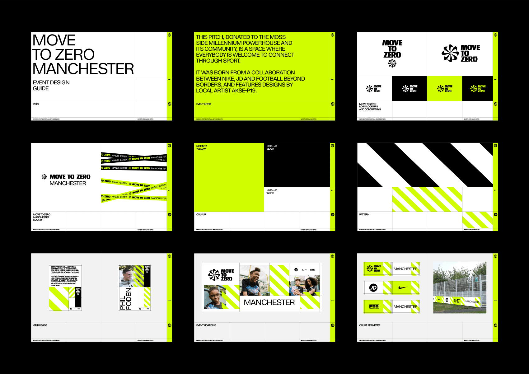
Following the core Nike MTZ branding, the event identity system feels fresh and new, but also informative and trustful. An exposed grid speaks to the transparency of the structure, hazard striping mimics emergency vehicles, and Volt keeps it undeniably Nike, without neglecting the brand influences of JD and FBB.
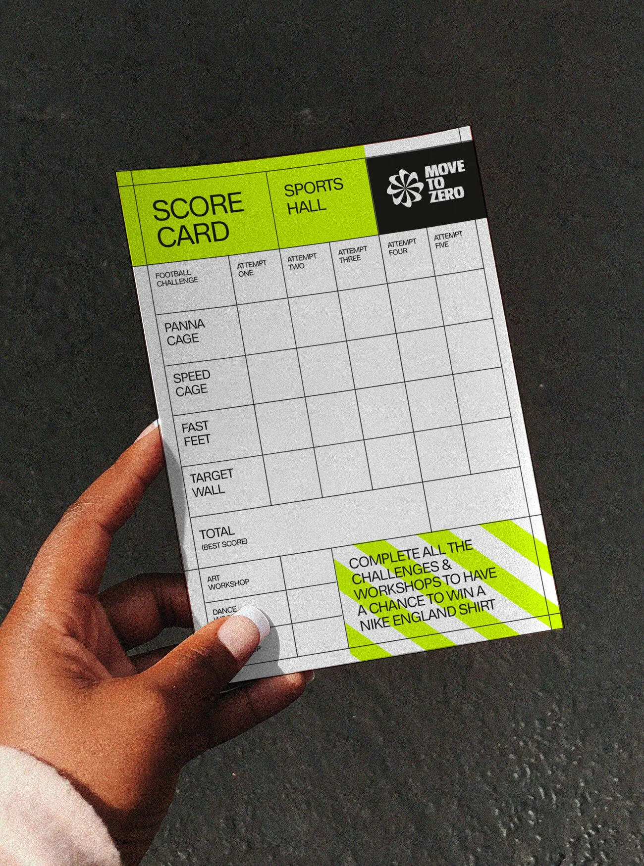
The same grid system translates across print and into digital space with ease. The responsive design is favourable to the exposed grid, the bold chevrons and the use of whitespace.