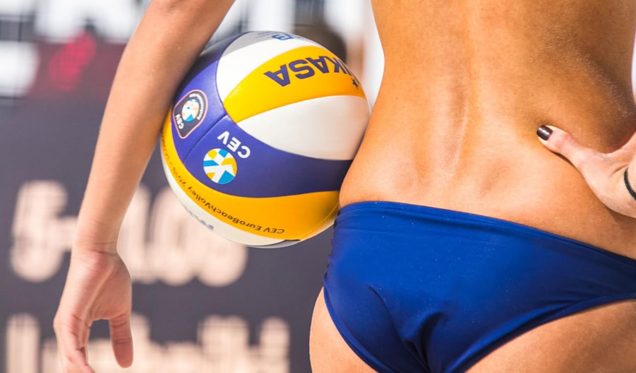
The Confédération Européenne de Volleyball or CEV is the continental governing body for Volleyball in Europe. We worked with them to build a brand from the ground up that would encapsulate the future of Volleyball.

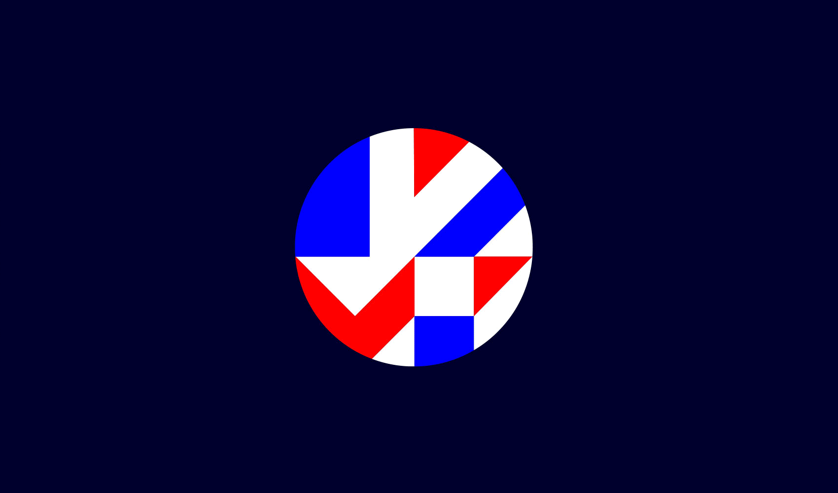
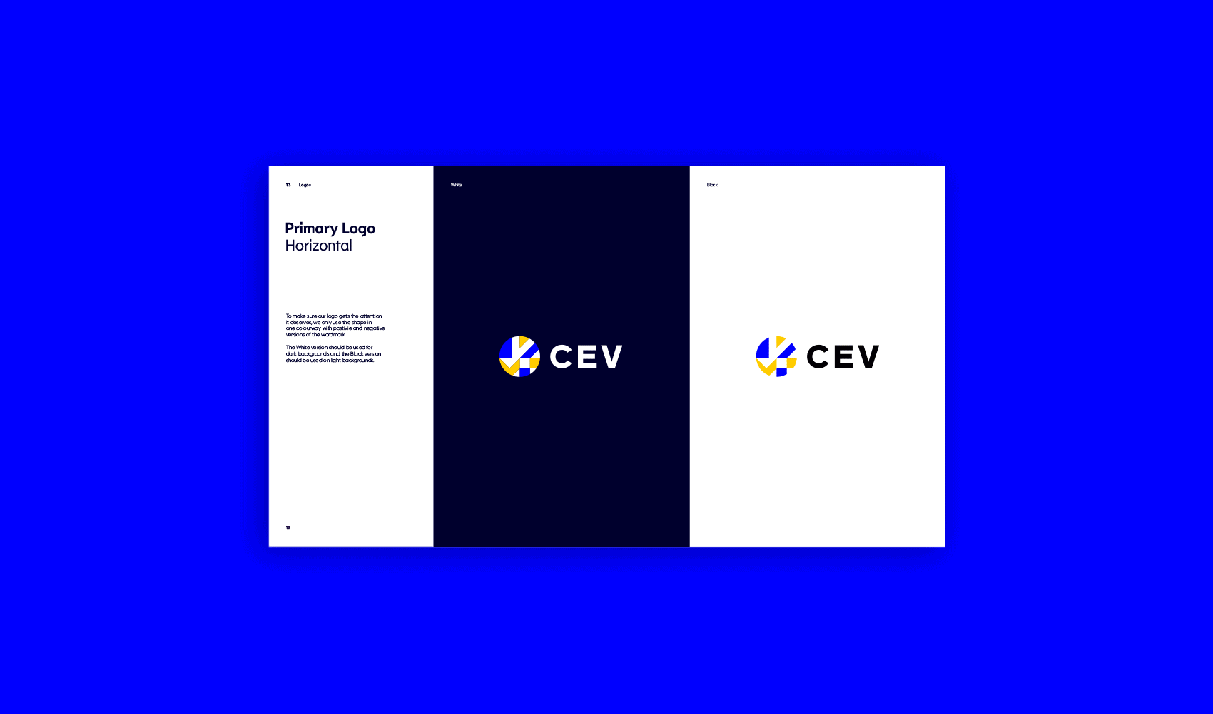
The Volleymark
Born from inspiration of the flags of all 56 European Nations, the Volleymark is the centrepiece of the brand identity. The shapes and angles illuminate the spectacular moments that transcend the sport.


Bringing Europe together
Once keylined, we used the flags as direct inspiration for the Volleymark. The angles in the design directly reference the angles used in the country flags. The final design is contained within the circular shape representing the volleyball.
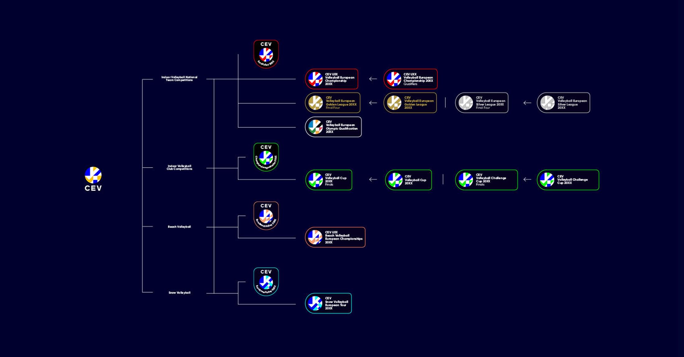
Sub-Brands & Competitions
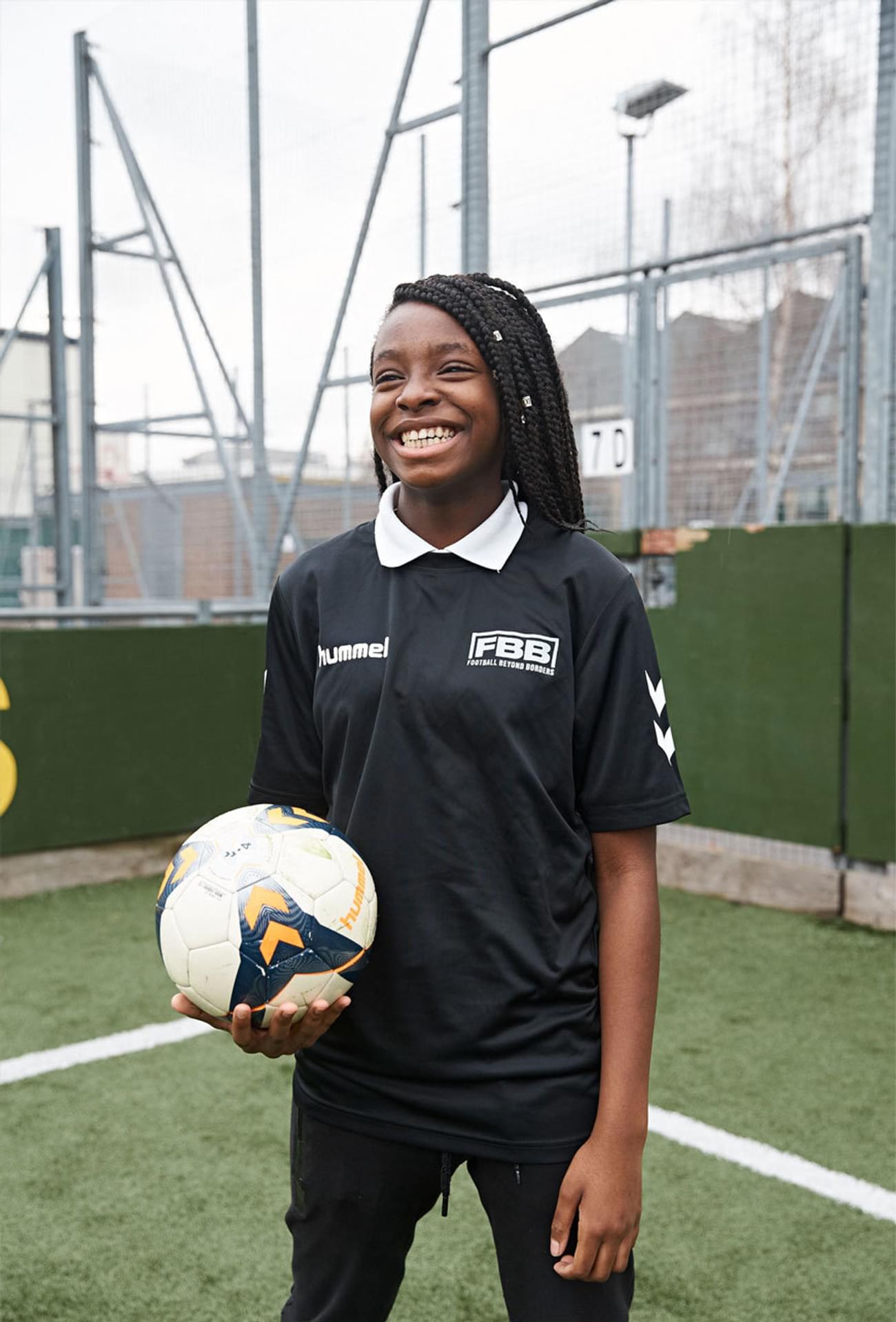
We devised a clear branding system where each of the main competitions (National, Club, Beach and Snow) had a unique colour palette and crest, with smaller horizontal badges for the sub-competitions that sit underneath each sector.
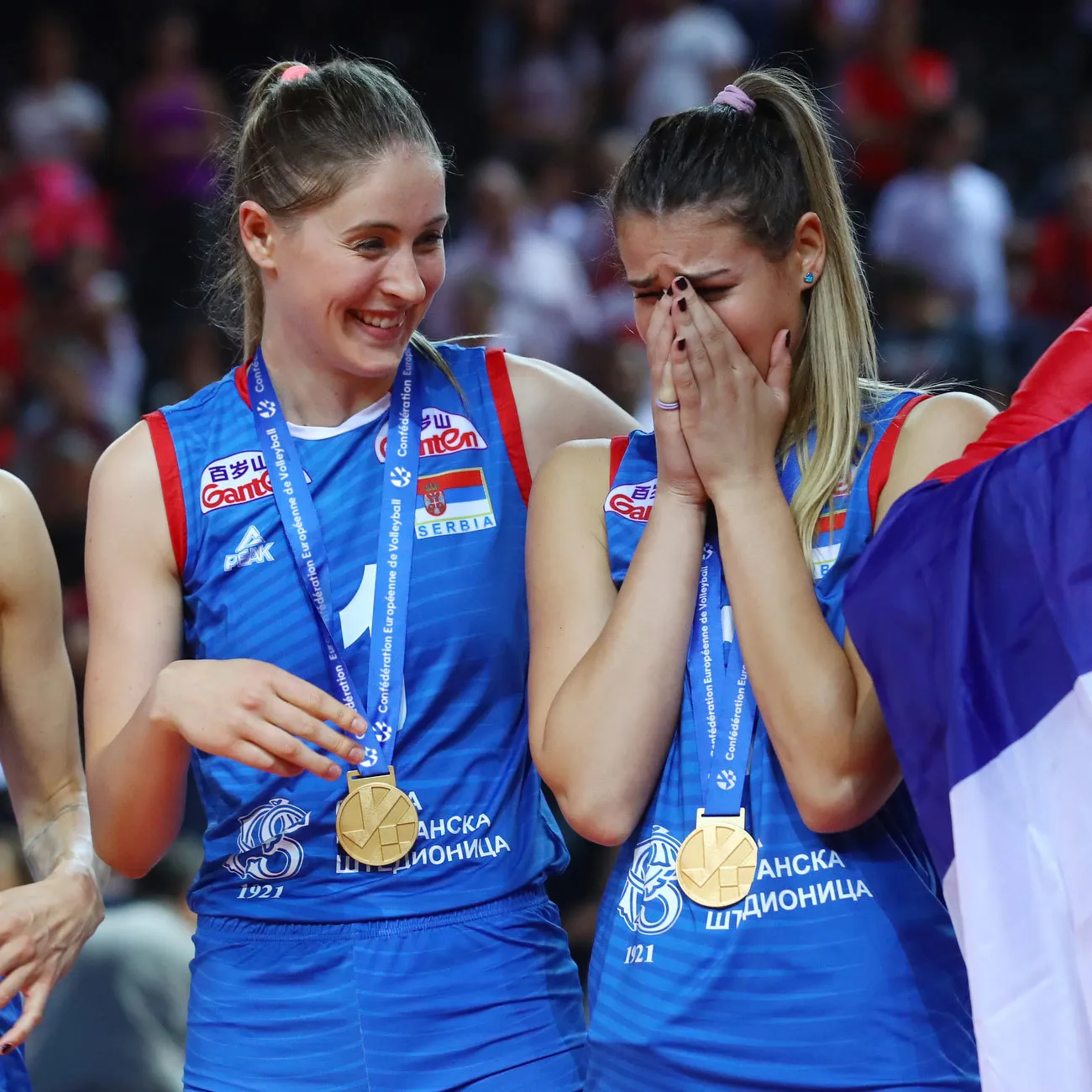
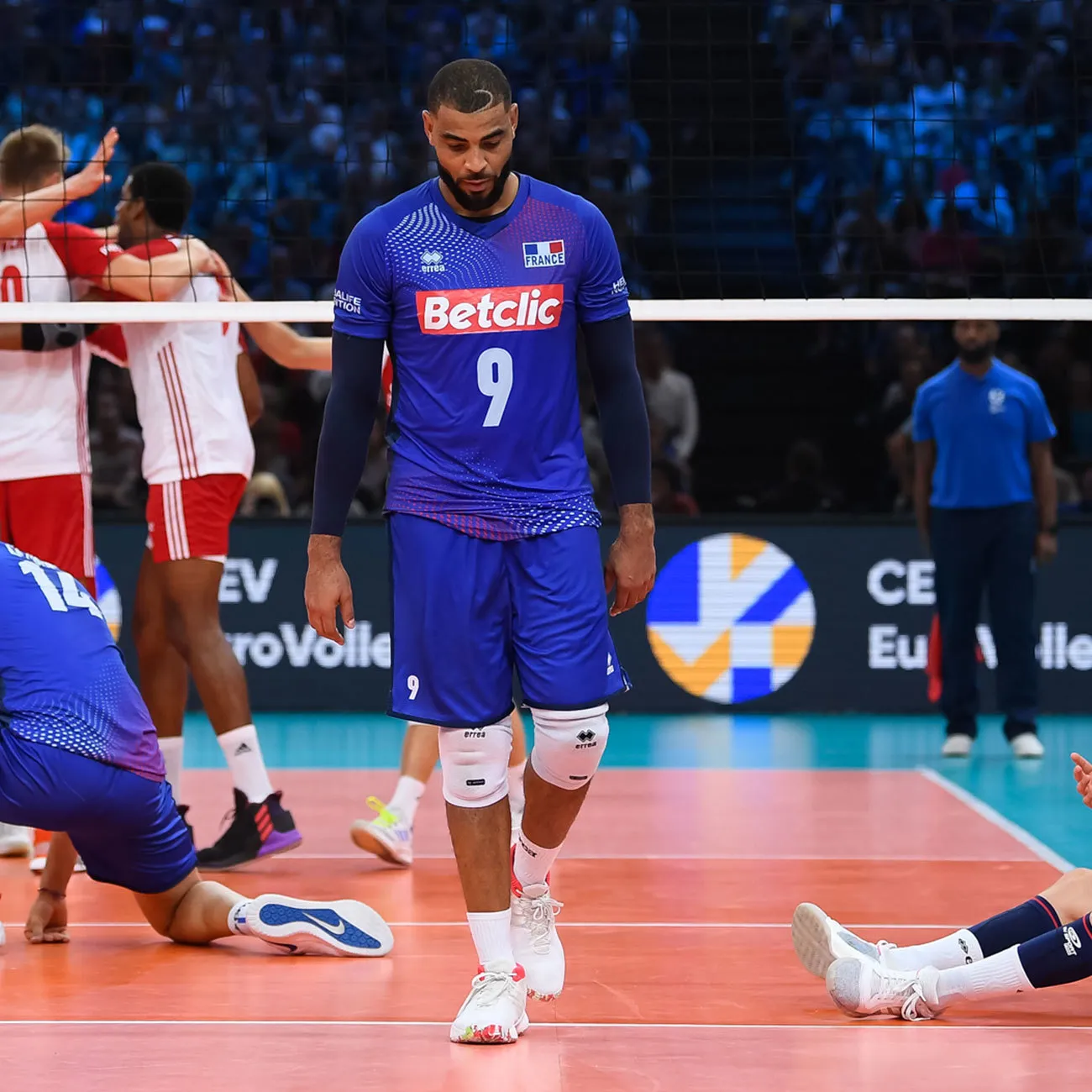
The crest designs of the main competitions are designed with application in mind. An example of this is the crest patch applied on to the arm of all teamwear.
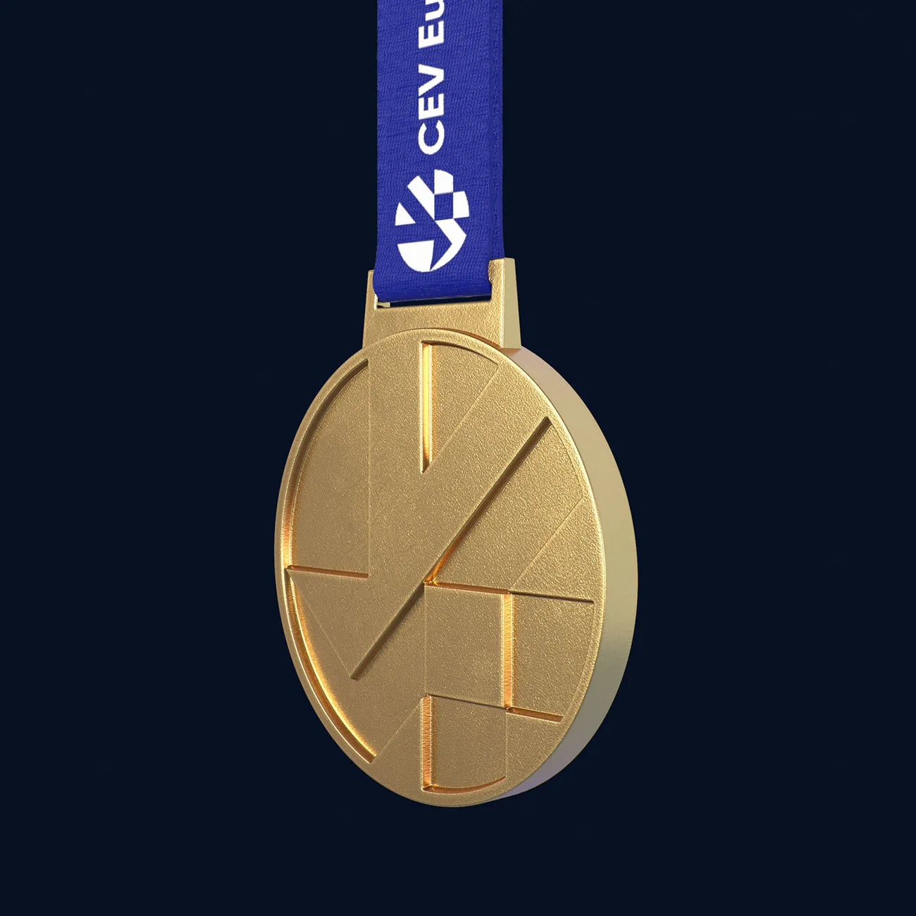
The iconic shapes of the logo lend themselves well to the most important of applications, in this case, the winners medals.
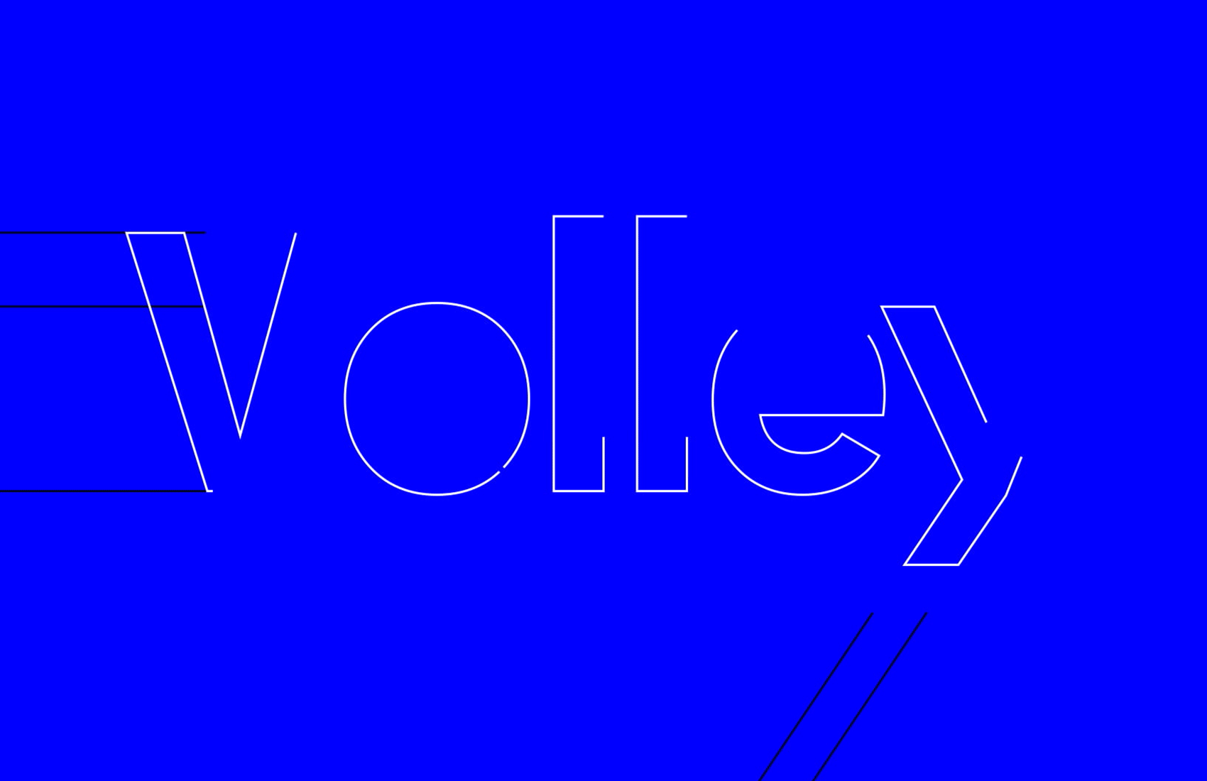


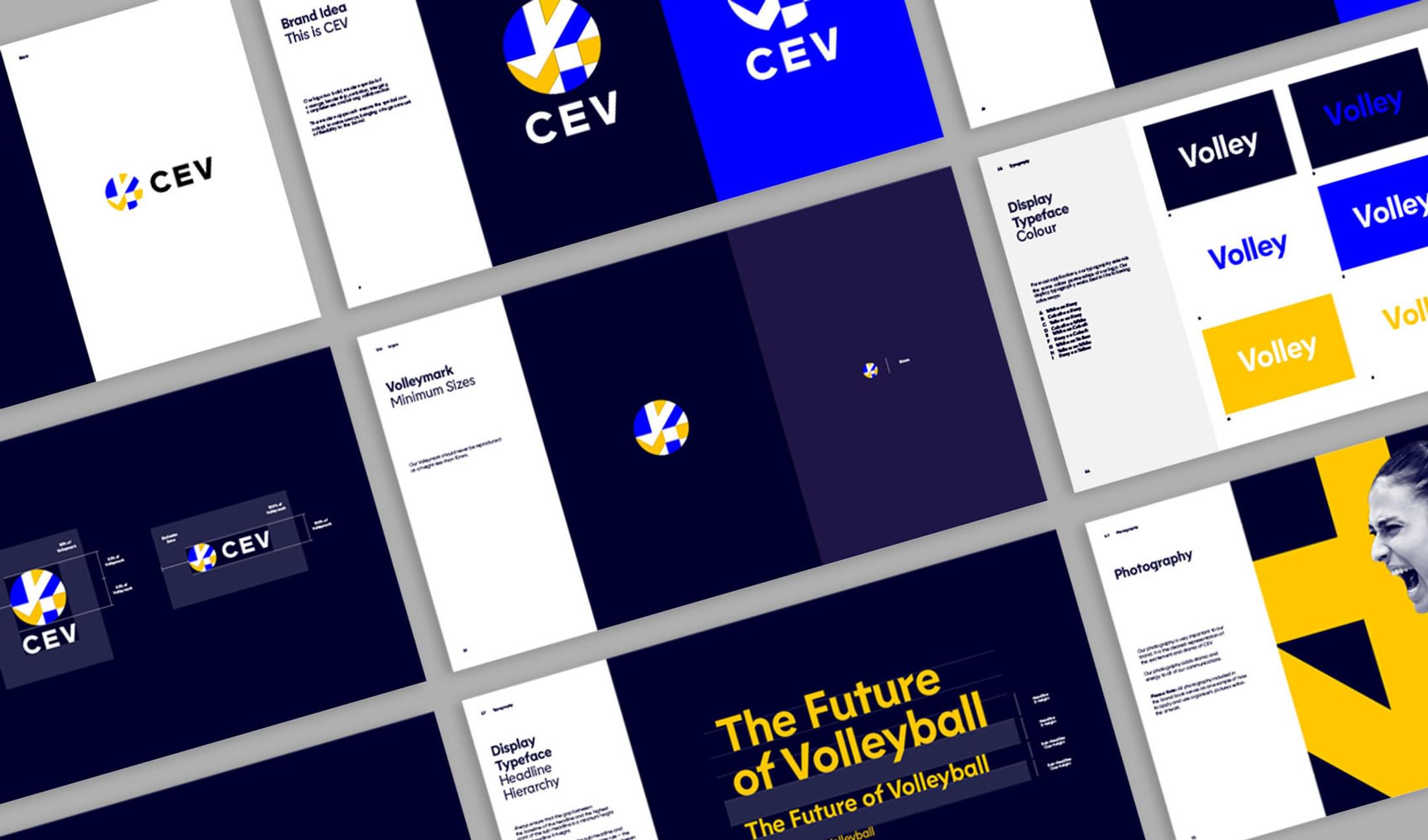
The display typeface is a classic geometric sans serif with a modern and energetic twist. A number of interesting angled letterforms represent the movement and fast-paced nature of the sport and are inspired by the angles found in the Volleymark.
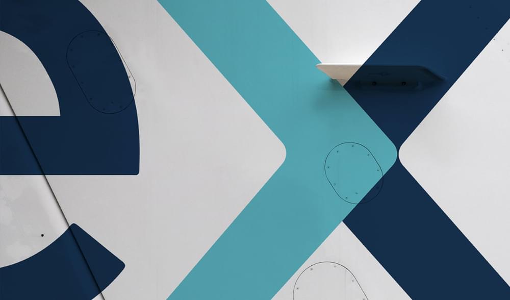
As the brand needed to be seen at all scales and on a wide-range of deliverables, we created a graphic device from the volleymark that can be cropped and used as a brand asset to create dynamic compositions.
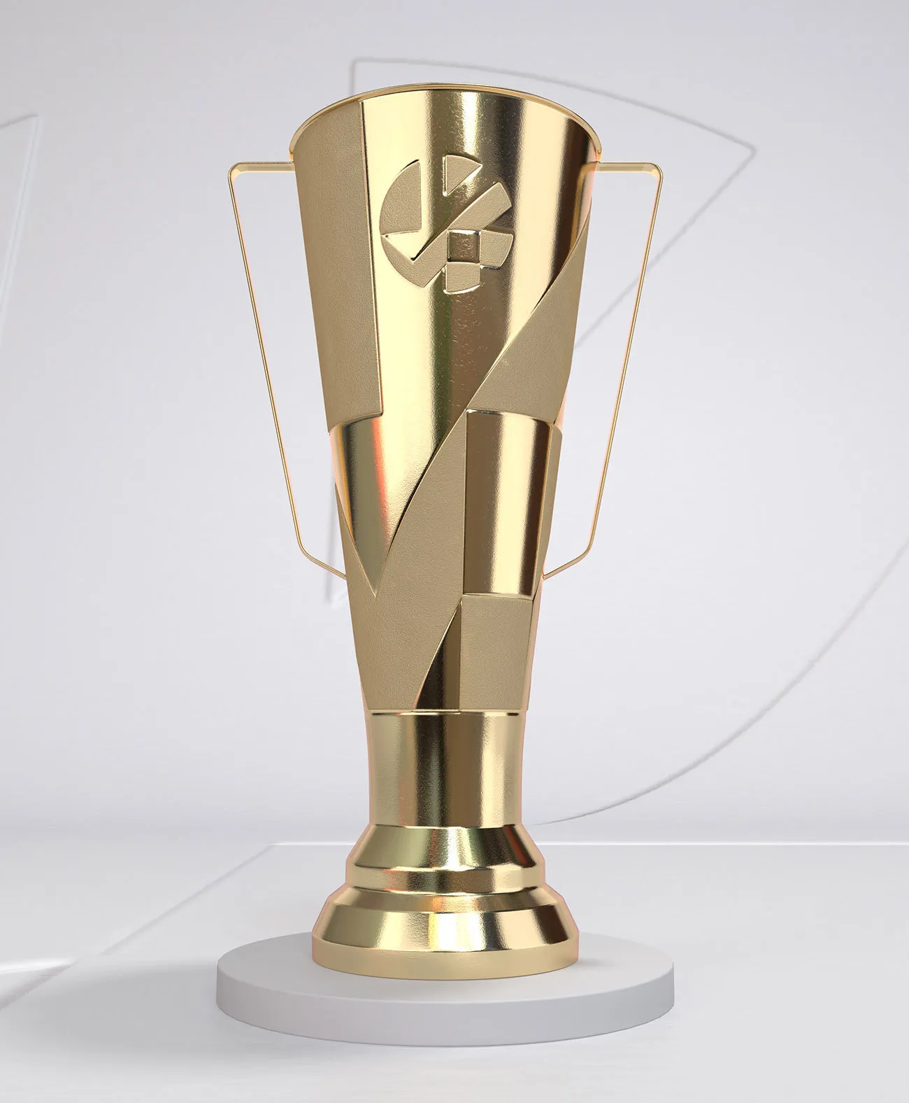
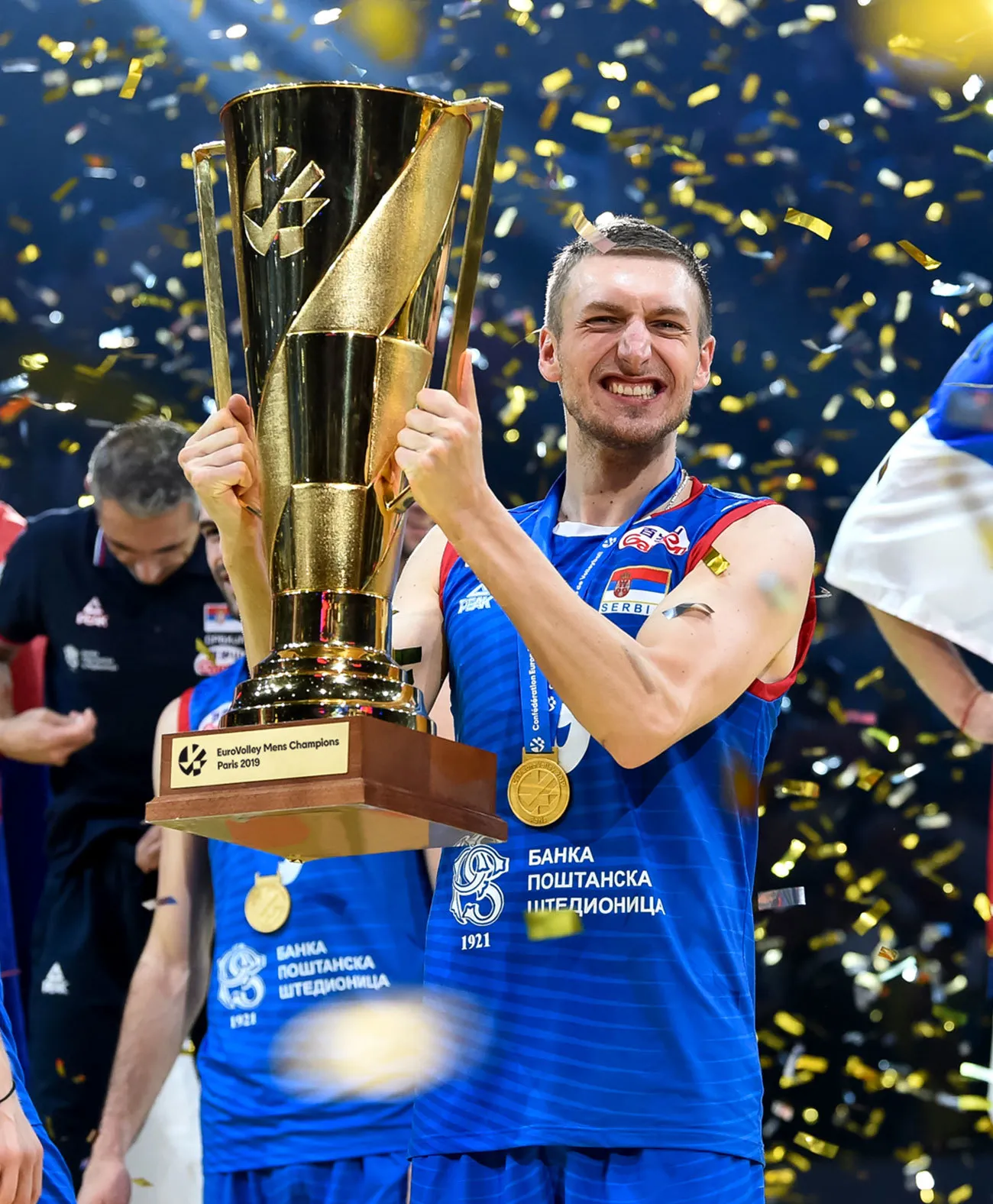
We worked with a CEV and a trophy manufacturer to ensure that the unique shapes of the Volleymark were captured and casted perfectly in the all-important trophy.


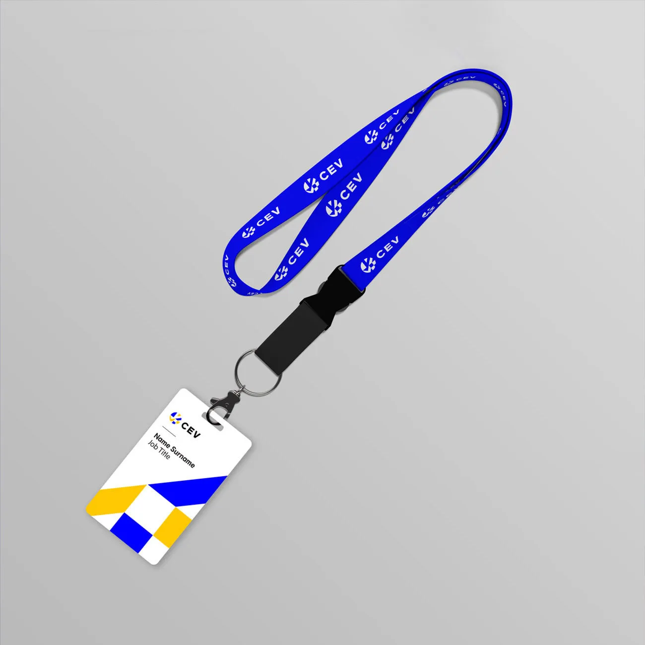
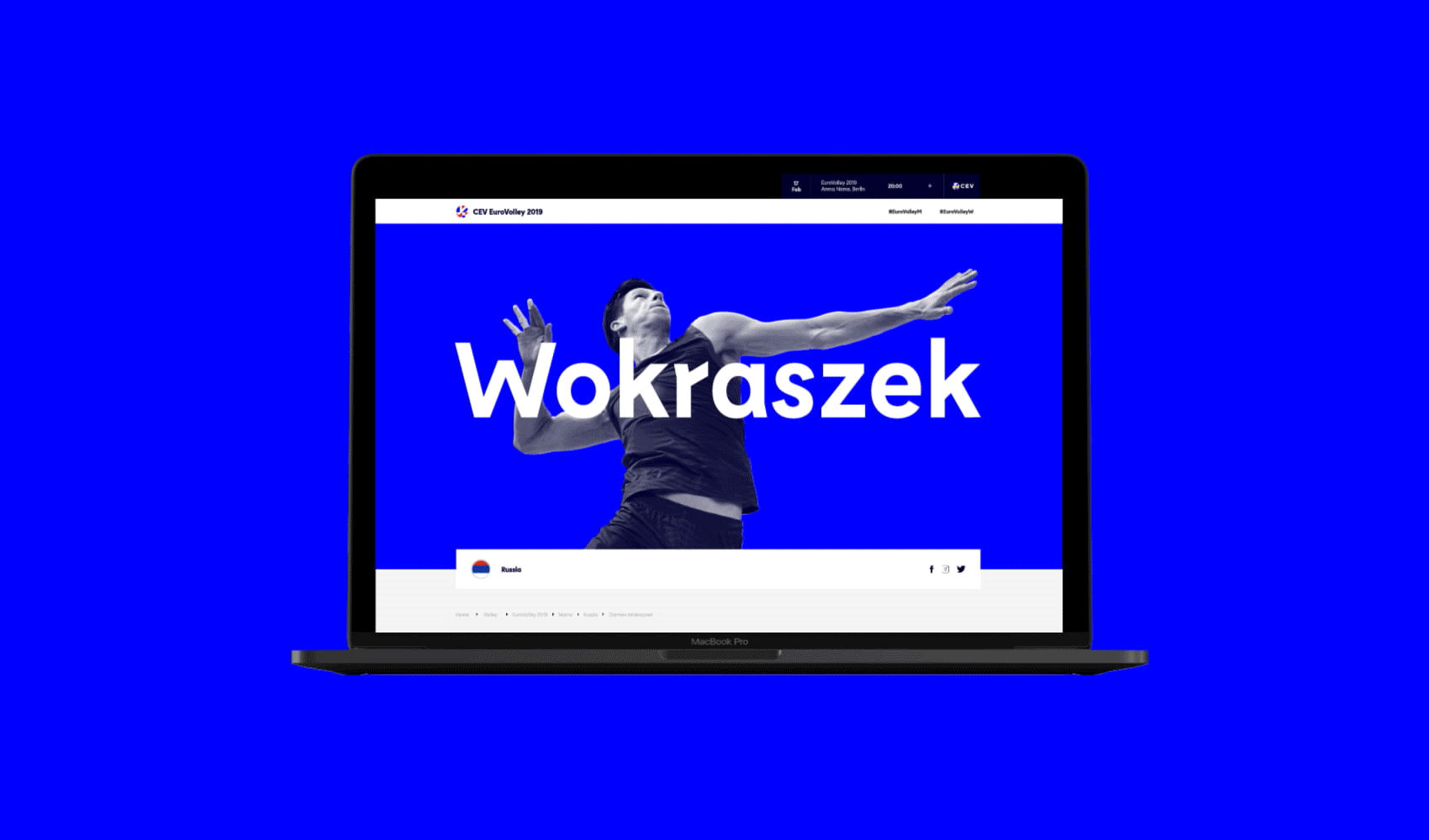
Examples show how the CEV logo is flexibly used across a wide-range of deliverables at different scales and sizes.
“At CEV we recognised it was time for change and we now have Alphabet as a partner who are bringing new ideas and a new energy to European Volleyball.”
Aleksandar Boričić
CEV President


The brand is able to flex from bold and vibrant to premium and elegant. A less liberal use of highlight colours, plus a toned-down graphic device enables corporate materials to work in their relevant settings without diluting the brand.


Previous Logo
Staying true to CEV's heritage we stripped back and rebuilt the branding keeping some of the original traits of the previous logo such as the circular shape and position of the wordmarque underneath.