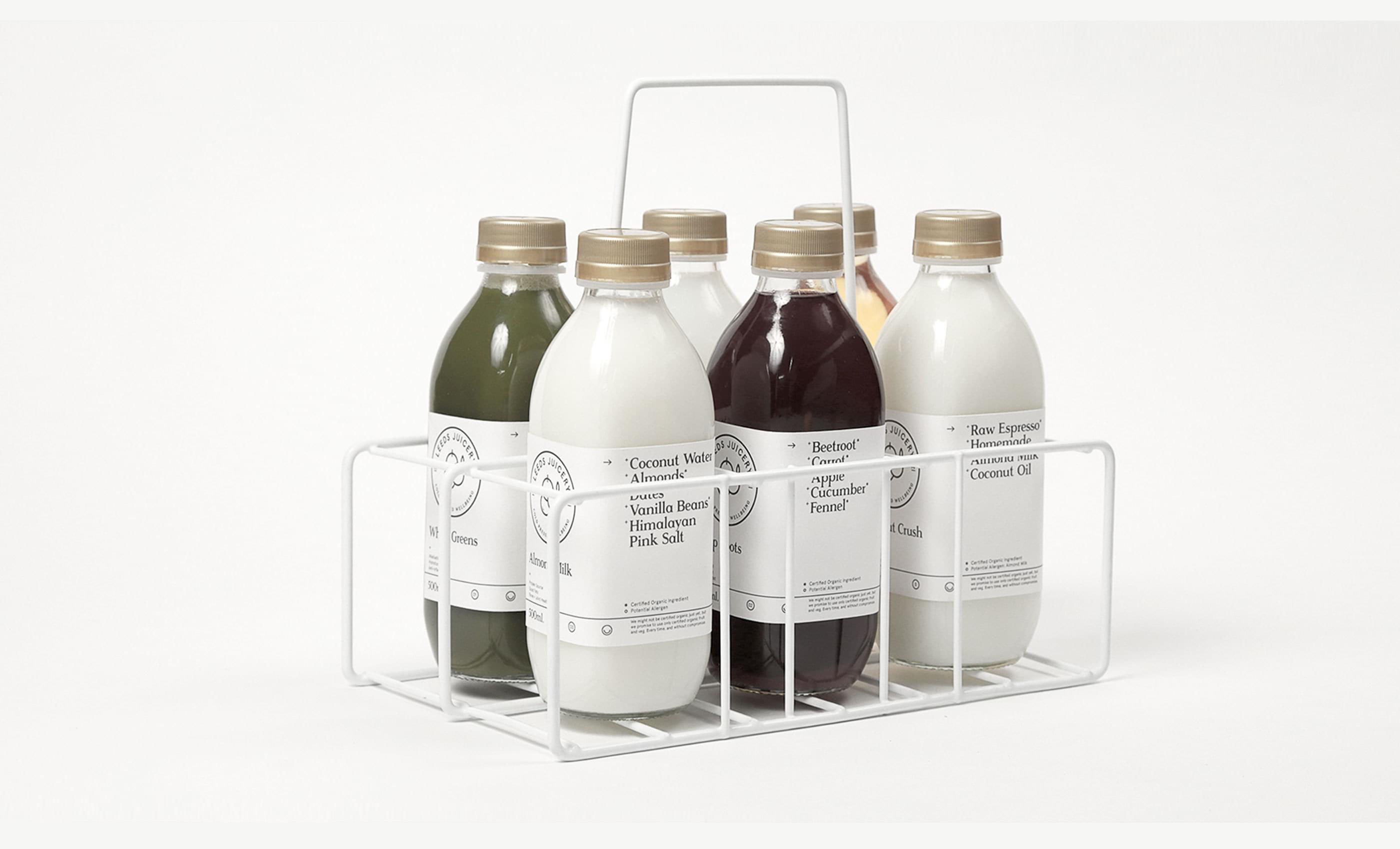
Leeds Juicery is an exciting new cold-pressed juice brand based in Leeds, UK with a unique approach and concept behind it’s product. The identity and art direction focuses on capturing purity, meditation, health, and the ancient Indian medicinal science of Ayurveda that underpins the process lifestyle of the company.


Equally important is expressing the unique location, local produce and client connection the company strives towards. This is amplified through hand-written personal elements and a proud Yorkshire tone of voice. This personality combined with the pure, minimal art direction forms a unique relationship.


Balance and Harmony
The product is aimed at young working professionals, and busy individuals who can rely on Leeds Juicery for their daily fix. Promotional and point of sales material is highly typographic, communicative and gives reverence to what’s most important - the pure ingredients.


Locally Produced
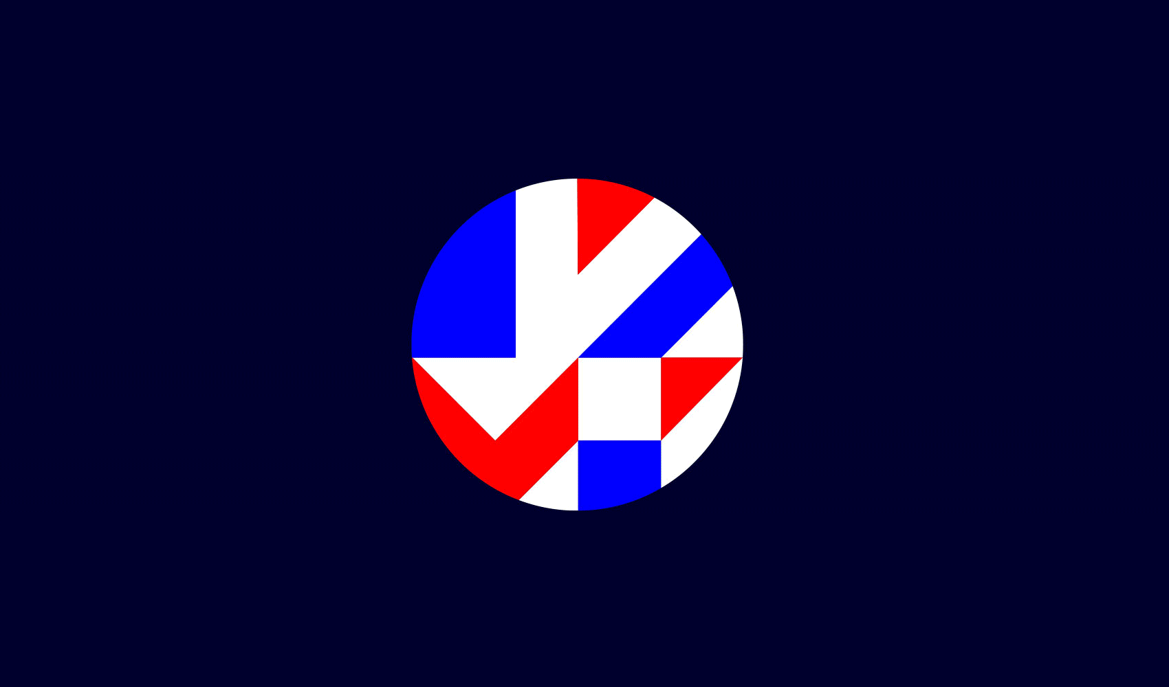
The tri-circle graphic device forms the graphic language and all iconography across the brand identity.
The base grid has the potential to be used effectively for any and all future initiatives, exemplified by the current Juice Together campaign. An initiative focused on delivering healthy fresh juice to schools and donating 10 pence from all Whole Green sales to local growing projects.


Ecologically Friendly
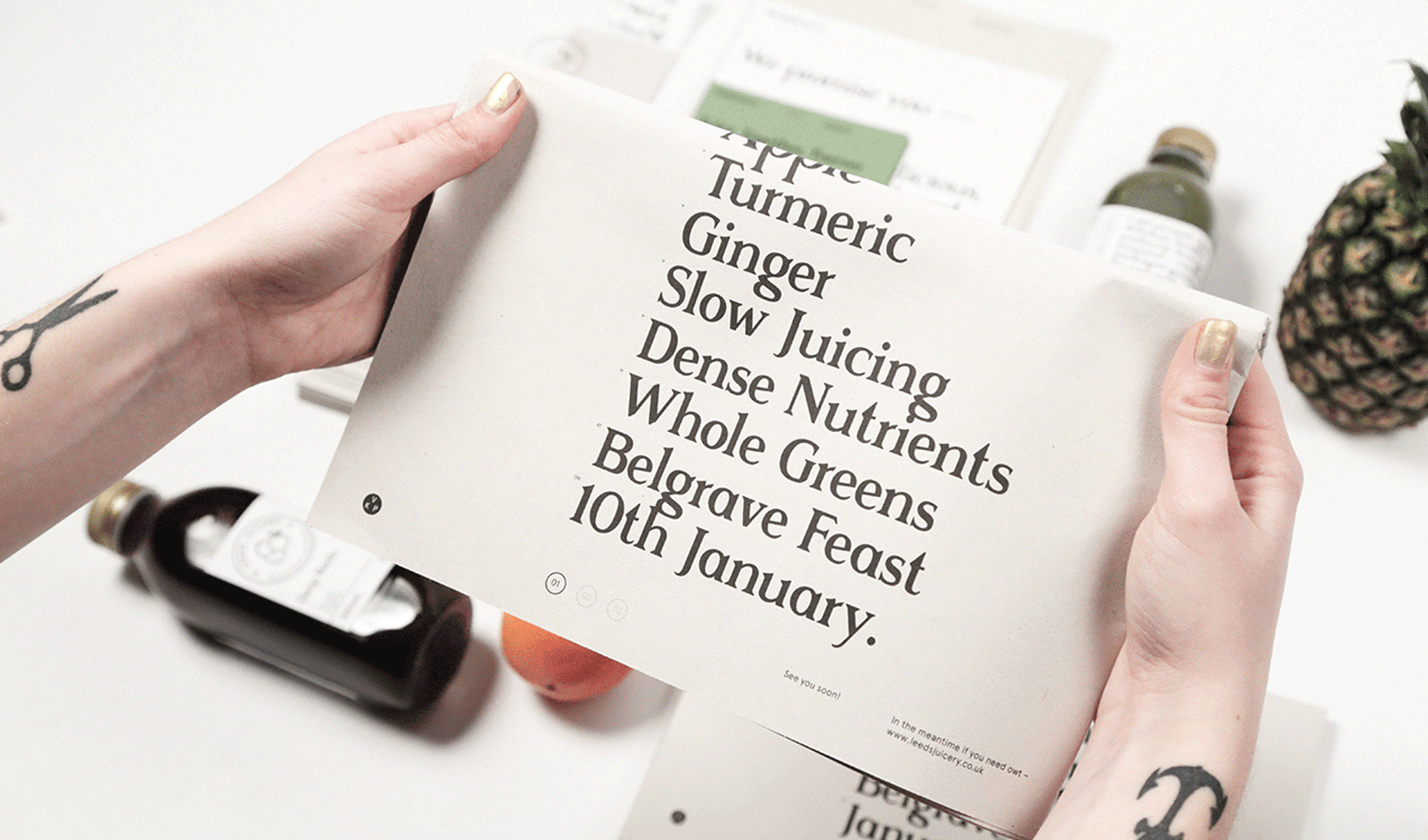
All print and promotional material is risographed on 100% recycled sugar paper, to look after our environment and print in an eco-friendly way. Sugar paper also has the beautiful characteristic of changing in prolonged sunlight, just as the ingredients of the product.