We worked on the rebrand of one of the leading cryptocurrency marketplaces in the world; Coindirect. We coined the strapline “Cryptocurrency for humans” and created a relatable, conversational tone of voice with a unique graphic device that informs the whole brand from image treatment to illustration. The end result is a brand that stands out in a saturated market, confidently.

The logomarque has been crafted to represent the movement and growth of funds as they are invested. To visually recreate this idea of movement, we generated a fading gradient effect that ends on a perfect circular point. The circular movement of the shape creates the form of the 'C' logomarque.
Sub-brands were created to represent the three core services that Coindirect offer; Wallet, Exchange and Marketplace.


The logomarque inspired the creation of a graphic device that interacts with imagery and typography to create branded content with real stand out value. To bring a more personal and honest approach to cryptocurrency, we focused on the different people and personalities that interact with the brand.

Using the same visual style as the logomarque and the graphic devices, a completely bespoke icon pack was created to help showcase the key features of the brand in an easy to digest way.


"The redesign evolves CoinDirect into a contemporary brand with a friendly personality that is straightforward, open and honest."
Sebastian Needler, Co-founder, Alphabet


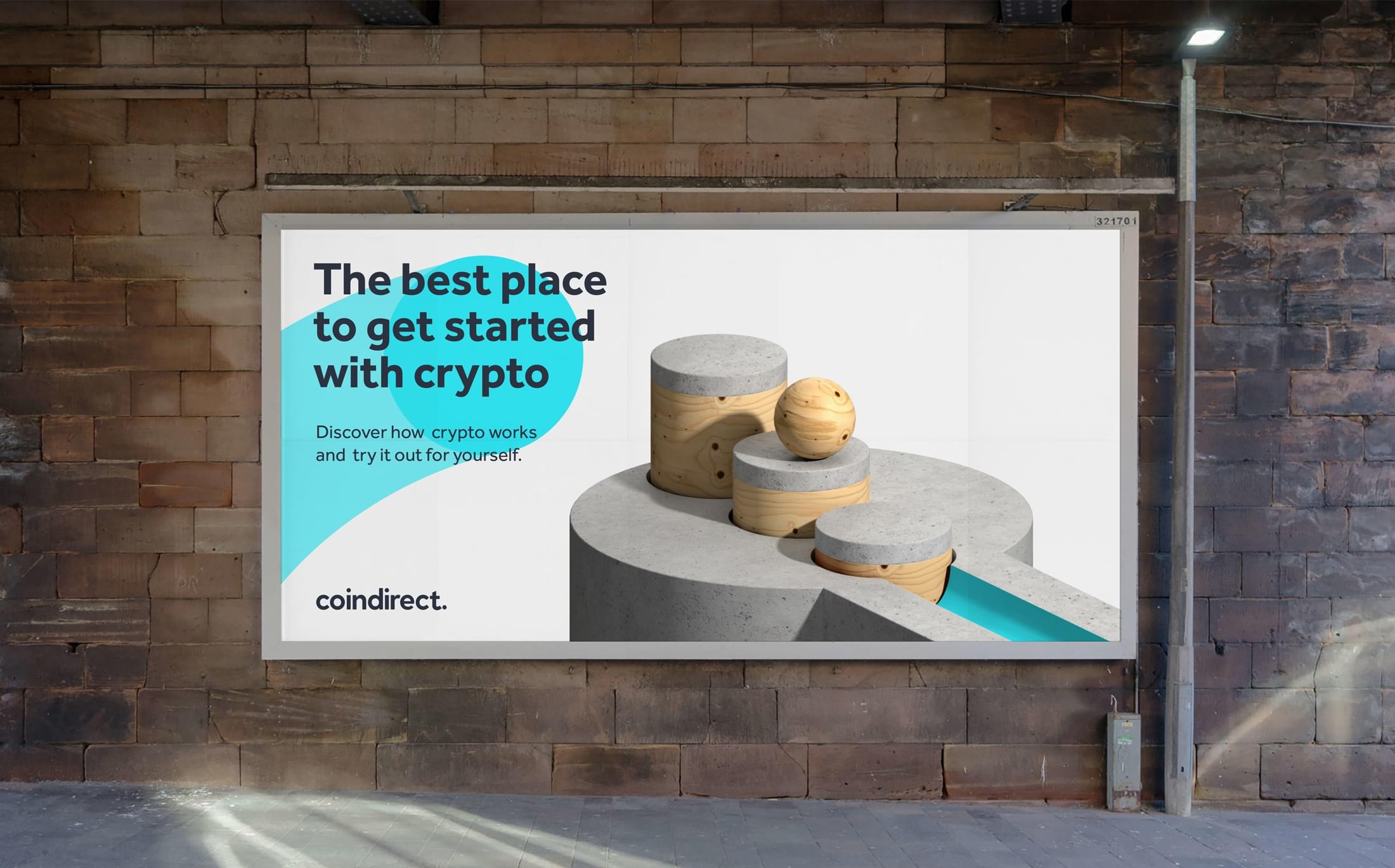
We created 3D animations to help represent the movement of money in a fun, playful and engaging way which aimed to make the concept of cryptocurrency more understandable to an entry-level audience.



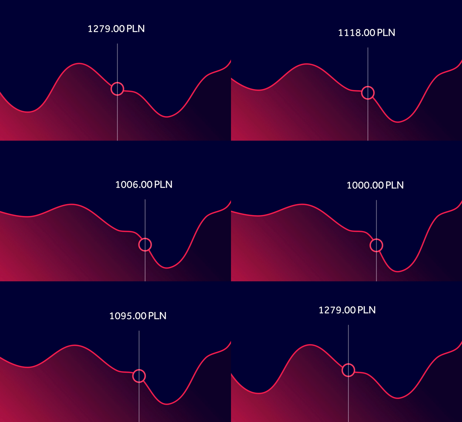
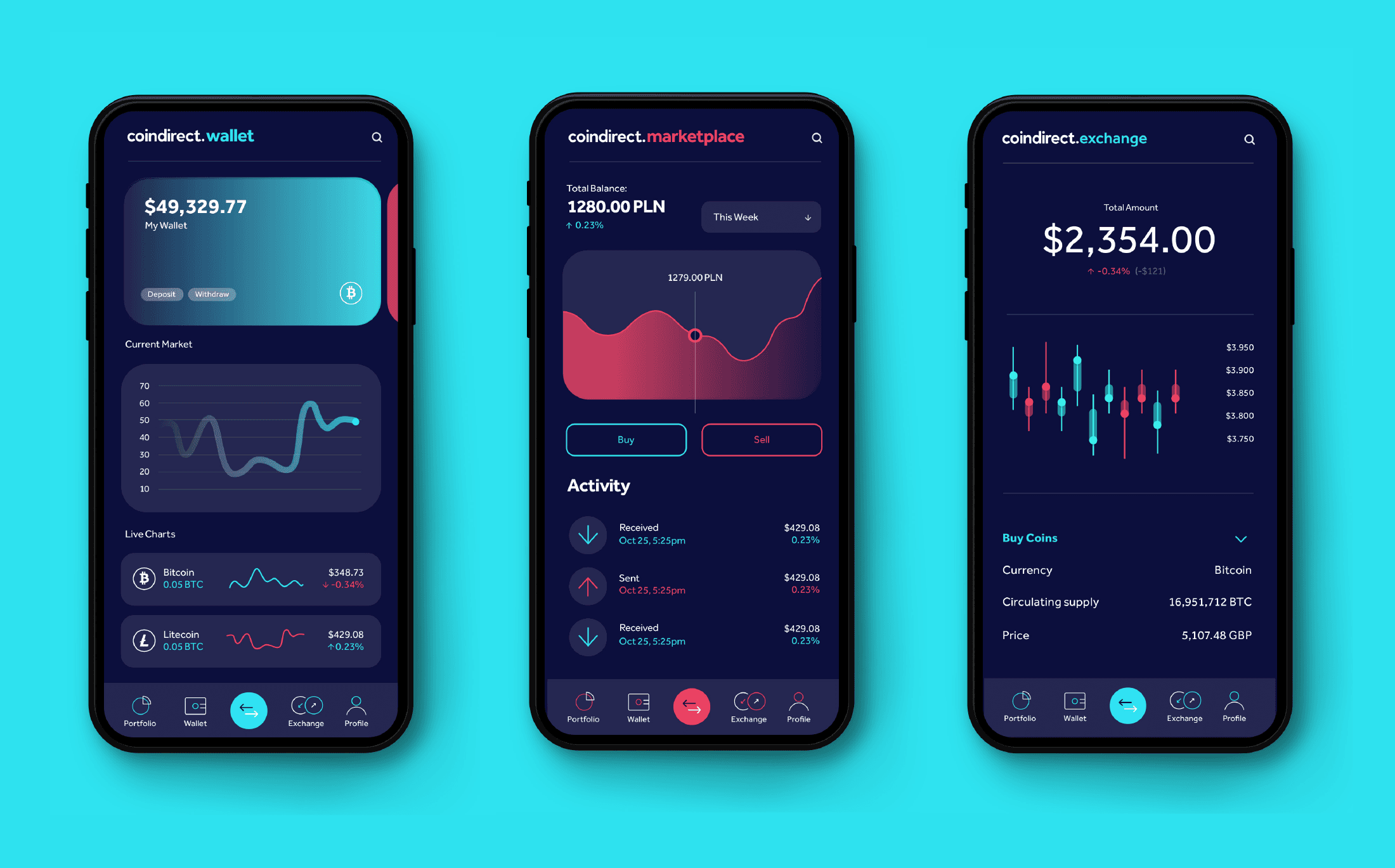
The graphic device is used to inform the design of the user interface, making the complete experience bespoke to the CoinDirect brand rather than relying on an off-the-shelf look and feel. The graphic device is used specifically to visualise graphs, charts and key details.
We created a completely bespoke website experience to make the user journey seamless from entry-level to experienced trader.
