We're excited to share with you the launch of the new visual identity for Ticket Arena; one of the largest online ticket agents in the UK.
Working in partnership with the Ticket Arena design team, we looked to create a bold and vibrant identity that includes a dynamic colour palette, clean and modern typography and a memorable graphic system, that is flexible for digital and physical formats.

Brand Workshops
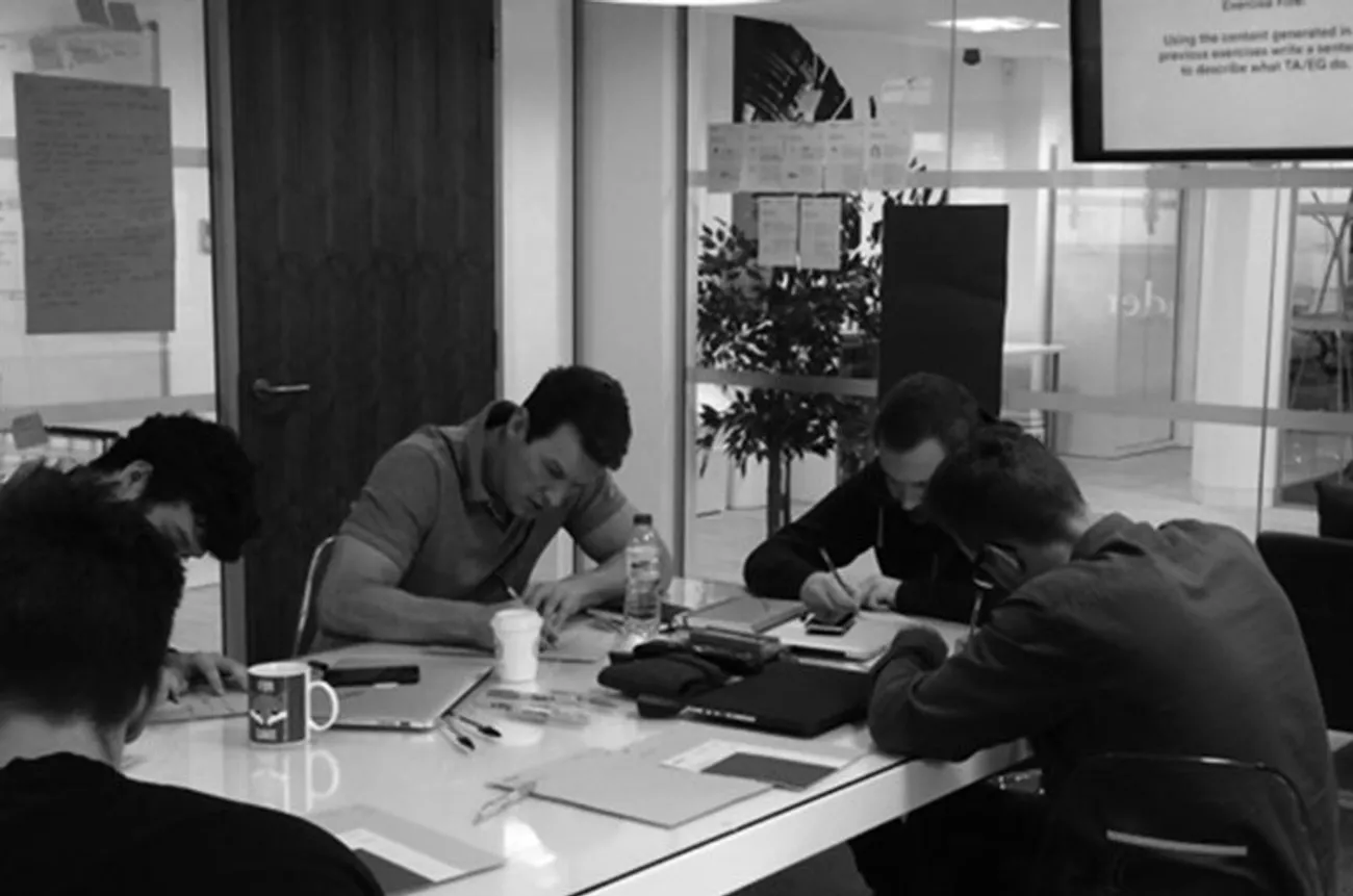
The project began over 6 months ago when we conducted a series of Brand Workshops with members of the Ticket Arena team at their headquarters in Leeds. The workshops consisted of a series of exercises that dissected the brand in order to dig deep and find out more about who they really are and what they do. Using our philosophy of 'people don't buy what you do, they buy who you are', we conducted a number of exercises that helped determine Ticket Arena's USP, what makes them different, what makes them stand out in a highly saturated market and what they should be shouting about!
We helped define their target audience by creating customer profiles and re-enacting real-life scenarios of people interacting with the Ticket Arena brand. We also took part in exercises that helped determine the Brand Values, Vision and Mission of the company which all helped shape Ticket Arena's new Brand Strategy and Position in the industry. We worked with the Ticket Arena team to build a Tone of Voice and a Messaging Platform that was packed full of personality and resonated with their audience.


Brand Launch
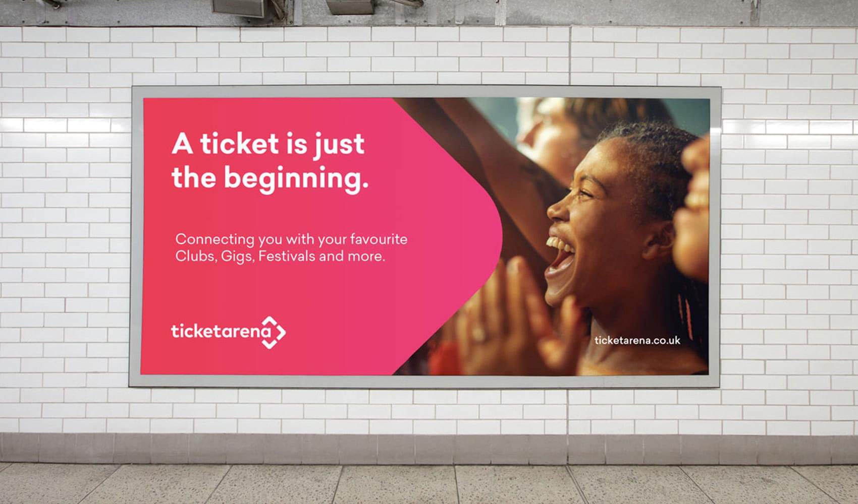
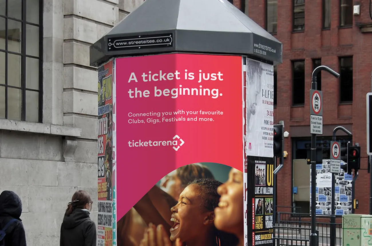
The initial Brand Launch campaign was centred around the tagline 'A ticket is just the beginning'. We helped design a campaign for Billboards and Ad-shells as well as Web Ads and Social Media. We're super excited to be working with the Ticket Arena design team on their new chapter and look forward to sharing more work down the line.
Check out the new TA brand in action;
ticketarena.co.uk / @ticketarena