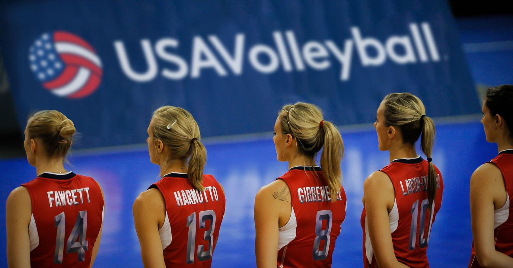
We've been working with Spark Capital and USA Volleyball helping them develop ideas for their merchandise leading up to the 2020 Olympic Games in Tokyo.
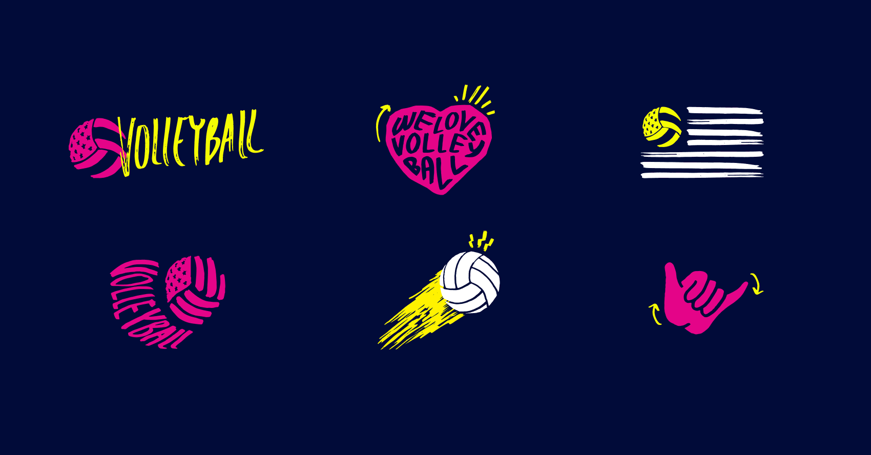
We were asked to create a classic range of merch appropriate for all audiences as well as a more vibrant, playful range targeting a younger, female-focussed demographic.


A Refreshed Brand
We started by looking at the existing USA Volleyball logo and proposing a slight update which would bring the brand into the 21st century whilst still retaining the history and memorability form before. (Left: Previous Logo, Right: Proposed Update.)


The Classic Range
For the classic range, we developed a bespoke typeface which is modern take on a traditional 'varsity' style that was confidently combined with the unmistakable USA red, blue and white colour scheme.
We developed typographic compositions and 'lock-ups' that could be used as feature graphics across all types of merch. We played on the unique hand-signals that are used in Volleyball, bringing these into the Merchandise in a physical, playful and engaging way.


The Modern Range
For the modern range, we combined bold and bright colours with a hand-rendered execution to create lively icons and devices that bring a little bit more personality and flavour to the game of Volleyball.


Be sure to Follow USA Volleyball on Instagram to stay updated with the build up to the 2020 Olympic Games in Tokyo.