The British Independent Film Festival
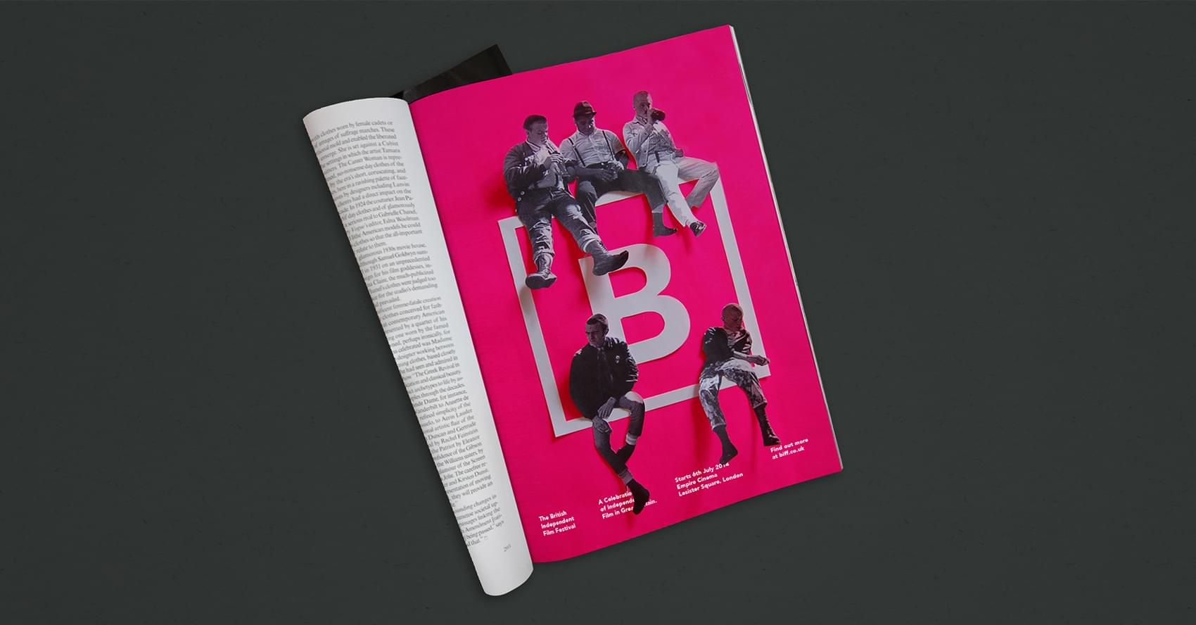
A bright new proposed re-brand for the British Independent Film Festival. With lack of funding available, we wanted to create a new Identity that had a stand out personality. This was achieved through the use of a bold colour scheme and unique image treatment alongside a very British 'tongue-in-cheek' copy-led campaign.

Creating a Buzz
Promotion was important when trying to create a buzz around the festival. We achieved this by using typically British slang words and a conversational tone carried through the copywriting; from the signage to the print based products. As well as this, imagery was used from iconic British independent films, mixed with the branding itself to help the audience make the connection of British film to the brand.


Building the Brand
We built on the festival identity primarily through print based products as these are things that the British public are most likely to come into contact with. Products ranged from ticket stubs and film listings to wristbands, invites and key-rings. Each piece of communication created used the stand-out pink colour scheme, combined with the confident logo and conversational copywriting.


The Awards
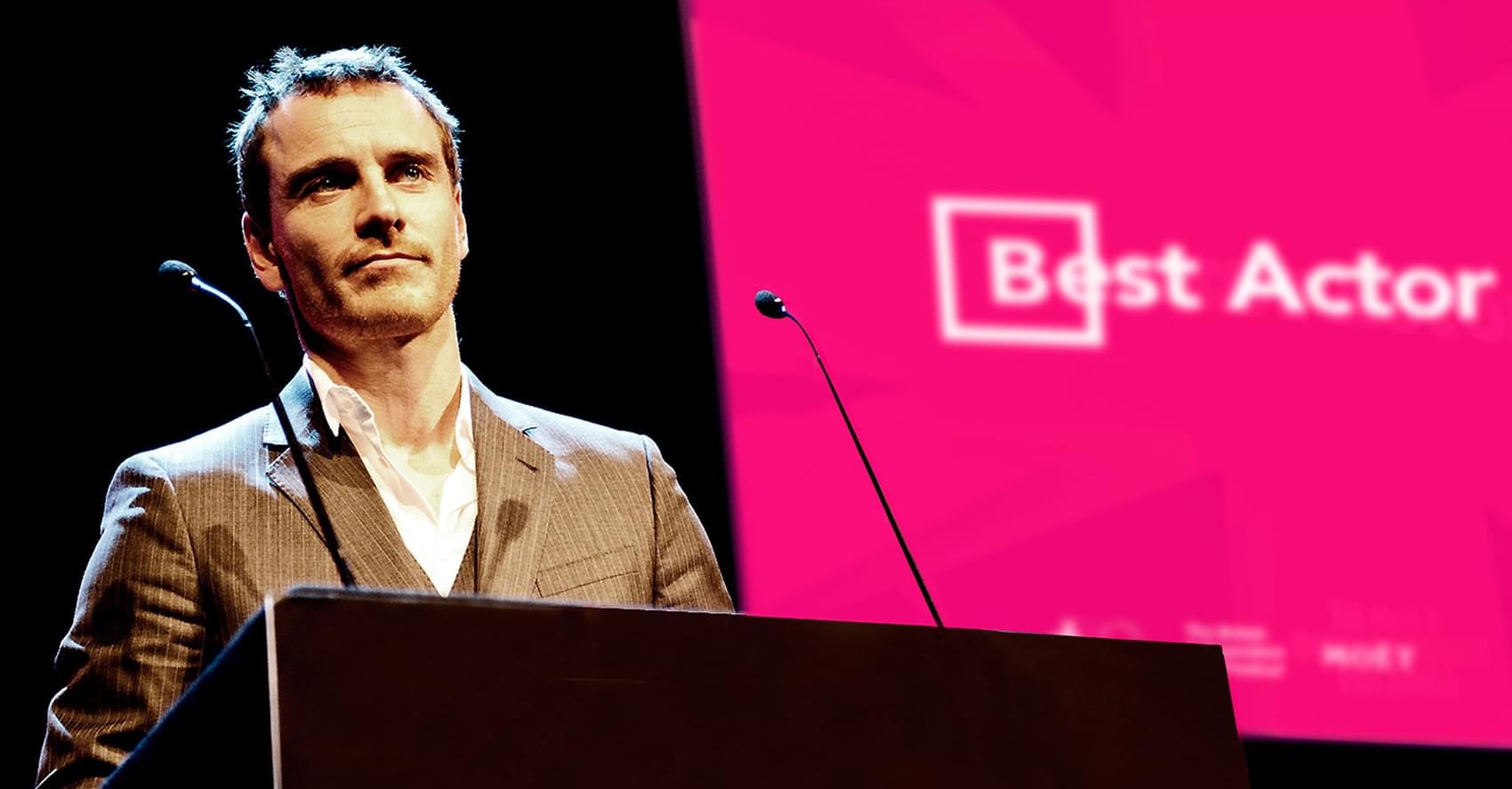
The festival comes to a close with its world famous awards ceremony, where various honors are up for grabs including Best Film, Best Screenplay and Best Cinematography. The brand was thoughtfully applied across this event, to make it all fit together seamlessly. A proposed award was created, which is an interactive version of the logo. The 'B' hanging in the centre of the frame is movable, pivoting around the metal spine.


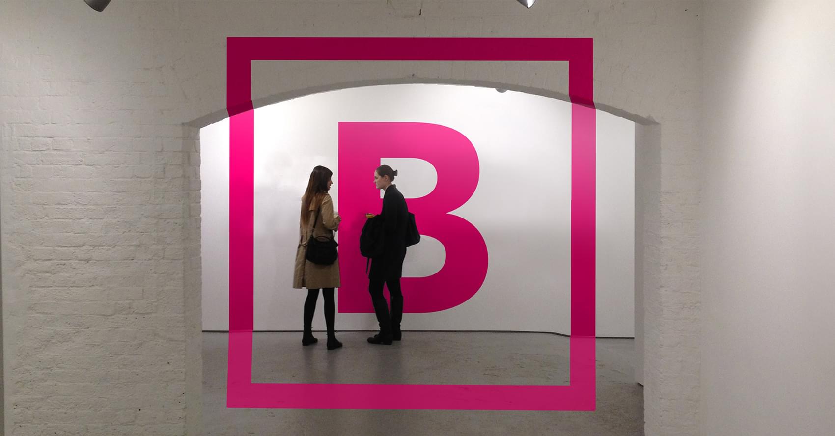
The Event
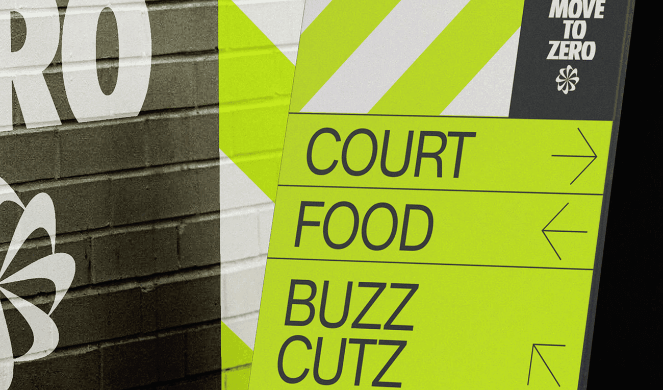
The brand was extended further into information and wayfinding. The festival is held at the prestigious Empire Cinema in London's Leicester Square, so we applied the strong base identity to this setting. The anamorphic type emphasises the idea of Film in transition and alters perspective depending on where you stand in the exhibition. All other signage and wayfinding was applied in a typically British fashion, using slang terms and a very conversational tone along with bold clean icons to instantly connect with the audience.


The British Independent Film Festival
A bright new proposed re-brand for the British Independent Film Festival. With lack of funding available, we wanted to create a new Identity that had a stand out personality. This was achieved through the use of a bold colour scheme and image treatment alongside a very British 'tongue-in-cheek' copy-led campaign.