We’ve been working on the branding for an innovative new property development company based in the US whose health-centric vision considers the occupant and their well-being at the centre of all design and production, applying the philosophy of 'A better lifestyle starts with a better home.’ We’re happy to share some unused concepts for the brand.
Their mission is to develop smarter, healthier homes that inspire and are in turn inspired by the occupant. Promoting health and a higher quality of life by applying a holistic approach to architecture, design construction and property management make up the centre of the company's ethos. Their properties incorporate a higher purity of indoor air, improved thermal properties, water, acoustics and even light.
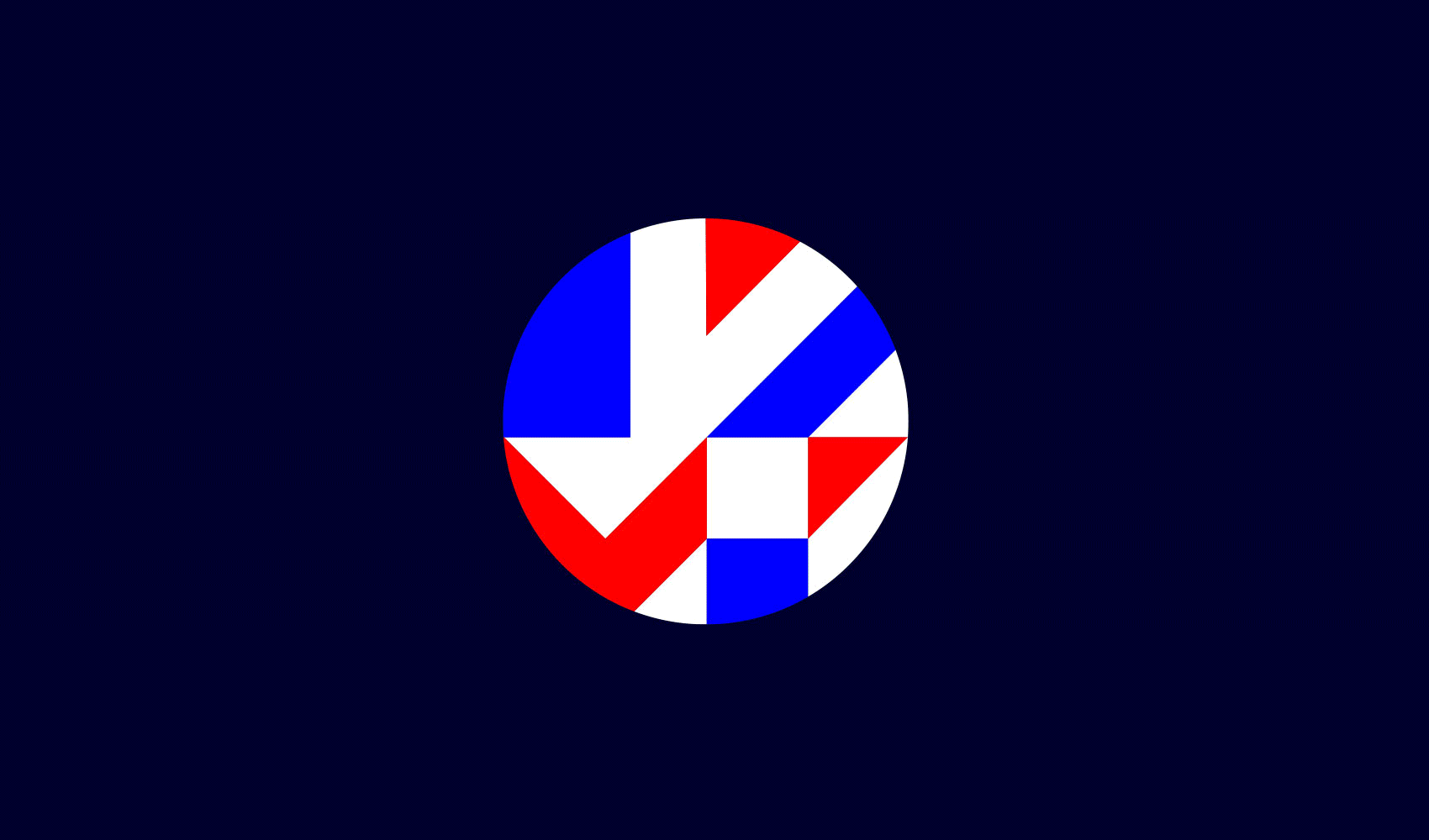
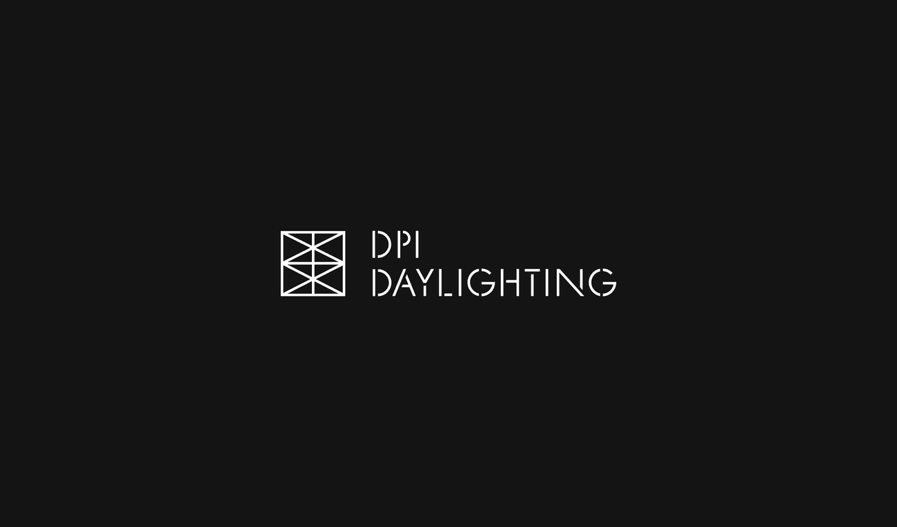
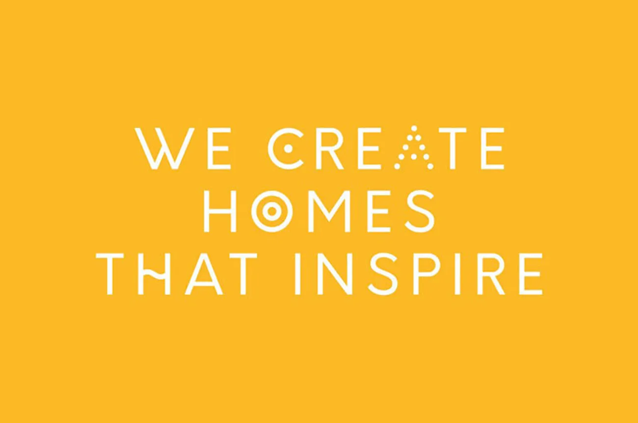
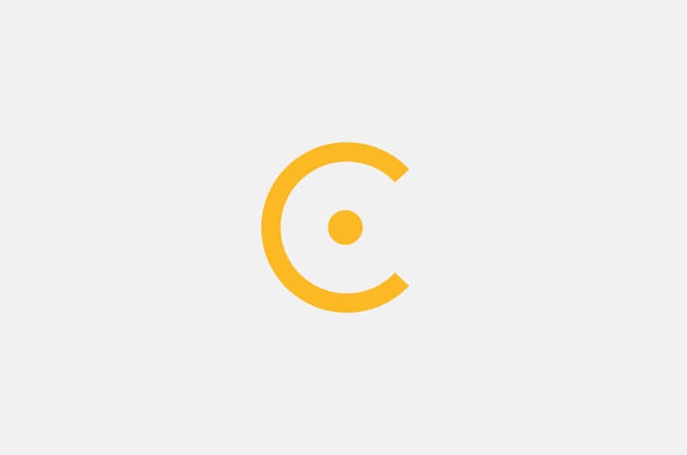
We’re working closely with the client to create a brand identity that seeks to embody not only the innovative ideas and high-quality product promised, but also importantly creates a language and brand identity that simplifies the complex. We have developed the brand tone of voice that is simple and explains to the end-user what the brand stands for in a few sentences. Alongside the tone of voice, we proposed a clear icon system to represent the key areas at the centre of the brand; air, water, acoustics, lighting, and thermal comfort.
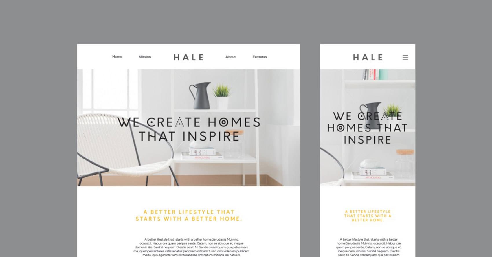
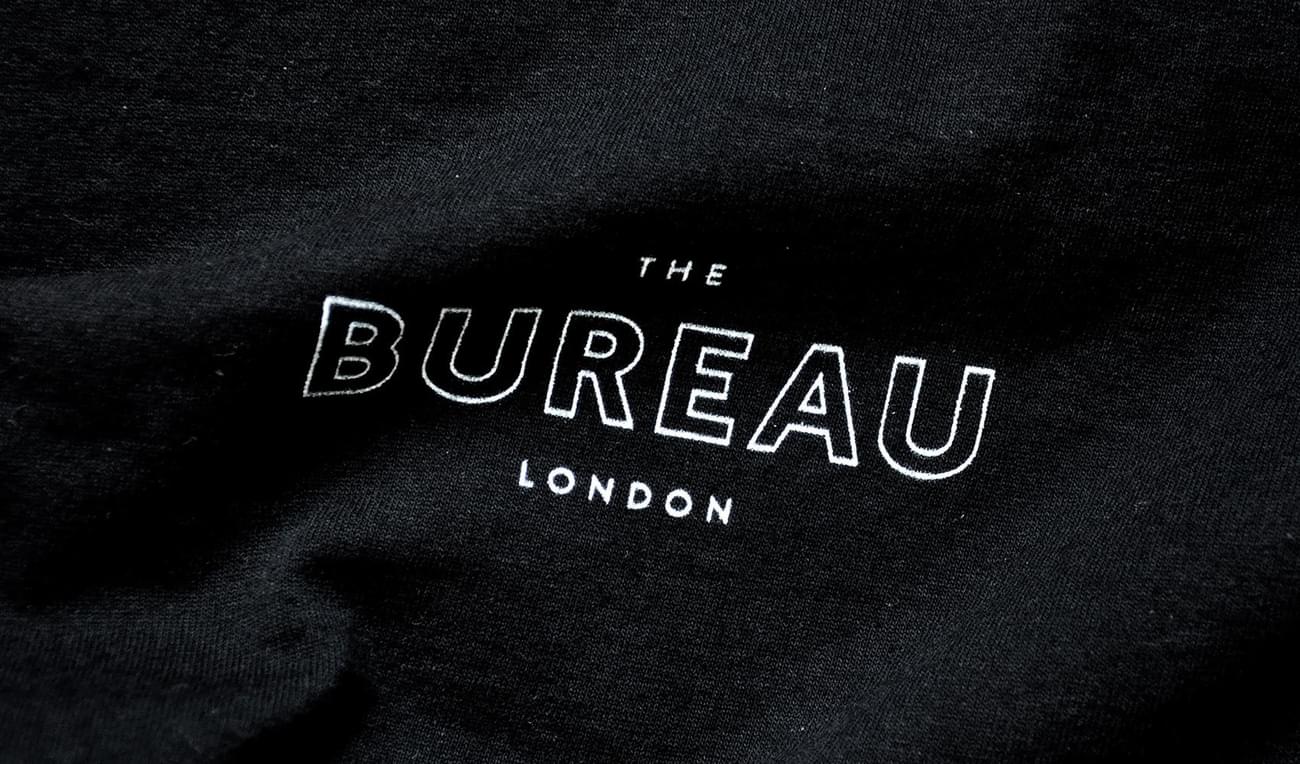
With any brand and flagship product, it's important the product speaks loudest. This case is no different. In order for the innovative product to steal the show, we created a custom brand typeface that stands out and is unique, just like the brand. The brand typeface expands upon the unique iconography of the brand making everything come full circle.
We look forward to sharing more updates of the project as it progresses.