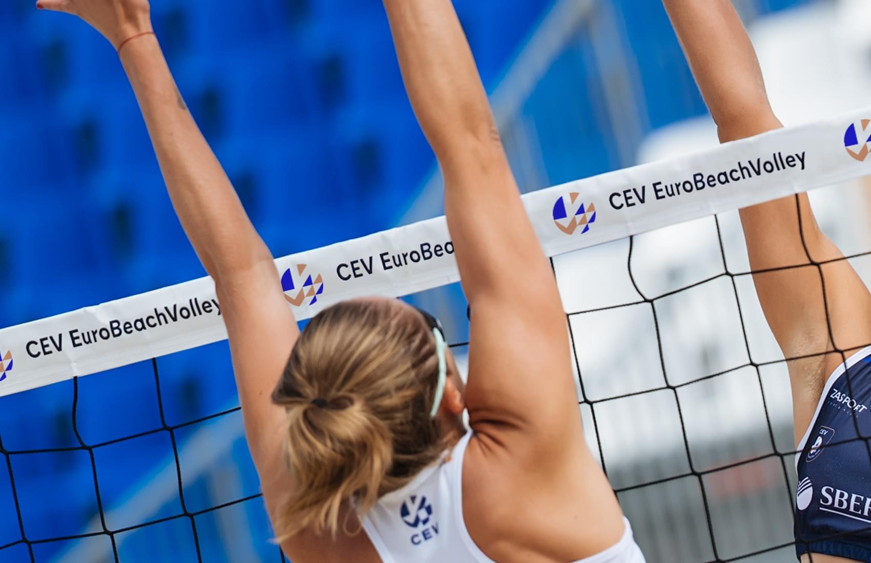
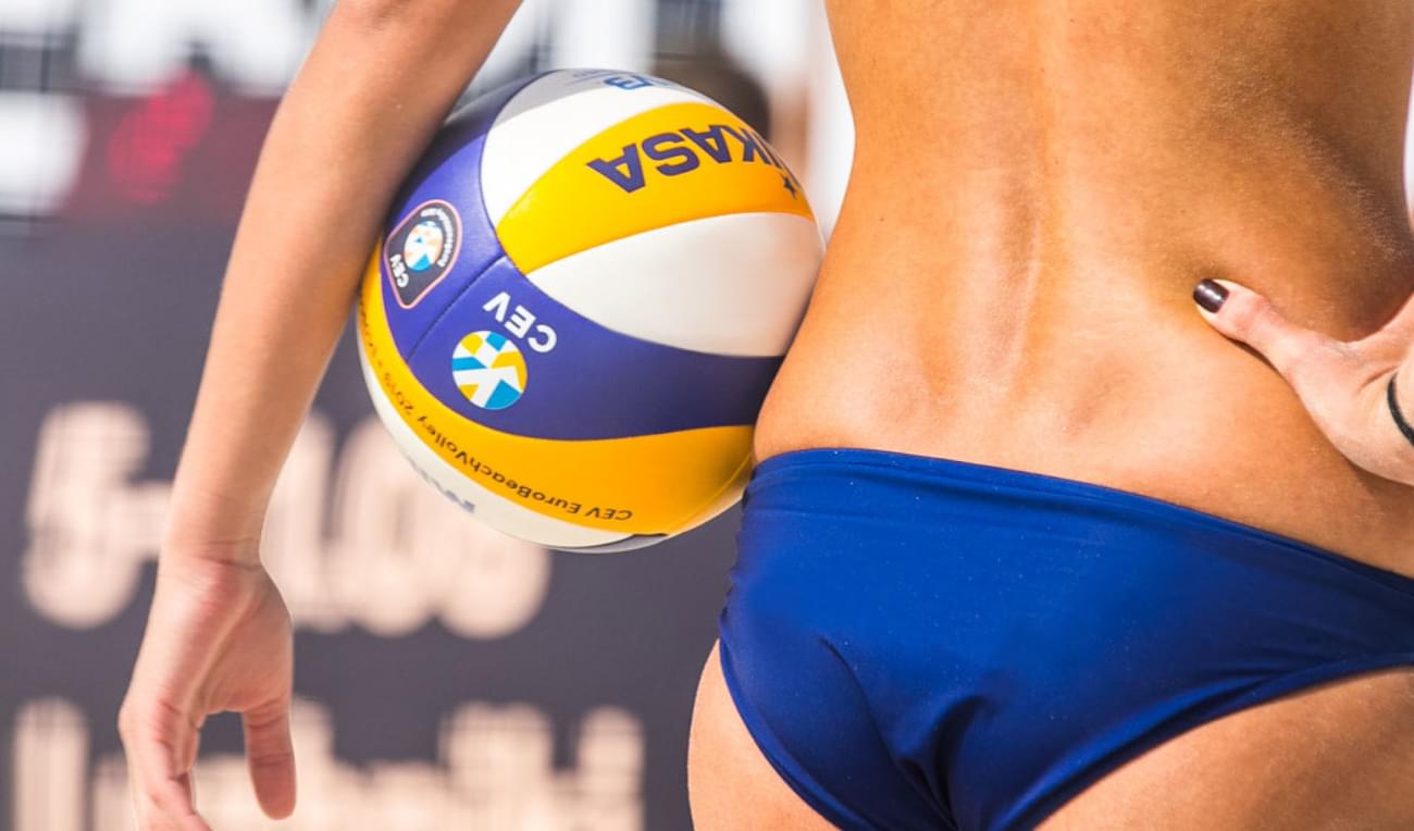
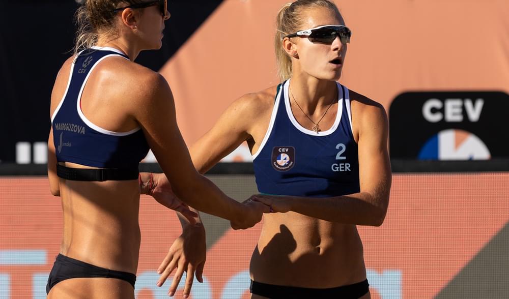
EuroBeachVolley is the flagship competition for Beach Volleyball in Europe. As part of a full rebrand of CEV (The European Volleyball Confederation) we helped build a sub-brand for EuroBeachVolley that would truly encapsulate the future of Beach Volleyball.
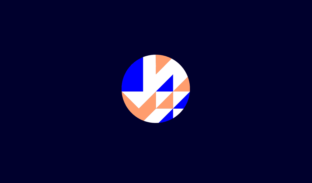
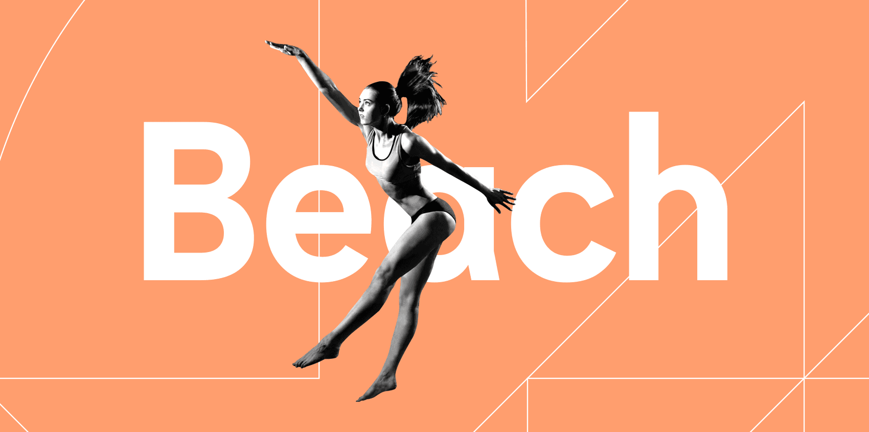
The Volleymark
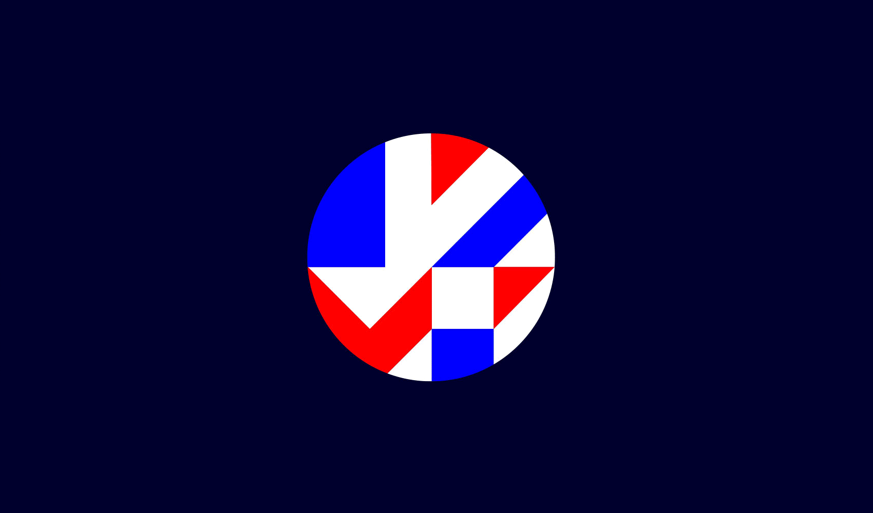
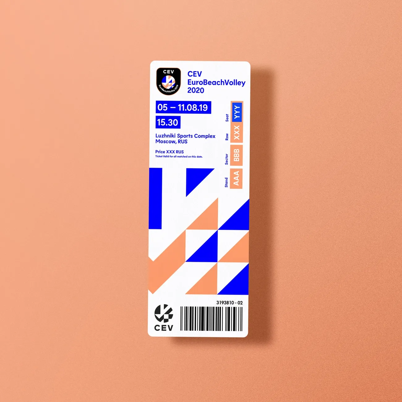
Born from inspiration of the flags of all 56 European Nations, the Volleymark is the centrepiece of the brand identity. The shapes and angles illuminate the spectacular moments that transcend the sport. The triangular shapes are unique to EuroBeachVolley, inspired by natural shapes found in Sand and Waves.


Sand, Seas and Skies
Using a strict colour palette of Navy Blue, Royal Blue and Coral kept the brand clean and modern whilst also clearly referencing the natural colours found in the Beach environment of Sand, Seas and Skies.
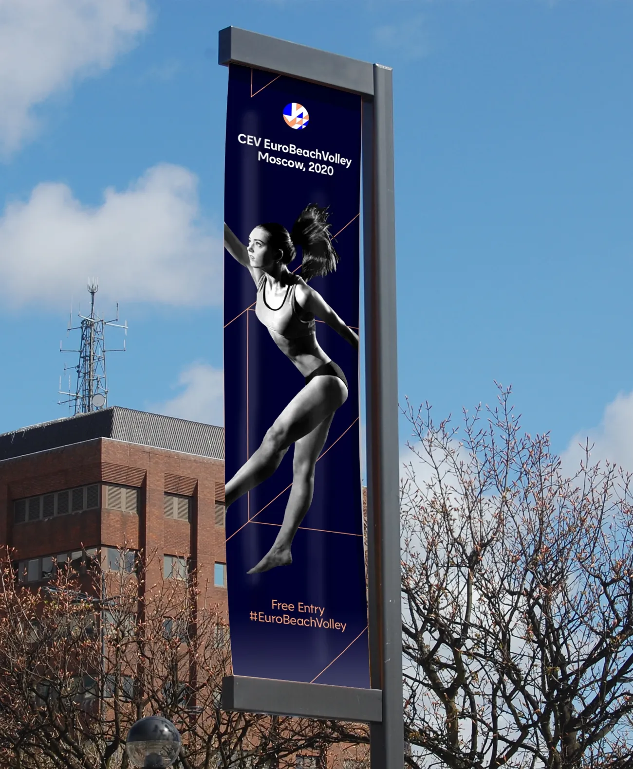
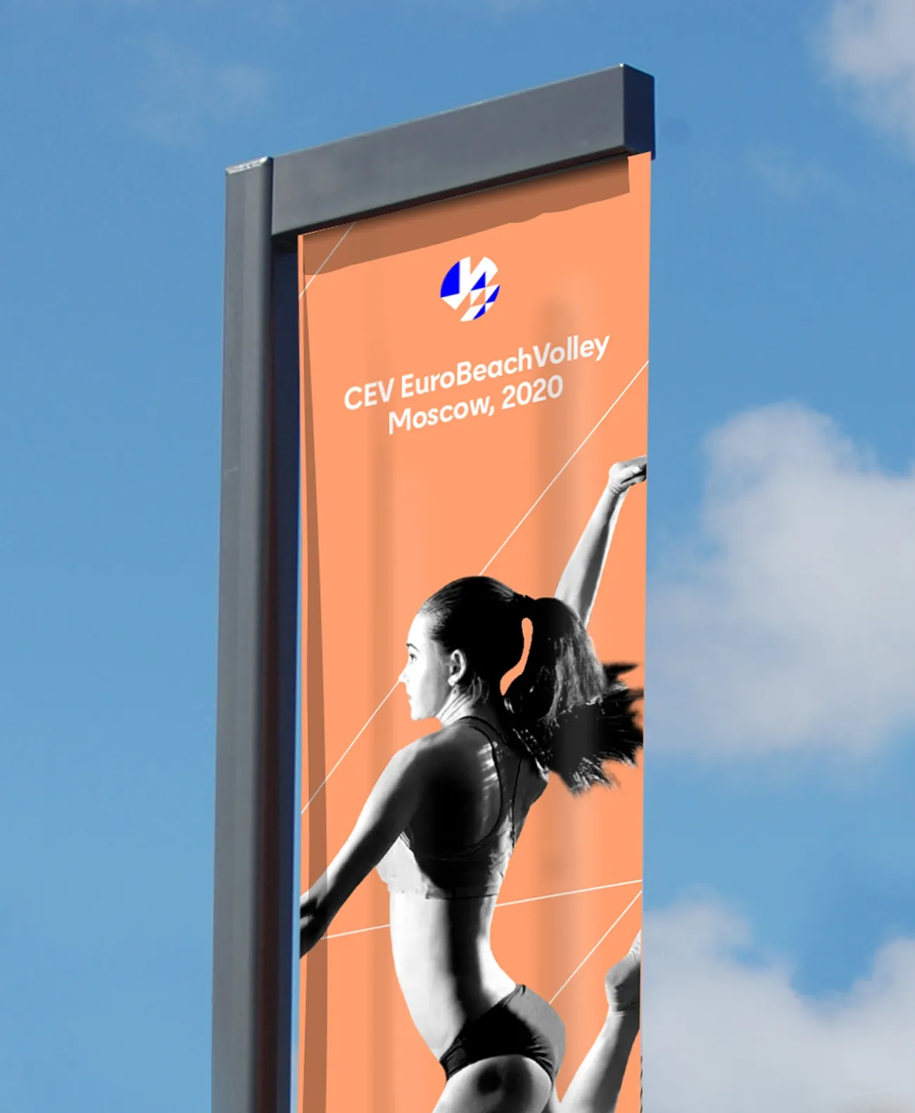
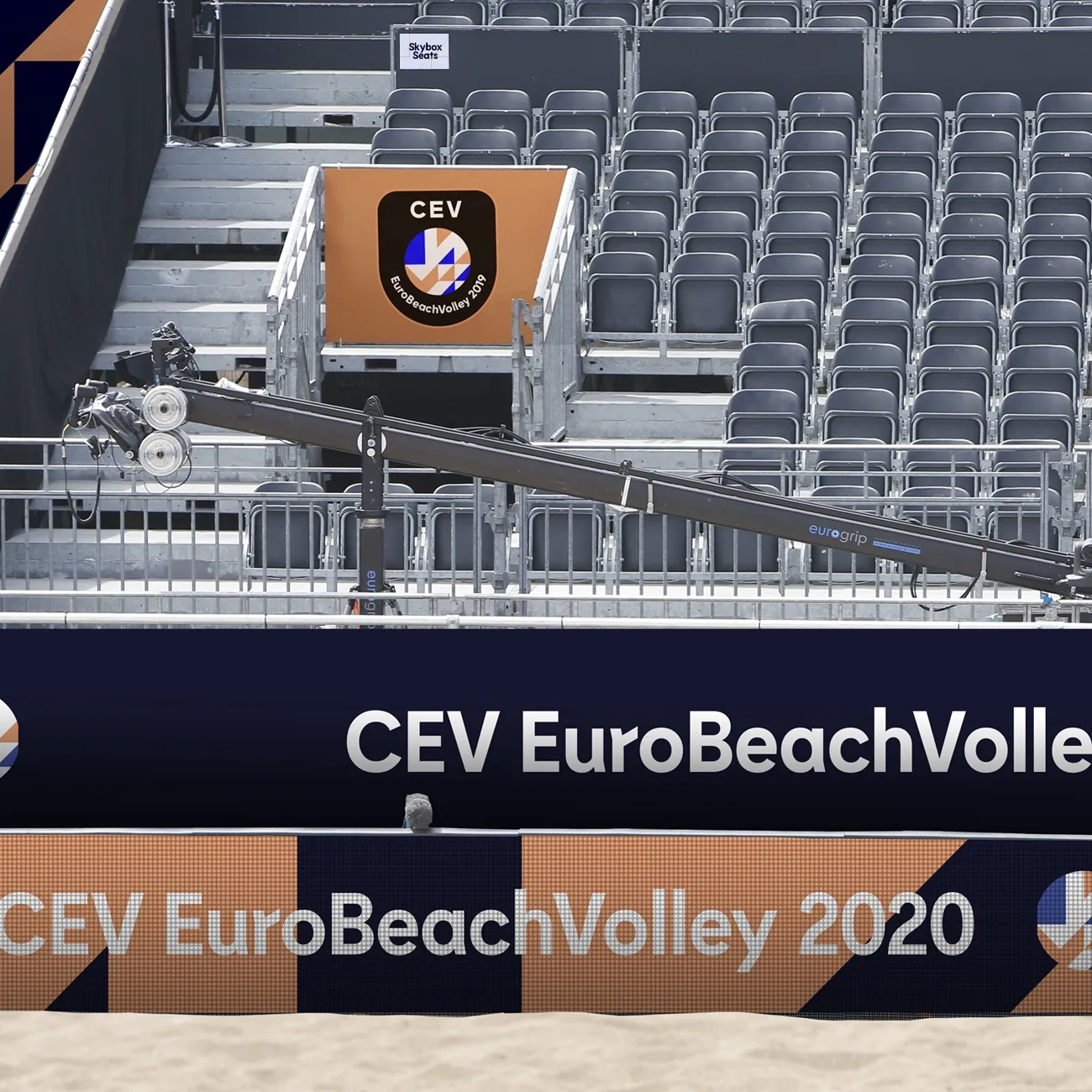
As the brand needed to be seen at all scales and on a wide-range of deliverables, we created a graphic device from the Volleymark that can be cropped, keylined and used with typography and photography to create dynamic compositions.


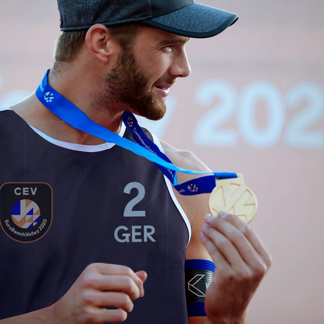
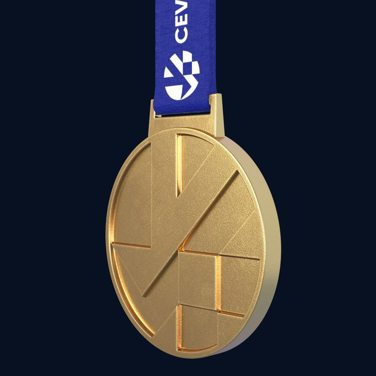
The iconic shapes of the logo lend themselves well to the most important of applications such as the winners' medals.
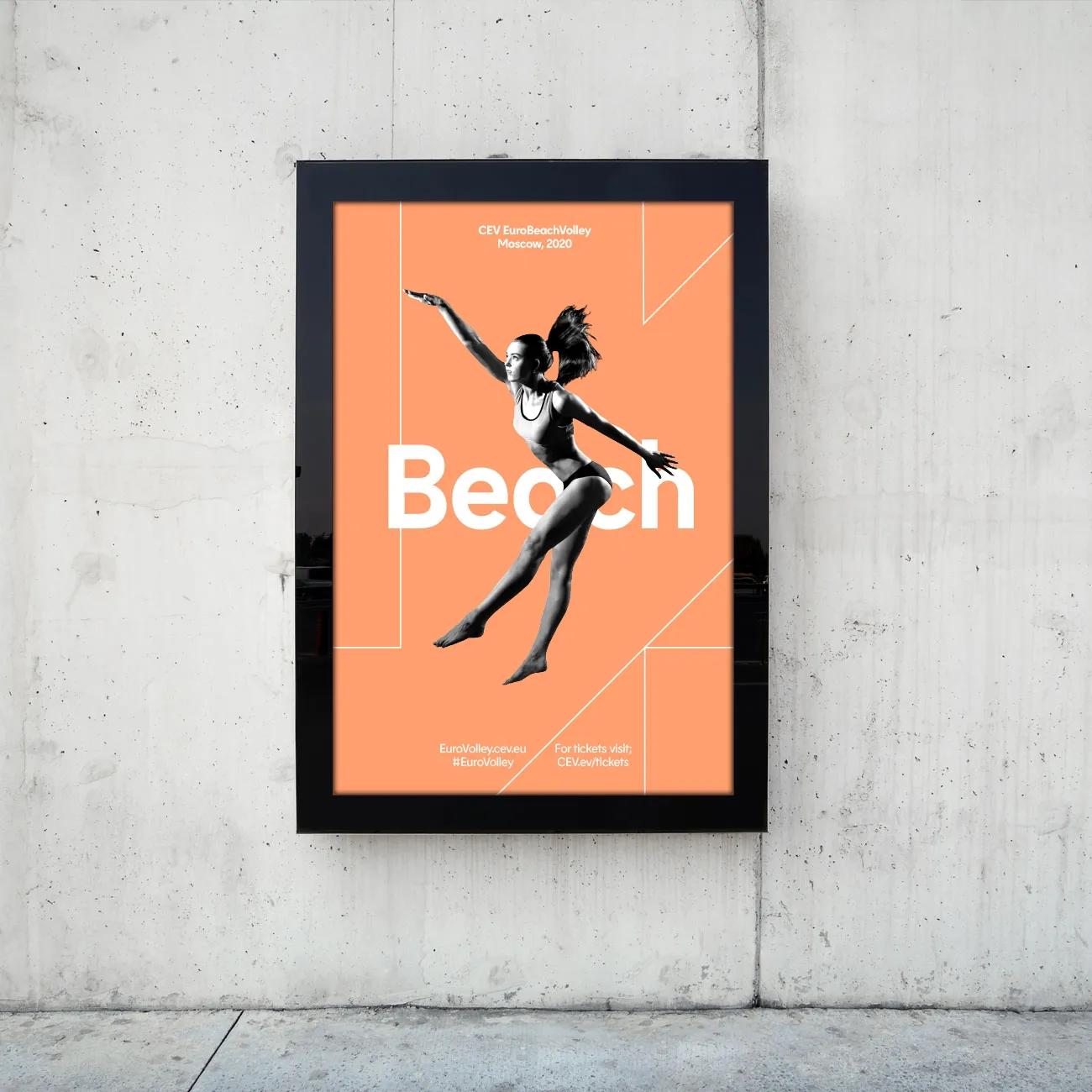
The display typeface is a classic geometric sans serif with a modern and energetic twist. A number of interesting angled letterforms represent the movement and fast-paced nature of the sport and are inspired by the angles found in the Volleymark.


“At CEV we recognised it was time for change and we now have Alphabet as a partner who are bringing new ideas and a new energy to European Volleyball.”
Aleksandar Boricic
CEV President
Designing for Screen
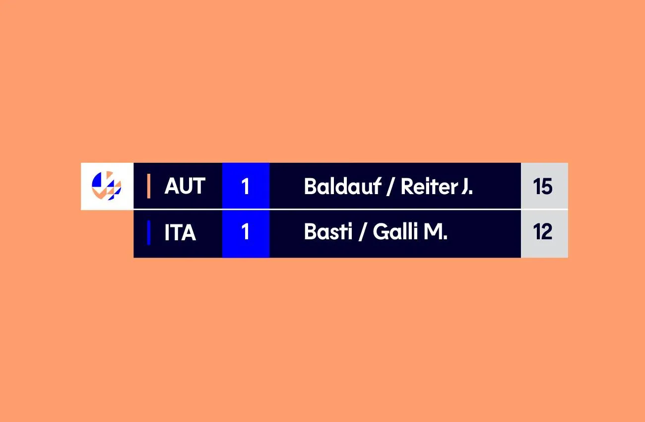
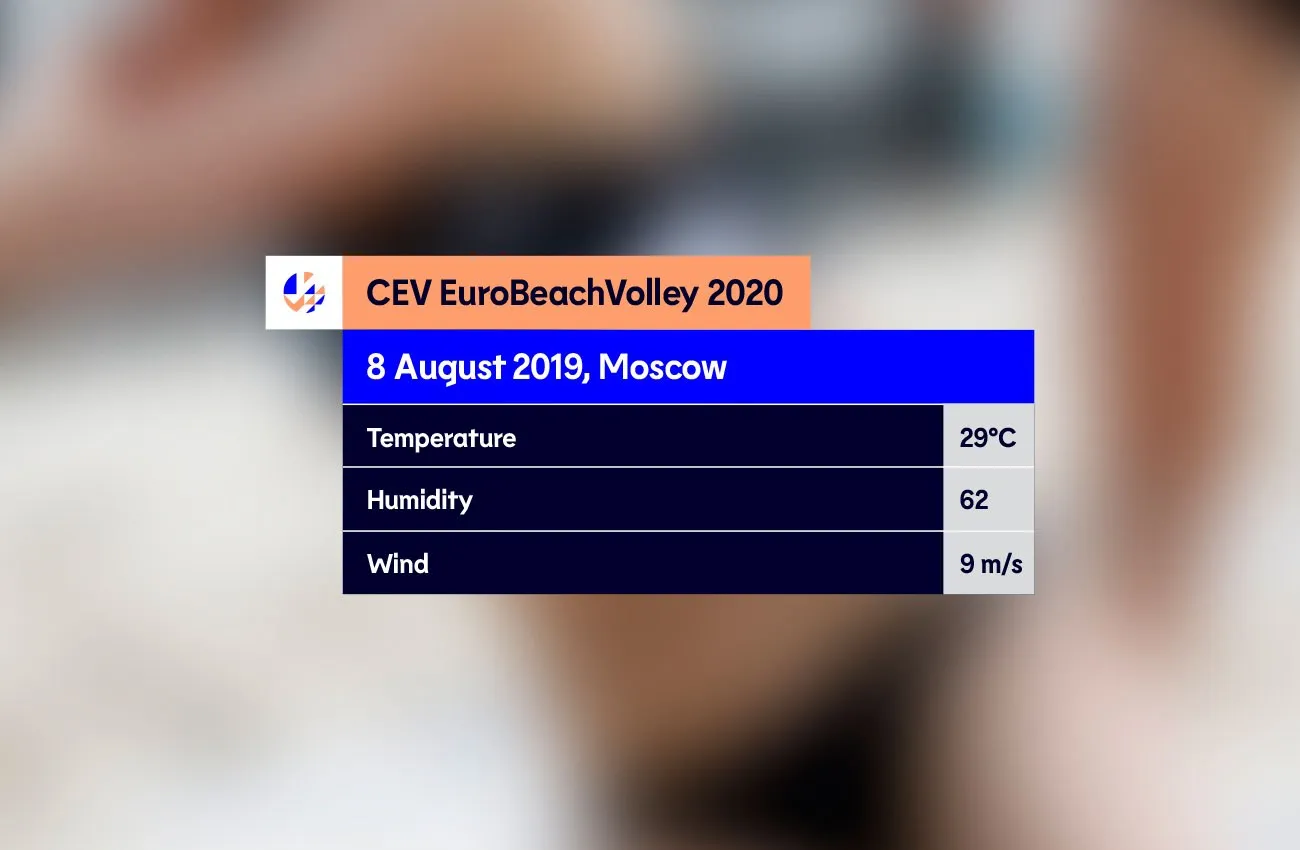
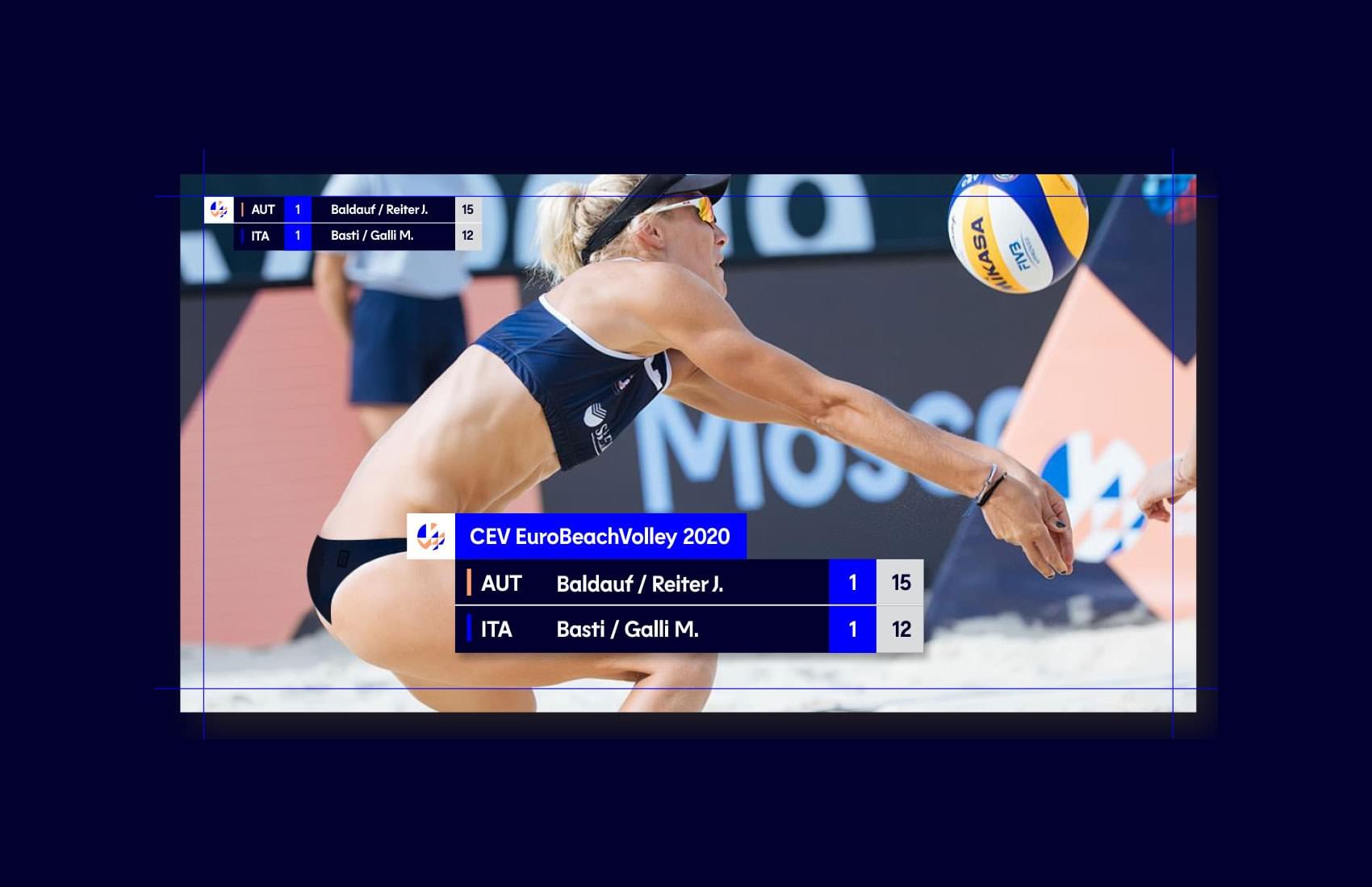
We worked with CEV to develop the full TV experience that brings a complex world of live data including league tables, charts, player profiles and in-match information together as a connected whole.
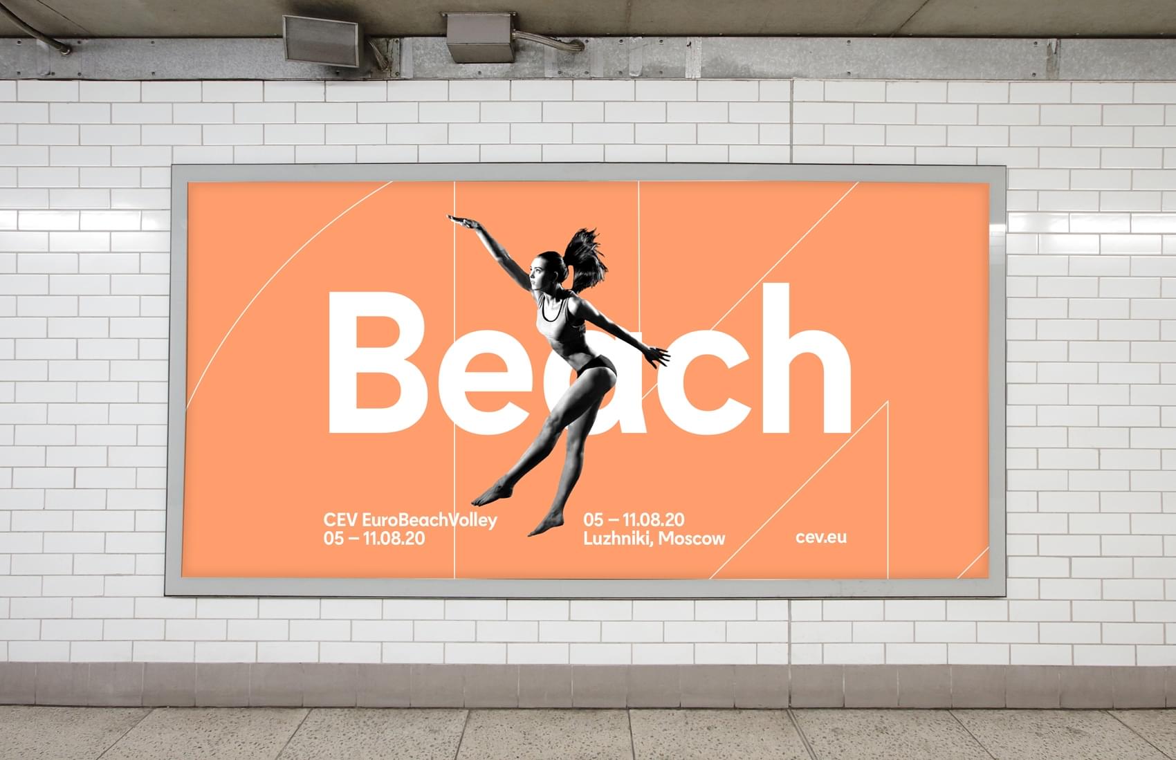
We brought variety to the brand by generating multiple applications of the graphic device and how this works with photography in particular. This enabled the brand to have real variety, whilst still remaining consistent and true.
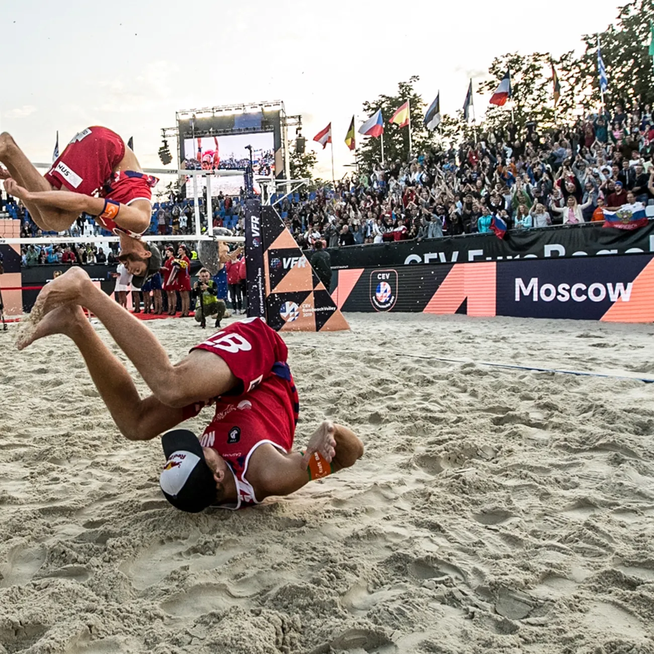
It was important to create a brand which could be dialled up or down depending on the touchpoint. The court graphics were designed to be clean and clear to let the players be the stars of the show.
The brand is able to flex from bold and vibrant to premium and elegant. A less liberal use of highlight colours, plus a toned-down graphic device enables corporate materials to work in their relevant settings without diluting the brand.